drawing, paper, ink, pen
#
drawing
#
hand-lettering
#
hand drawn type
#
paper
#
ink
#
pen-ink sketch
#
pen work
#
pen
#
calligraphy
Copyright: Rijks Museum: Open Domain
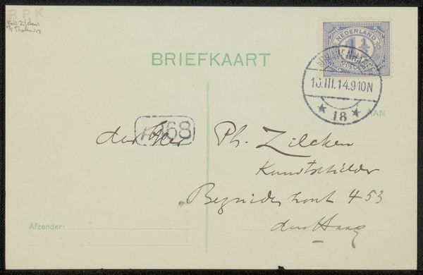
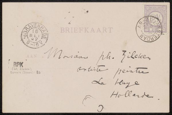
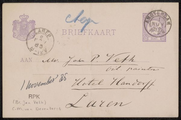
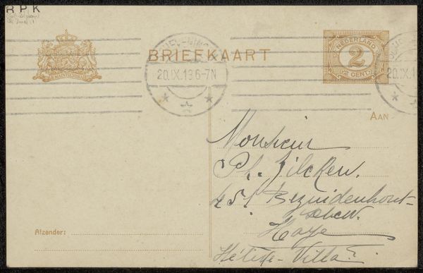
Editor: So, here we have "Briefkaart aan Philip Zilcken," a pre-1918 drawing in ink on paper by F.M. Melchers. The whole thing feels very delicate and intentional, especially the handwritten aspect of it. How would you approach understanding this piece from a formalist perspective? Curator: We might start by focusing on the line itself, the precision of Melchers' hand. Observe the variance in thickness and the flow of the pen across the paper. Notice how the negative space around the letters contributes to the overall composition, almost as a dance of form. Does this create a balanced visual experience, or is there tension in the arrangement? Editor: I see what you mean. The "Briefkaart" title seems balanced, yet the handwritten portion seems more fluid, almost unbalanced with varying stroke weight. I am thinking the stamps also provide visual elements; do you see those fitting into the overall visual composition, or do they remain separate? Curator: Indeed. The stamps punctuate the composition with geometric shapes. The crispness of the printed text and stamped elements provides a contrasting element of standardization against the subjective expressiveness inherent within the handwritten inscription. Look closely at the postmarks. Consider how the circles echo the overall shape, but with contained information, as distinct shapes. What feeling does this contrast create? Editor: It does highlight the contrast between the official, printed form and the personal message, but it somehow melds well, forming a complete visual whole with structured and fluid elements. The tension then lies in its duality, its composition of the ordinary and the personal. Curator: Precisely. This close observation of line, shape, texture and negative space allows us to unpack its complex, carefully planned communication and artistic structure on its own, beyond cultural interpretations of the text. Editor: That makes a lot of sense. Now I understand how concentrating on formal qualities helps us reveal intentionality even without historical context! Curator: Yes, this attention provides one route to understanding this artwork. Every element works in relation to the others, crafting the artwork’s meaning.
Comments
No comments
Be the first to comment and join the conversation on the ultimate creative platform.
More like this