drawing, paper, ink, pen
#
drawing
#
pen illustration
#
pen sketch
#
hand drawn type
#
paper
#
personal sketchbook
#
ink
#
ink drawing experimentation
#
pen-ink sketch
#
thin linework
#
pen work
#
sketchbook drawing
#
pen
#
sketchbook art
#
calligraphy
Copyright: Rijks Museum: Open Domain
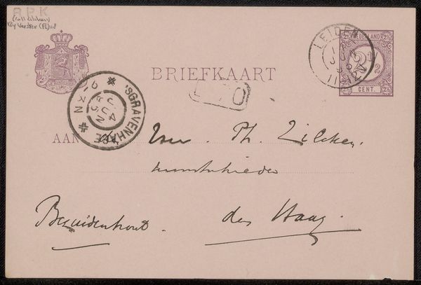
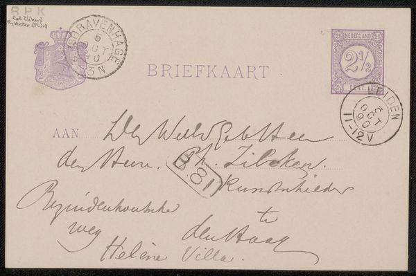
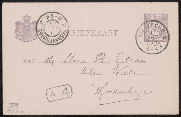
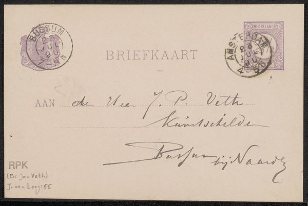
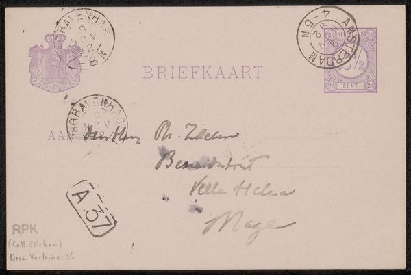
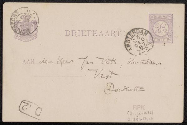
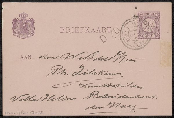
Curator: Before us, we have a simple yet revealing piece, "Briefkaart aan Philip Zilcken," a postcard created before 1895 by Maurits van der Valk. It’s currently held in the Rijksmuseum collection and rendered in pen and ink on paper. Editor: My immediate reaction is intimacy. It’s so personal, so clearly functional rather than monumental, even the typography speaks of a handwritten age, there’s even postmarks that create almost talismanic symbolism of a different era. Curator: Absolutely, it’s a window into artistic correspondence of the time. The stylistic choice of the pen and ink drawing really places us in an intimate moment of that period. Editor: The ink reminds me of memory itself - fragile and enduring, so deeply etched onto something transient. And note the precision - it appears delicate but conveys purpose, as if preserving every word was crucial. I want to delve into the exchange! Was this common practice, and were postcards already accepted into artistic environments at the time? Curator: These were a very important form of communication, linking artists and creating professional exchanges, alongside family and personal events. We often only see artworks after they have been received by the public, polished and finished, whereas here we are looking at someone else’s mail, giving us unprecedented access. Editor: It is an access into the everyday that would never have been intended to be monumental, but takes on monumental relevance. You can find little hidden signatures for example. The symbolic implications of handwritten fonts over the printing press would have meant something at the time also. What feelings were elicited with those chosen font types, versus a standardized printing? Curator: The hand-drawn lettering has connotations of personalized content, in comparison to the text “Briefkaart” that may indicate printing of standardized messaging or services that operated on it. It is an early visual strategy to enhance or detract from, personalize or depersonalize the artwork with multiple types of handwriting. Editor: What a gem. To look through another’s post at a precise moment in history gives us almost supernatural clarity in observing an otherwise obfuscated and now sentimentalized art culture. Curator: A fascinating, subtle piece revealing a time not long gone but so very changed by societal innovation.
Comments
No comments
Be the first to comment and join the conversation on the ultimate creative platform.
More like this