Copyright: Modern Artists: Artvee
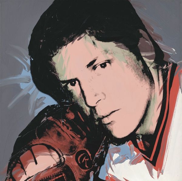
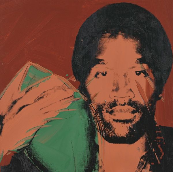
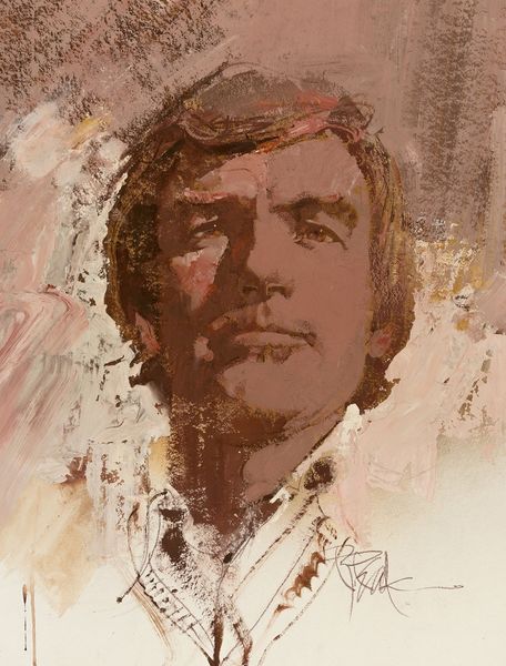
Editor: So here we have Andy Warhol's portrait of Rod Gilbert from 1977, painted with acrylics. The bright colors against that grey backdrop immediately give it this cool, almost detached feeling, even though it's a portrait. How do you read it? Curator: That detachment is so Warhol, isn't it? It's like he's immortalizing Rod Gilbert but keeping him at arm's length. The colors—that electric green, that almost sickly peach—they pop, but they also create this slight unease. Makes you wonder if Warhol saw Gilbert as a person or just another icon, a brand to be silkscreened. Editor: That's a good point. It does feel like the image takes precedence over the person, even though you can clearly see his face. What do you think he's trying to say by using these almost artificial colors? Curator: Maybe it’s a comment on celebrity itself? We’re so used to seeing these faces, blown up and made larger than life, that they almost become caricatures. The vibrant, slightly off-kilter colors might be Warhol's way of highlighting the artificiality of fame. What I find fascinating is how, even with all this pop art sheen, Gilbert's gaze is incredibly direct. Editor: Yeah, it’s like he's staring right through you, almost challenging the viewer. But do you think that Warhol, known for his superficiality, was actually going that deep? Curator: Warhol was a mirror reflecting society's obsessions, but maybe he also was a funhouse mirror. He might’ve reveled in surface, but he definitely saw beneath it, and wanted us to question our hunger for it. Editor: I never really thought of him that way before – both a mirror and funhouse mirror! Curator: Exactly. Food for thought. Food for the eyes. Warhol always gives you a little more than you bargain for.
Comments
No comments
Be the first to comment and join the conversation on the ultimate creative platform.
More like this