Copyright: Modern Artists: Artvee
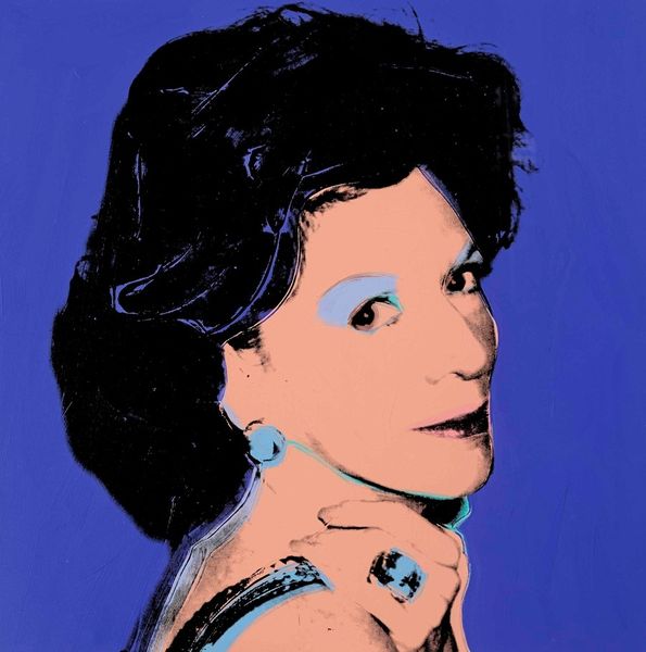
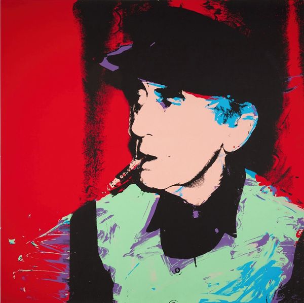
Andy Warhol made this screenprint, Kimiko, sometime between 1928 and 1987, and what strikes me is the immediate, almost poster-like quality of the work, which comes from his bold, flat colour and high contrast. The process is so visible, you can almost smell the ink! I find myself drawn to the kimono, where the solid blocks of light blue meet a textured, almost mossy green, the colour feels both intentional and accidental. The layering of these colours creates a sort of visual vibration, making the surface feel alive. It reminds me that even in the most mechanically reproduced images, there is room for the hand, for the happy accident, for the sheer joy of putting colour next to colour. I often think of Warhol as a kind of bridge between Pop Art and earlier masters like Matisse, especially in the way he uses colour and flattens space. I love how he reminds us that art is always a conversation, a constant remixing of ideas across time.
Comments
No comments
Be the first to comment and join the conversation on the ultimate creative platform.