About this artwork
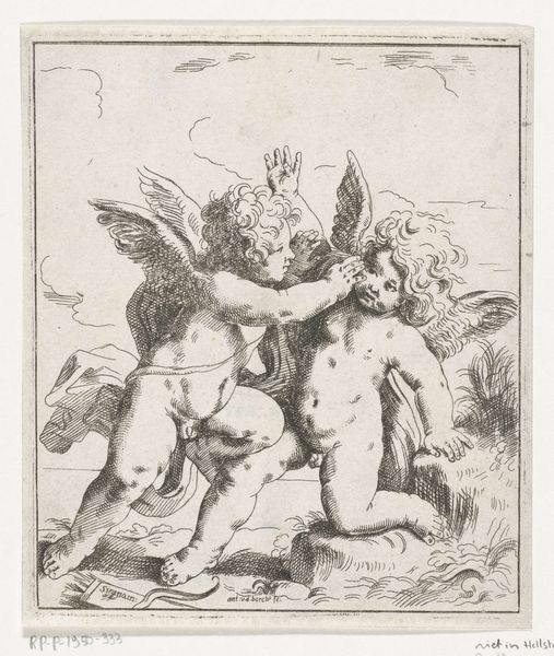
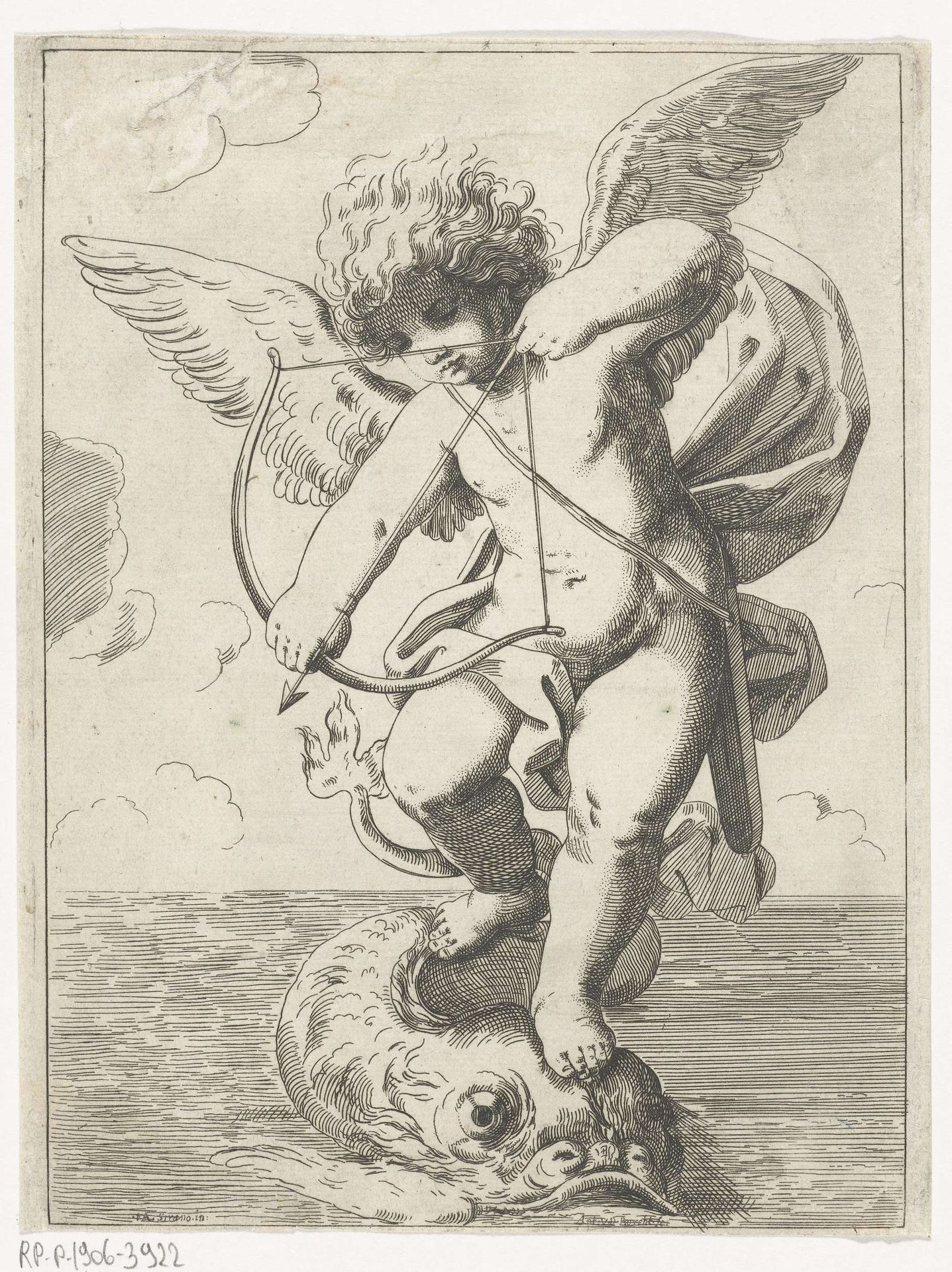
Curator: This engraving by Anton van der Borcht, created sometime between 1648 and 1663, depicts "Cupid Riding a Dolphin." The scene bursts with a sort of... well, a playful tension. Editor: Playful? At first glance, I sense more dominance than play. Look at the contrast. A tiny Cupid, poised with bow and arrow, asserts himself over this massive, almost comical dolphin. It suggests mastery, power… something beyond mere childish fun. Curator: Absolutely! The Baroque loved a bit of drama. Think of Cupid as a tiny god wielding enormous power. The dolphin beneath isn't just a sea creature; it symbolizes navigation and guidance. Cupid subverts that, steers the ship – or rather, the sea – towards love’s chaotic, irrational destinations. Editor: Precisely. Semiotically, we could read the dolphin as a suppressed libido, dominated by Cupid’s rationalized, formalized 'love.' Notice the detail in the engraving: the meticulous rendering of the dolphin’s scales versus the almost idealized, smooth texture of Cupid's skin. This disparity reinforces the theme of subjugation, wouldn’t you agree? Curator: Subjugation maybe. But in the throes of love, isn't there always someone steering, or dreaming of steering? The engraving style itself lends something dreamlike to it. And in fairness, perhaps the dolphin actually *likes* giving Cupid a lift? Maybe it sees him as a little beacon? Editor: You inject too much sentiment. While individual interpretation is always relevant, formally speaking, the arrow’s directedness implies control, not consent. Further, it's a masterful engraving: a display of line quality. Note how Borcht uses the density of the lines to describe not just shape, but also mood. See how different linear textures affect the atmosphere so vividly? Curator: That dense linework gives a sense of depth to something that would feel static if it was not handled with such delicacy and imagination. It makes me feel as though everything is on the move; a Baroque masterclass in controlled chaos. Editor: Well articulated. It showcases, indeed, how close observation and astute visual choices render complex allegorical themes accessible through structured form. Curator: True; and perhaps it is in that balance between controlled lines and implied emotion that it still resonates with our chaotic little hearts today.
Artwork details
- Medium
- print, ink, engraving
- Dimensions
- height 192 mm, width 142 mm
- Copyright
- Rijks Museum: Open Domain
Tags
Comments
Share your thoughts
About this artwork
Curator: This engraving by Anton van der Borcht, created sometime between 1648 and 1663, depicts "Cupid Riding a Dolphin." The scene bursts with a sort of... well, a playful tension. Editor: Playful? At first glance, I sense more dominance than play. Look at the contrast. A tiny Cupid, poised with bow and arrow, asserts himself over this massive, almost comical dolphin. It suggests mastery, power… something beyond mere childish fun. Curator: Absolutely! The Baroque loved a bit of drama. Think of Cupid as a tiny god wielding enormous power. The dolphin beneath isn't just a sea creature; it symbolizes navigation and guidance. Cupid subverts that, steers the ship – or rather, the sea – towards love’s chaotic, irrational destinations. Editor: Precisely. Semiotically, we could read the dolphin as a suppressed libido, dominated by Cupid’s rationalized, formalized 'love.' Notice the detail in the engraving: the meticulous rendering of the dolphin’s scales versus the almost idealized, smooth texture of Cupid's skin. This disparity reinforces the theme of subjugation, wouldn’t you agree? Curator: Subjugation maybe. But in the throes of love, isn't there always someone steering, or dreaming of steering? The engraving style itself lends something dreamlike to it. And in fairness, perhaps the dolphin actually *likes* giving Cupid a lift? Maybe it sees him as a little beacon? Editor: You inject too much sentiment. While individual interpretation is always relevant, formally speaking, the arrow’s directedness implies control, not consent. Further, it's a masterful engraving: a display of line quality. Note how Borcht uses the density of the lines to describe not just shape, but also mood. See how different linear textures affect the atmosphere so vividly? Curator: That dense linework gives a sense of depth to something that would feel static if it was not handled with such delicacy and imagination. It makes me feel as though everything is on the move; a Baroque masterclass in controlled chaos. Editor: Well articulated. It showcases, indeed, how close observation and astute visual choices render complex allegorical themes accessible through structured form. Curator: True; and perhaps it is in that balance between controlled lines and implied emotion that it still resonates with our chaotic little hearts today.
Comments
Share your thoughts