graphic-art, poster
#
graphic-art
#
figuration
#
line
#
poster
Copyright: Boris Bućan,Fair Use
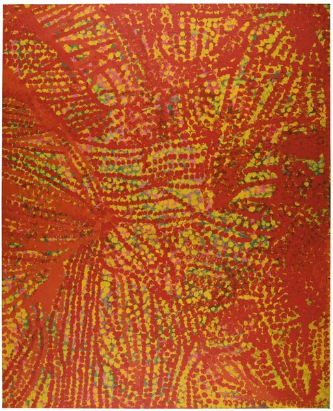
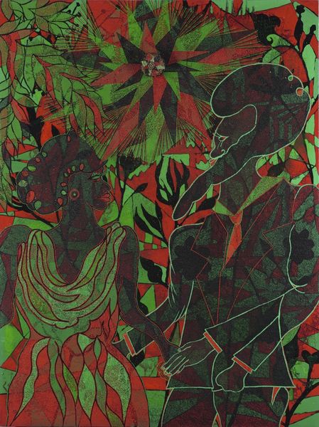
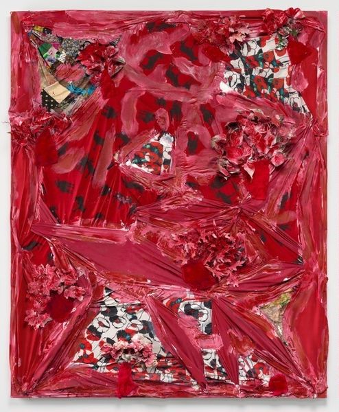
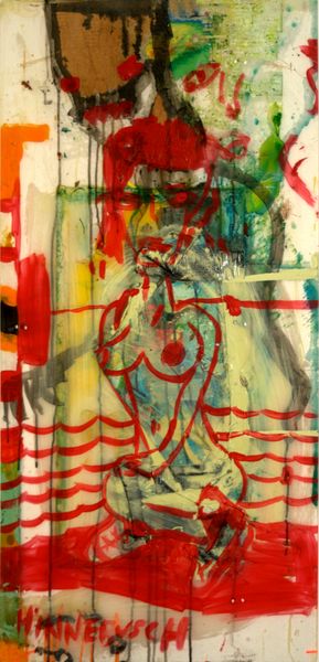
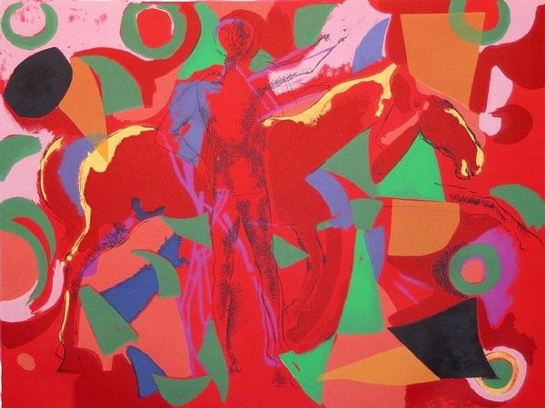
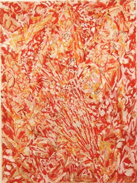
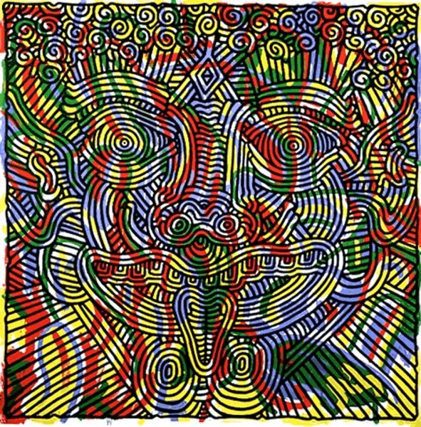
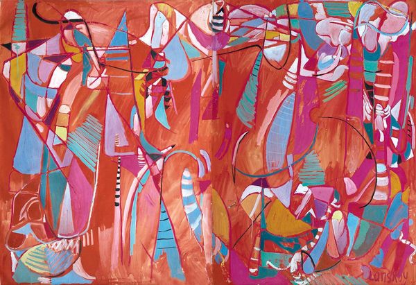
Editor: Here we have Boris Bućan’s 1986 poster, "Devil in the Village." The artwork seems to be fighting the figure with a swirling configuration of red and orange lines, which creates a rather aggressive effect. How do you see this work, thinking about its structure and material qualities? Curator: I see a carefully constructed tension achieved through layering. Observe the chromatic intensity; the restricted palette amplifies the visual impact. Note how Bućan uses line not only to depict the figure of the devil, but also as a disruptive, energetic force that challenges our perception of depth and space. Editor: That makes sense. So, you’re less focused on the devil as a symbol, and more on the lines and colours? Curator: Precisely. Semiotically, the devil *could* signify chaos, which is visibly articulated in this work. But it is primarily through formal qualities – colour harmony, rhythmic lines and spatial interplay – that Bućan communicates. Notice also how the sharp angles contrast with the figure's organic, almost grotesque form, creating an aesthetic disjunction. Editor: It is such a powerful piece, it seems like the conflicting formal relations are what generate the visual chaos. Curator: Precisely! This close formal engagement can reveal a surprising depth. Do you find the artist successfully delivers a balance, despite its subject and tension? Editor: Now I see it. I came into it expecting obvious, more on-the-nose meaning of the devil. But you’ve helped me understand it's more about the push and pull of the composition itself. Curator: Yes. Close viewing empowers us to see beyond simplistic interpretations. The poster uses colour, composition and space to reveal far more.
Comments
No comments
Be the first to comment and join the conversation on the ultimate creative platform.
