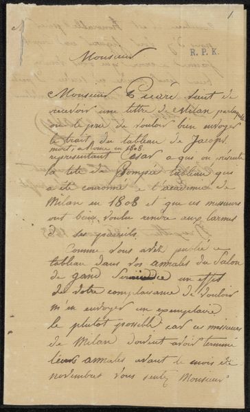
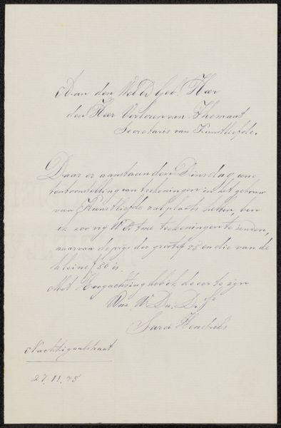
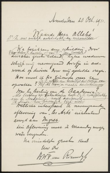
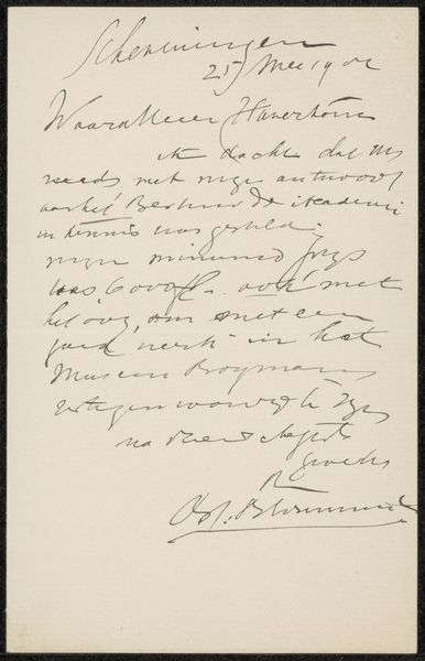
drawing, paper, ink
#
drawing
#
paper
#
ink
#
sketchbook drawing
#
calligraphy
Copyright: Rijks Museum: Open Domain
Editor: This is "Brief aan Pieter Haverkorn van Rijsewijk," possibly from 1896, by Jan van Essen. It's ink on paper, held at the Rijksmuseum. The calligraphy gives it a very formal feel, almost bureaucratic. What strikes you most about this letter? Curator: I'm immediately drawn to the historical context. Letters like these offer glimpses into social networks and artistic collaborations of the time. Van Essen is writing to Rijsewijk regarding a selection for an exhibition. The tone, while formal, hints at power dynamics: who is in a position to ask, and who has the authority to grant access to an exhibition? Editor: So, it's about more than just a simple invitation? Curator: Absolutely. Consider the gatekeeping roles inherent in the art world. This letter signifies a system where certain individuals held significant influence. Who decided whose work was worthy? How did artists without these connections navigate their careers? What underlying societal assumptions shaped the aesthetic standards? Editor: That's fascinating. I hadn't thought about the letter in terms of access and power. Does the calligraphy itself tell us anything about those power dynamics? Curator: Possibly. Calligraphy was a valued skill. Fluency might signify education and a certain social standing. Moreover, it points to a slower pace of communication, emphasizing intentionality. Each word carefully chosen and inscribed. It begs us to slow down and consider each carefully wrought expression. Editor: I see. I’ll definitely look at letters in museums differently from now on. Thank you. Curator: Indeed. This single letter invites us to interrogate larger issues surrounding art, access, and societal structures in the late 19th century. I will see letter writing differently too.
Comments
No comments
Be the first to comment and join the conversation on the ultimate creative platform.
More like this