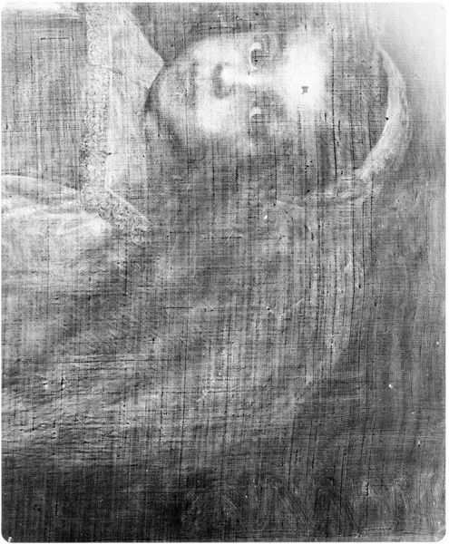
painting
#
portrait
#
painting
#
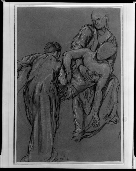
charcoal drawing
#
monochrome colours
#
portrait reference
#
group-portraits
#
black and white
#
expressionism
#
portrait drawing
#
charcoal
#
monochrome
Dimensions: 74 cm (height) x 89.5 cm (width) (Netto)
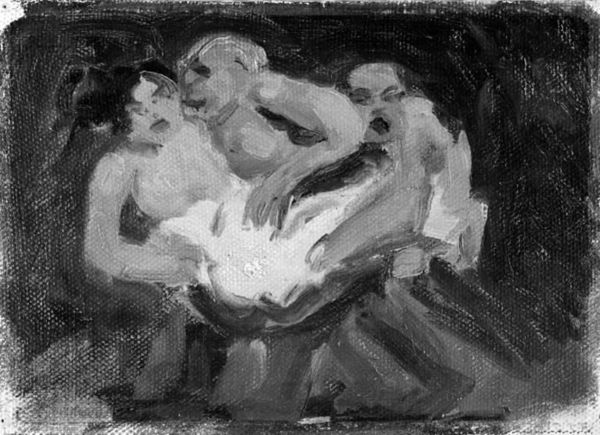
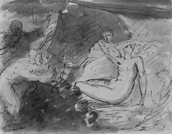
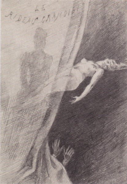
Editor: This stark, monochrome painting is "Pieta" by Nils Nilsson, created sometime between 1916 and 1939. It’s quite striking, almost brutally expressive. What do you see in this piece? Curator: Immediately, the title "Pieta," paired with this stark imagery, brings to mind centuries of artistic tradition. The composition echoes the classic Deposition scene, where Mary cradles the body of Christ. But Nilsson strips it bare, doesn't he? The figures become archetypes of grief, rendered in shades of raw emotion rather than religious iconography. What does the reduction to monochrome do, in your view? Editor: I think it amplifies the emotional intensity. Without colour, there's nowhere to hide; only form and feeling remain. It feels universal, rather than specific to one religion or culture. Curator: Precisely. This universality is crucial. By eschewing overt religious symbols, Nilsson taps into a more primal well of human experience – loss, mourning, the enduring power of human connection even in the face of death. The angularity also adds a level of disorientation, no? What underlying emotions do you perceive beyond the literal representation of grief? Editor: Maybe despair and futility. The way the figures are hunched and seemingly defeated. The person lying down is brightly illuminated, while the other two huddle in the dark, a sharp visual contrast suggesting life extinguished versus the survivors in shadow. Curator: Yes, exactly. But isn't there also something resilient here? Even in their despair, they're still embracing. The continuity, in human embrace... That echoes across millennia. Look at ancient Mesopotamian mourning sculptures or even prehistoric burial rituals – the form changes, but the human response to death remains powerfully, recognisably, similar. I wonder how intentional that visual continuity was on Nilsson's part. Editor: It’s amazing to see how he’s used these familiar visual cues to create something both timeless and intensely personal. The raw emotion really gets you. Curator: Absolutely. This image reveals, doesn't it, how symbols evolve and endure, carrying emotional weight across generations and cultures, speaking to fundamental aspects of the human condition.
Comments
No comments
Be the first to comment and join the conversation on the ultimate creative platform.
More like this