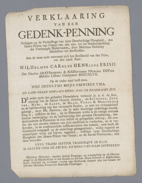
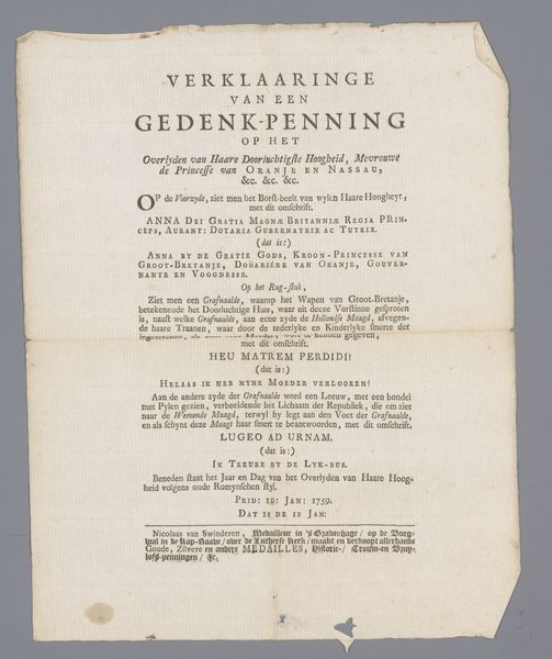
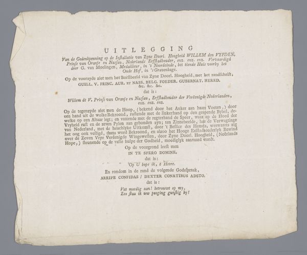
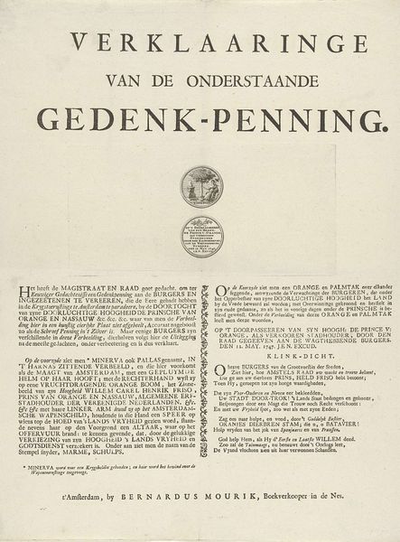
Verklaring van de penning door Nikolaas van Swinderen geslagen op het overlijden van Willem IV, prins van Oranje-Nassau 1751
0:00
0:00
anonymous
Rijksmuseum
print, textile, paper, typography
#
baroque
#
dutch-golden-age
# print
#
hand drawn type
#
textile
#
paper
#
typography
#
classical type
Dimensions: height 26.8 cm, width 20.4 cm
Copyright: Rijks Museum: Open Domain
Curator: Here we have a piece titled "Verklaring van de penning door Nikolaas van Swinderen geslagen op het overlijden van Willem IV, prins van Oranje-Nassau," dating back to 1751. It's a printed explanation of a commemorative medal created by Nikolaas van Swinderen after William IV's death, currently held in the Rijksmuseum collection. Editor: My first impression? Somber. It has this overwhelmingly melancholic and formal tone, almost like an official decree announcing sadness. You can almost feel the weight of the moment it captures. Curator: Exactly. What’s intriguing here is the typography. You see elements that harken back to baroque flourishes—it’s undeniably ornate. It utilizes a combination of fonts and sizes to create a hierarchy, drawing your eye to certain phrases while setting a reverential tone throughout. The overall structure serves as an emotional amplifier. Editor: It is visually complex. It seems crammed—almost suffocating—though maybe that density mirrors the era's artistic tastes. There's definitely a lot of classical typography on display, a clear attempt to convey solemnity and respect for the deceased. And there are some elements of textile influence? It’s an unexpected combination with a pretty specific goal. Curator: Indeed. You'll note that the text explains the symbolism of the medal itself: The Dutch Maiden weeping on a hill, a setting sun. The language even alludes to hope rising from sorrow. The work reflects a moment of public mourning, aiming to console the Dutch people through imagery and carefully chosen words. Editor: So it uses its design to perform and amplify cultural narratives... it's not merely about the aesthetic; it's deeply interwoven with the society's emotions, fears, and aspirations during a significant political transition. It's a textual and typographical dance reflecting the echoes of loss, designed to leave a lasting impression on the Dutch population. Curator: Precisely. Through thoughtful composition and purposeful symbolism, this commemorative print preserves both a moment of grief and an ambition for national resilience. Editor: Thinking about all this... I can definitely feel it more deeply than at first glance. There’s an inherent value to recognizing those nuanced signals within such a concentrated and emotionally deliberate composition.
Comments
No comments
Be the first to comment and join the conversation on the ultimate creative platform.
More like this