print, engraving
#
aged paper
#
homemade paper
#
paper non-digital material
#
ink paper printed
# print
#
sketch book
#
landscape
#
river
#
paper texture
#
personal sketchbook
#
romanticism
#
folded paper
#
cityscape
#
paper medium
#
sketchbook art
#
engraving
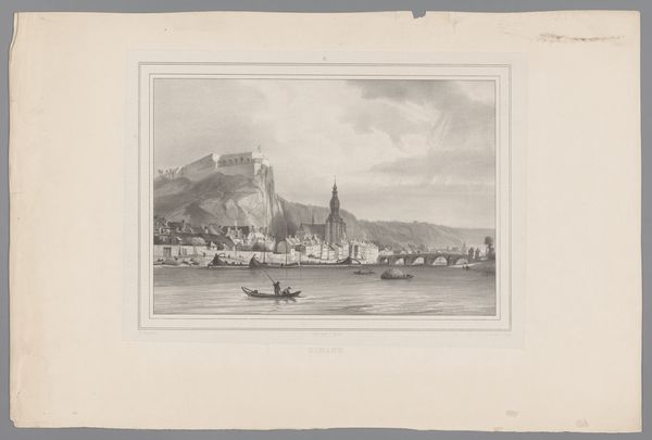
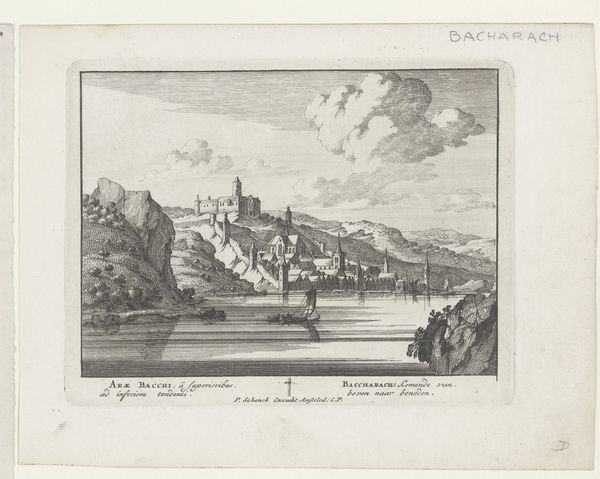
Dimensions: height 202 mm, width 242 mm
Copyright: Rijks Museum: Open Domain
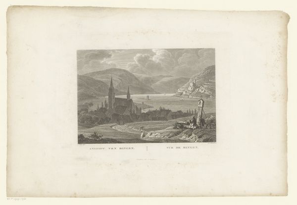
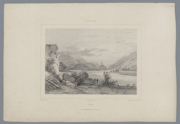
Curator: Here we have Carl Mayer’s "Gezicht op Bacharach," dating from sometime between 1822 and 1868. It’s a delicate engraving, currently residing here at the Rijksmuseum. Editor: My initial impression is one of serenity, almost melancholy. The composition leads my eye gently across the water, resting on the town. The values—primarily grays—reinforce this feeling. Curator: Precisely! Mayer uses the contrast between the light river and darker foreground to establish depth and a rather clear spatial logic. Note how he breaks up the overall cityscape with the prominent church spire. It lends the composition vertical dynamism, offsetting the horizontal stretch of the river. Editor: The spire does indeed act as a visual anchor. Churches are so often potent symbols. Their spires reaching towards the heavens, a physical manifestation of faith, acting as a bridge between earthly existence and the divine. The inclusion of such a prominent, idealized structure underscores a deeper sense of order and morality in the town, even though there are just regular rooftops as well. Curator: An astute observation. He manipulates light and shadow to enhance certain architectural details, highlighting, for example, the complex geometry of the buildings, to reinforce that exact sense of structural clarity you pinpointed. Semiotically, this is powerful! Editor: I wonder about the personal element too. We’re viewing it in what seems to be someone's old sketchbook—it appears so aged. Perhaps this location had some resonance, perhaps an experience lived here. The folds of the paper even feel symbolic. Each one represents a story, a time, memory impressed into its form. It feels very intimate. Curator: Intimacy created, of course, through the manipulation of artistic elements such as value and form. One shouldn't overlook the meticulous linework which defines the spatial recession from detailed foreground elements. And the balance in symmetry gives a kind of idealized view. Editor: Yes, but the ideal feels more emotionally charged given the medium: the aged paper itself seems to breathe a kind of truth, a weathered permanence that elevates the symbolic weight, reminding me of humanity’s timeless connection to places like this. Curator: I appreciate your reading; and I must say, considering how the materiality interacts with composition, it has broadened my reading. Editor: And, I yours. It's easy to let emotions sway our perception, when true appreciation demands the more clinical eye to discern precisely why this is!
Comments
No comments
Be the first to comment and join the conversation on the ultimate creative platform.
More like this