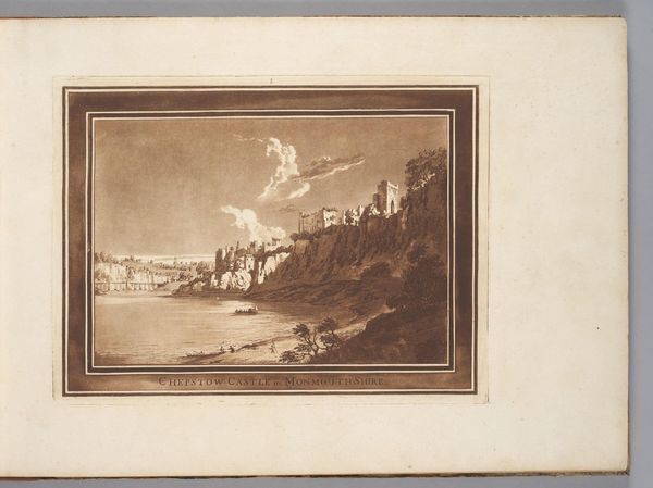
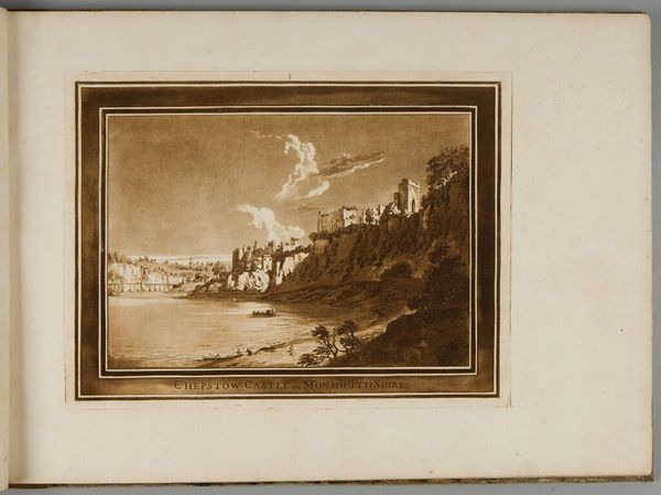
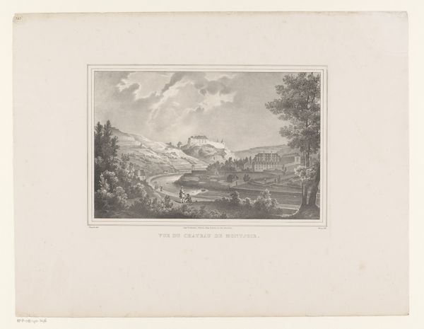
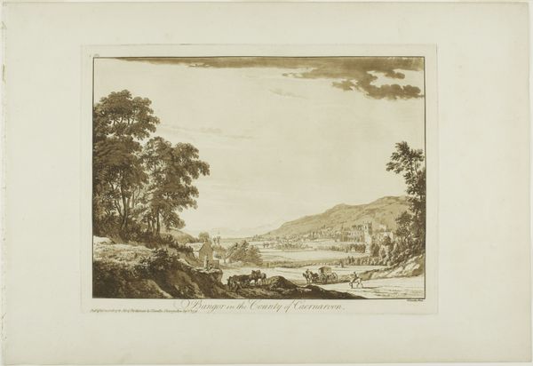
Chepstow Castle in Monmouth Shire, from Twelve Views in Aquatinta from Drawings taken on the Spot in South Wales 1773 - 1775
0:00
0:00
Dimensions: 178 × 255 mm (image); 238 × 314 mm (plate); 357 × 527 mm (sheet)
Copyright: Public Domain
Curator: This is "Chepstow Castle in Monmouth Shire, from Twelve Views in Aquatinta from Drawings taken on the Spot in South Wales" created by Paul Sandby between 1773 and 1775. It’s a print, employing aquatint on paper, housed right here at the Art Institute of Chicago. Editor: It’s striking how still and peaceful the scene feels. The monochromatic aquatint lends a sort of aged quality, a softness. There’s a beautiful balance between the horizontal expanse of the river and the verticality of the castle ruins perched on the cliff. Curator: Indeed. Sandby was instrumental in popularizing the aquatint technique in England. What’s fascinating here is how aquatint allowed him to mimic the tonal range and subtle gradations of watercolor, which was also a popular medium for landscape depiction at the time. Consider, too, the rising interest in picturesque aesthetics—these ruins embody that perfectly, framed for consumption and trade. Editor: The texture created through aquatint really draws my eye. You can see the granular details mimicking natural surfaces – the stone, the foliage. The way he handles light too, casting the castle in silhouette, emphasizes the geometrical forms within the ruin itself. It has such presence on that cliff face. Curator: Absolutely, but don't forget Sandby's process. He made preparatory drawings on site. It was through workshops, studios, and collaborations with printers that such images made their way into albums, displayed in country houses and the emerging print market. Editor: So you’re emphasizing this artwork's accessibility, a widely consumable version of British landscapes. Interesting! Thinking again about form, note how Sandby carefully constructs a classical composition using line and shade to guide the eye from the foreground boats toward the distant bridge. The tonal gradations emphasize space and atmosphere while drawing on neo-classical values, balanced but never contrived. Curator: And that blend of emerging Romanticism in the face of the industrial revolution alongside established Neoclassical tastes certainly reflects an era in transition. Think, for example, about who had the time, space, and financial means to collect albums featuring British landscapes! Editor: A nice point. Well, I’ve really been drawn in by the play of light and shadow. It creates depth and lends an air of melancholy to the subject—the wistful sense of something slowly eroding over time. Curator: Indeed. Focusing on materials and techniques gives new insights into its significance, far more than a superficial glimpse might reveal!
Comments
No comments
Be the first to comment and join the conversation on the ultimate creative platform.
More like this