About this artwork
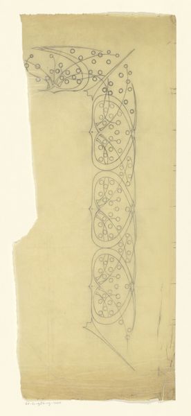
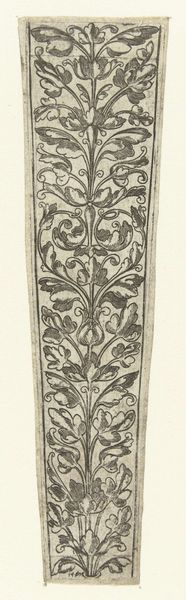
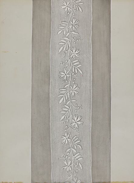
Curator: Right now we're standing in front of "Ornament met bloemen", a textile design rendered around 1910 by Bernard Willem Wierink, held here at the Rijksmuseum. Editor: Well, it certainly strikes me as restrained, doesn’t it? A kind of… melancholy elegance? It feels quite formal in its structure. Curator: It's fascinating how Wierink uses such a limited palette to evoke the natural world. Those simplified floral motifs, combined with geometric shapes, create a rhythmic pattern. It almost feels like a stylized trellis. Editor: Yes, that strict, vertical emphasis definitely lends a formal air, almost like the architectural plans for a highly cultivated, controlled garden. The use of negative space is quite striking as well; the creamy background almost breathes. Curator: Exactly! And consider the cultural context. Early 20th century, Art Nouveau… a yearning for nature amidst rapid industrialization. This design suggests a desire to tame, perhaps even codify nature’s beauty. Notice, for example, the symmetrical arrangements. That speaks of order, balance. Editor: And, in that codification, you lose the wildness. I'm reminded of ancient Greek key patterns. These geometric meanders spoke of rivers, boundaries, infinity... Wierink seems to use his floral motifs to mark a kind of contained border. Perhaps a gentle boundary between domestic life and the wild outdoors? Curator: That's a lovely observation! And, the repetition. A core feature in Pattern and Decoration movement! It’s a soothing visual rhythm that provides an echo of the never ending abundance that is always associated with natural ornamentation. Editor: Absolutely. The simplicity almost acts like a visual mantra. But I wonder, could that simplicity also be a limitation? Does that limited palette reflect perhaps a restriction or a certain period restraint rather than pure artistic choice? Curator: A question for us to continue to ask. Overall, I experience it like an exquisite balancing act: art and geometry, wildness and refinement, restriction and abundance. Editor: Beautifully put! An object lesson on finding that delicate middle way between the call of nature and structure of everyday living.
Artwork details
- Medium
- print, paper, woodcut
- Dimensions
- height 270 mm, width 60 mm
- Location
- Rijksmuseum
- Copyright
- Rijks Museum: Open Domain
Tags
Comments
Share your thoughts
About this artwork
Curator: Right now we're standing in front of "Ornament met bloemen", a textile design rendered around 1910 by Bernard Willem Wierink, held here at the Rijksmuseum. Editor: Well, it certainly strikes me as restrained, doesn’t it? A kind of… melancholy elegance? It feels quite formal in its structure. Curator: It's fascinating how Wierink uses such a limited palette to evoke the natural world. Those simplified floral motifs, combined with geometric shapes, create a rhythmic pattern. It almost feels like a stylized trellis. Editor: Yes, that strict, vertical emphasis definitely lends a formal air, almost like the architectural plans for a highly cultivated, controlled garden. The use of negative space is quite striking as well; the creamy background almost breathes. Curator: Exactly! And consider the cultural context. Early 20th century, Art Nouveau… a yearning for nature amidst rapid industrialization. This design suggests a desire to tame, perhaps even codify nature’s beauty. Notice, for example, the symmetrical arrangements. That speaks of order, balance. Editor: And, in that codification, you lose the wildness. I'm reminded of ancient Greek key patterns. These geometric meanders spoke of rivers, boundaries, infinity... Wierink seems to use his floral motifs to mark a kind of contained border. Perhaps a gentle boundary between domestic life and the wild outdoors? Curator: That's a lovely observation! And, the repetition. A core feature in Pattern and Decoration movement! It’s a soothing visual rhythm that provides an echo of the never ending abundance that is always associated with natural ornamentation. Editor: Absolutely. The simplicity almost acts like a visual mantra. But I wonder, could that simplicity also be a limitation? Does that limited palette reflect perhaps a restriction or a certain period restraint rather than pure artistic choice? Curator: A question for us to continue to ask. Overall, I experience it like an exquisite balancing act: art and geometry, wildness and refinement, restriction and abundance. Editor: Beautifully put! An object lesson on finding that delicate middle way between the call of nature and structure of everyday living.
Comments
Share your thoughts