graphic-art, print, paper, typography
#
graphic-art
#
still-life-photography
# print
#
paper
#
typography
#
history-painting
#
modernism
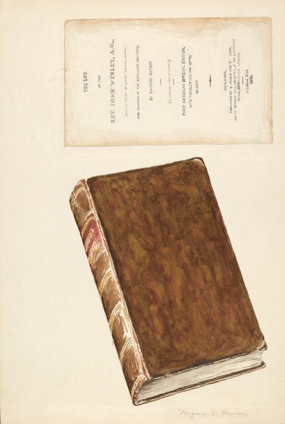
Dimensions: height 242 mm, width 294 mm
Copyright: Rijks Museum: Open Domain
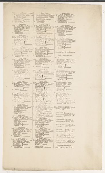
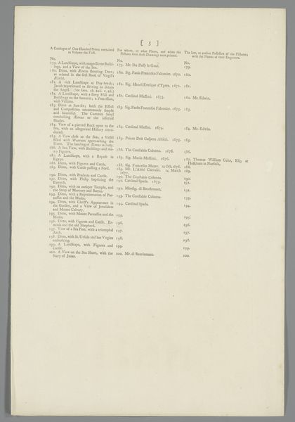
Editor: Here we have "Moeder en kind in klederdracht uit het koninkrijk Napels," or "Mother and Child in Traditional Dress from the Kingdom of Naples," dating back to 1830. It appears to be a print on paper. What strikes me immediately is the texture of the paper itself; it feels aged and fragile. As an art historian, what aspects draw your attention most? Curator: Indeed, the materiality is quite evocative. More specifically, this appears to be a printed catalogue page. Observe the rigid structure imposed by the columns of text. Each block, defined by typography, presents distinct information – perhaps titles and prices? Note how these discrete units, contained within the frame, contribute to the overall composition. This emphasis on structure reflects modernism through rigid organization to flatten out traditional pictorial space. Editor: So, you're seeing the structure and its flatness before any representational element. Do you find it significant that these descriptions may be tied to corresponding works? Curator: Precisely. Consider the interplay between text and image, or in this case, potential imagery. Each textual block functions almost as an abstract shape, creating a visual rhythm across the page. How the forms and placement of typography on a flat support result in its effectiveness and overall communication of form and function is the key focus. Editor: It’s interesting to consider the piece as shapes creating a rhythm and not necessarily its value as documentation of a sale, which brings me back to this discussion of semiotics we recently had. How can we be sure the structural elements intended were this important at the time this catalogue page was printed? Curator: This piece demonstrates an essential modernist perspective, where form precedes function and where the focus lies on a detailed analysis of intrinsic visual elements such as a printed typography rather than external elements. Considering semiotics in relation to these compositional devices and how they make meaning, might shed light on both intentionality and broader impact this piece presents. Editor: This approach really reframes how I view not just this work but printed works generally. Thanks for that shift in perspective. Curator: My pleasure, viewing art from various approaches expands its interpretation.
Comments
No comments
Be the first to comment and join the conversation on the ultimate creative platform.
More like this