#
op-art
# print
#
op art
#
pop art
#
geometric
#
abstraction
Copyright: National Gallery of Art: CC0 1.0
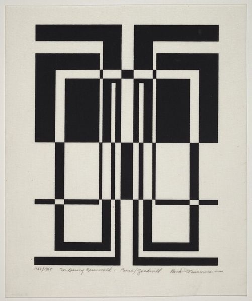
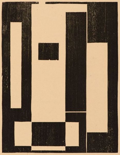
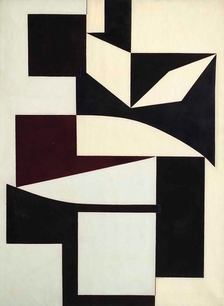
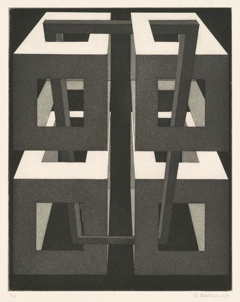
Editor: Here we have Burton Wasserman’s “Untitled” print, created between 1971 and 1972. The stark black and white geometric shapes are eye-catching and somehow soothing, despite the sharp angles. What strikes you about the work? Curator: Formally, the power resides in the interplay between positive and negative space. Wasserman's strategic arrangement of geometric shapes--primarily triangles and parallelograms--yields a compelling optical push and pull. Note the dynamism achieved through the stark contrast in value and the figure-ground relationship: do you perceive a stable form or a field of fluctuating shapes? Editor: I can't quite decide. I keep shifting between seeing it as a solid object and a collection of shapes. How does this relate to op art? Curator: The Op Art movement thrived on visual illusions, disrupting the viewer's perception through calculated manipulation of line, color, and form. This work relies on fundamental geometric forms that create a subtle vibrational effect without using color at all. Observe how your eye is led around the composition by the repetition and variation of the shapes. Editor: It’s interesting that it still feels so modern despite being made over 50 years ago. I didn't initially appreciate how much the limited palette emphasizes the shapes themselves. Curator: Exactly. By reducing the color palette to its most fundamental elements, the viewer is forced to focus solely on form and its internal relationships, activating a dialogue between geometric purity and perceptual instability. What has this analysis taught you? Editor: I see now that this artwork has less to do with a representational subject and more with pure visual sensations achieved through manipulating form. Thanks!
Comments
No comments
Be the first to comment and join the conversation on the ultimate creative platform.
More like this