#
pop art-esque
#
popart
#
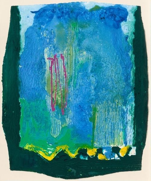
green and blue tone
#
egg art
#
physical art
#
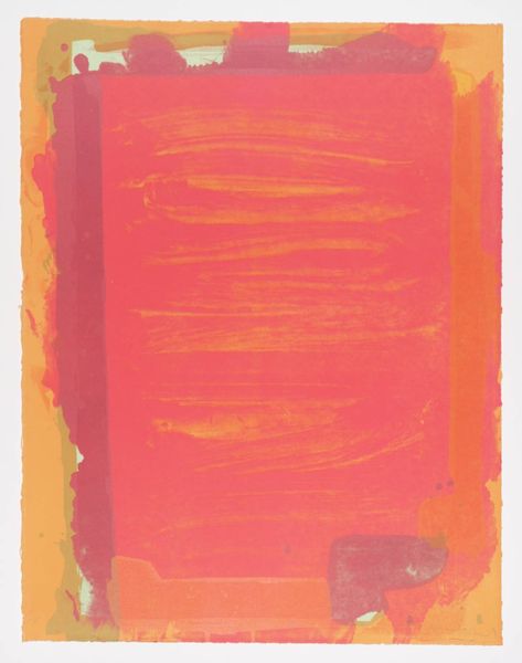
pop art
#
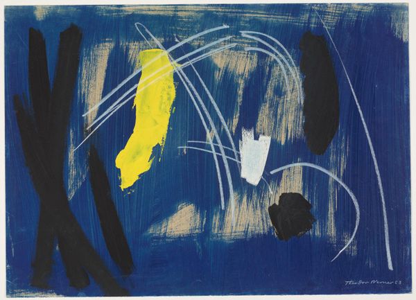
teenage art
#
aquatic colours
#
spray can art
#
pop art-influence
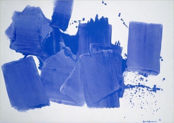
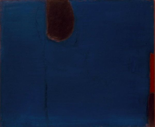
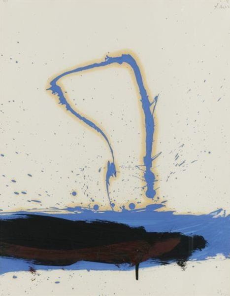
Dimensions: 177 x 147 cm
Copyright: Helen Frankenthaler,Fair Use
Curator: Standing before us is Helen Frankenthaler's "Freefall," created in 1992. What strikes you first about it? Editor: It's overwhelmingly blue. The texture gives the sense of great depth, almost as though we're looking into water or perhaps even... outer space. There is an undeniably pensive quality that gives the feeling of introspection. Curator: Absolutely, Frankenthaler, emerging from Abstract Expressionism, constantly navigated the boundaries of painting. In "Freefall," we see how her signature soak-stain technique, influenced by Jackson Pollock and Clement Greenberg, pushes against formalism to embrace the unexpected. Consider the social and artistic pressures of that era. Pop Art’s grip was inescapable, wasn't it? Editor: Indeed. The silkscreen method emphasizes this intersection between process and popular appeal. It's as if she is wrestling with Abstract Expressionism’s claim for the supremacy of pure expression while the cultural tide carries us elsewhere. I also notice that these techniques echo through movements connected with teen culture. Do you feel that link? Curator: That's insightful. I'd add that beyond the medium, Frankenthaler always had a masterful control over the emotional landscape that informs "Freefall.” These choices, of this particular blue, these specific gestural lines, position the artwork within ongoing dialogues concerning both gender and power, her navigation through the artworld ecosystem is just as interesting as the work itself. The use of that blue specifically feels evocative and even defiant. Editor: Precisely. And notice how that limited palette contributes to its overall feeling. There's that black mass below that draws you in, as the streaks of green break through, offering these slight visual disruptions in the blue canvas. Its almost lyrical! It speaks volumes. The title itself – “Freefall” – has multiple possible meanings; her titles often contain that kind of rich ambiguity, open to a number of interpretive contexts. Curator: Her mark-making invites us to meditate on our experiences and contemplate how personal stories interface with art history. Editor: Looking at the work, the "aquatic colours" and the very form bring forth sensations akin to that of losing your sense of balance. Ultimately, it’s a sensation I will hold on to! Curator: Likewise! "Freefall" reminds me that history isn't fixed— it is constantly being re-interpreted by new generations.
Comments
No comments
Be the first to comment and join the conversation on the ultimate creative platform.
More like this