Dimensions: overall: 56 x 71.5 cm (22 1/16 x 28 1/8 in.)
Copyright: National Gallery of Art: CC0 1.0
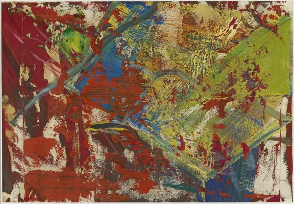
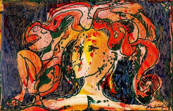
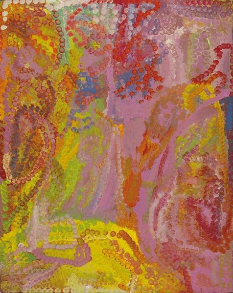
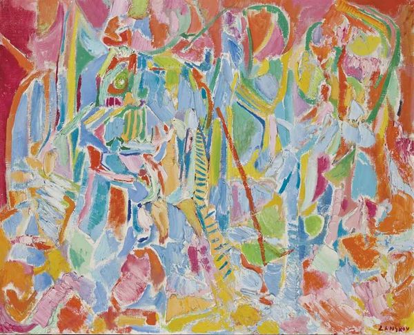
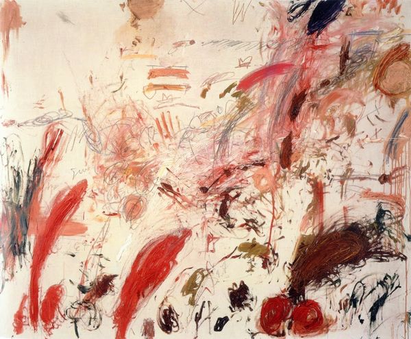
Editor: This is George McNeil’s “Manathe” from 1981, created using mixed media as a print. It strikes me as a powerful piece with its bold colors. What elements of the formal composition do you find most compelling? Curator: I find the interplay of chromatic intensities and textural densities to be its most arresting feature. Consider how the saturation of the reds dominates the visual field, only to be interrupted by strategic applications of yellow and green. Does this controlled chaos resolve, perhaps, into some greater compositional harmony? Editor: I can see the tensions you mention, especially with how the colors overlap. Do you see any implied forms or shapes within these layered gestures? Curator: The tension arises precisely because there is a flirtation with figuration - fragmented, elusive, and always on the verge of dissolving back into pure abstraction. Examine how McNeil utilizes the grid structure. Editor: The grid is a good point; I hadn’t noticed the implicit geometry beneath all those frantic marks. That grid suggests order struggling against chaos, right? Curator: Precisely. This creates a push-and-pull that invigorates the picture plane. How does this internal dialogue impact the viewing experience for you? Editor: I think I initially missed the subtlety by being overwhelmed with color, but I'm coming to understand its underlying structure and dynamic relationships. Thank you for elucidating how McNeil integrates both harmony and discordance in his abstraction. Curator: It is by embracing the dualities within art, that we achieve the greatest interpretive sophistication. I will ponder "Manathe" even further after our discussion.
Comments
No comments
Be the first to comment and join the conversation on the ultimate creative platform.