Curatorial notes
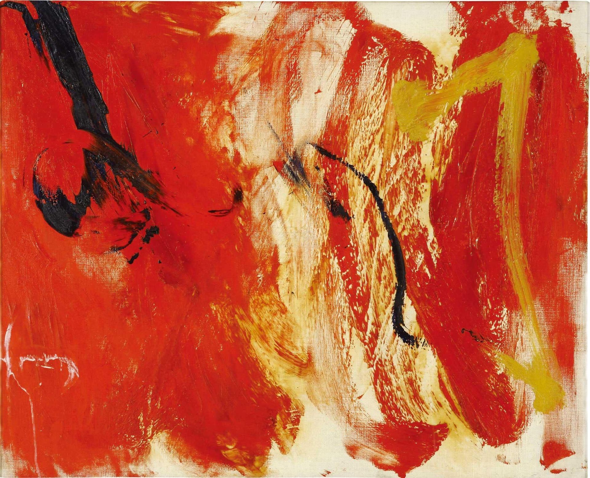
Editor: Here we have an "Untitled" mixed-media piece from 1960 by Jiro Yoshihara. The strong reds give it an immediate, visceral feel; almost like looking at raw emotion. How do you interpret the energy conveyed through the color and form? Curator: Indeed. Note the artist's application of paint. Observe the textural variations achieved through layering of broad strokes. Consider the interplay between the aggressive slashes of crimson and umber. How might one consider the black calligraphic forms here against the ground? Editor: They seem almost violent, cutting across the warmth of the other colors. Are they intended to disrupt the harmony, or create tension? Curator: An astute observation. Disrupt is too strong a word here, I would posit that it's less an issue of harmony, but rather rhythm. Tension is productive. Do the gestural marks compete with the color field or complement? How does that formal tension enhance or diminish the artwork? Editor: I see what you mean. It's less about what they represent, and more about how they interact visually and structurally, like a dynamic arrangement of forms and color, creating a kind of visual push and pull. Curator: Precisely. We can thus begin to move past facile readings and towards deeper considerations of composition and its internal logic. Yoshihara presents the essence of the material here; its ability to elicit feeling through structure alone. Editor: That focus on the material really shifts my perspective. I'm no longer searching for a hidden meaning but appreciating the visual dialogue on the canvas itself. Thank you. Curator: An excellent way to think about approaching the canvas!