drawing, watercolor
#
drawing
#
neoclacissism
#
watercolor
#
line
#
cityscape
#
history-painting
#
academic-art
Dimensions: height 245 mm, width 195 mm
Copyright: Rijks Museum: Open Domain
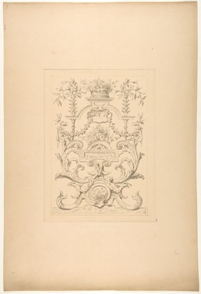
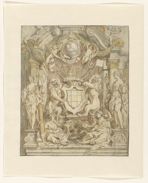
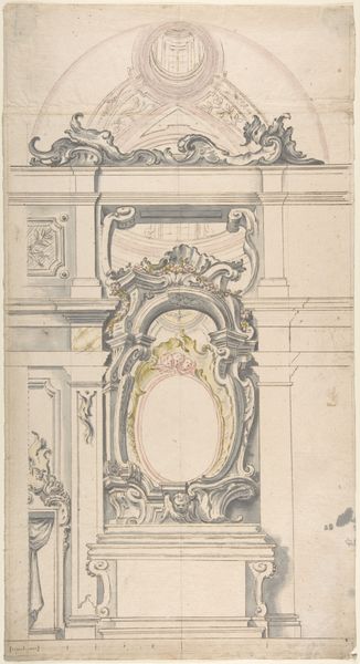
Curator: This watercolor and ink drawing, made around 1816 by an anonymous artist, is titled "Ereboog voor de Beurs," meaning "Arch of Honor for the Stock Exchange." It resides in the Rijksmuseum collection. Editor: The lightness of the washes gives it an almost ethereal quality, though that stern neoclassical architecture hints at a much heavier, socio-political undertone. It reminds me of architectural renderings you see before a construction project, or perhaps of stage design. Curator: Notice the materials: watercolor and line drawing used here denote a pre-industrial artistic process; consider how the piece might function within the Dutch Golden Age mercantile context. The choice of medium is interesting, almost as if designed to not overawe the commercial process that this stock exchange facilitates. Editor: Precisely. And then observe the prominent heraldic symbols. A sword, wings and a crown dominate the central composition, speaking volumes about power and ambition. How do those motifs play into the understanding of that era's Dutch identity? The cornucopia—that represents abundance, no doubt—placed alongside nautical elements and civic coats of arms also contribute to this complex iconography. Curator: We shouldn't overlook how the medium of drawing creates both immediacy, by virtue of its connection to the hand of the maker and reproducibility if required to inform architectural or craft design during its own time. How might this design serve to naturalize the authority implied by these historical motifs, like those wings or that sword, throughout the modern economy in practice? Editor: Indeed! Each carefully chosen symbol speaks volumes about wealth, power, and societal ambition. The entire tableau reflects aspirations woven into the fabric of the building itself, as though attempting to permanently infuse it with that meaning. The sun, for example, suggests new beginnings but equally evokes a divine, timeless aspect. This blending seems deliberate, an assertion about values to which we must pay attention. Curator: And to whom? Considering our artist's decision to embed civic identity so thoroughly within a commercial structure using an easily duplicated, though relatively "unrefined" medium of expression invites viewers to ponder where value and identity actually arise, from the state-sponsored icon or in common labor of commerce. Editor: A valuable reminder that behind stone, and commerce, there is always something much, much more!
Comments
No comments
Be the first to comment and join the conversation on the ultimate creative platform.
More like this