mixed-media, paper, ink, pen
#
mixed-media
#
hand-lettering
#
hand drawn type
#
hand lettering
#
paper
#
personal sketchbook
#
ink
#
pen work
#
pen
#
calligraphy
Copyright: Rijks Museum: Open Domain
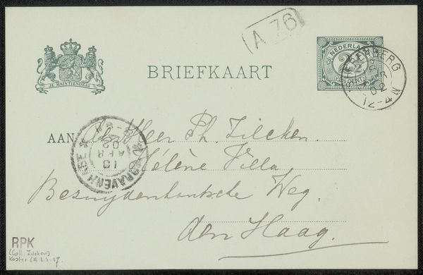
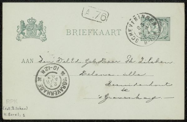
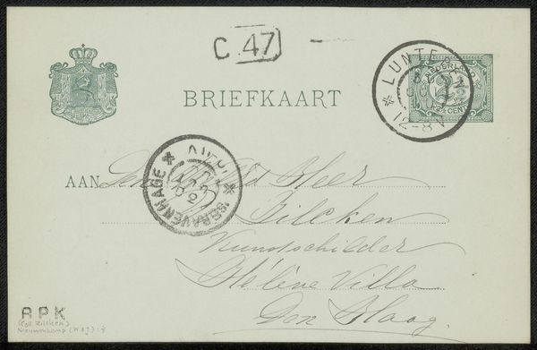
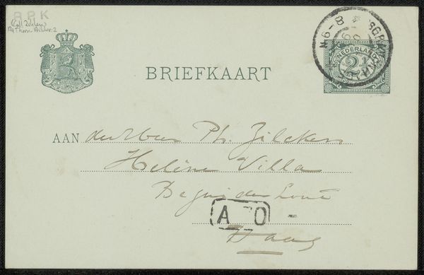
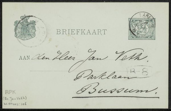
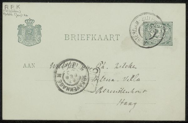
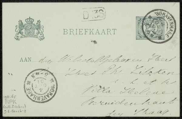
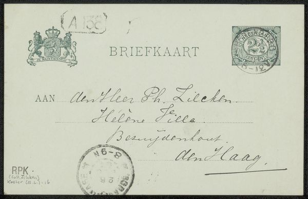
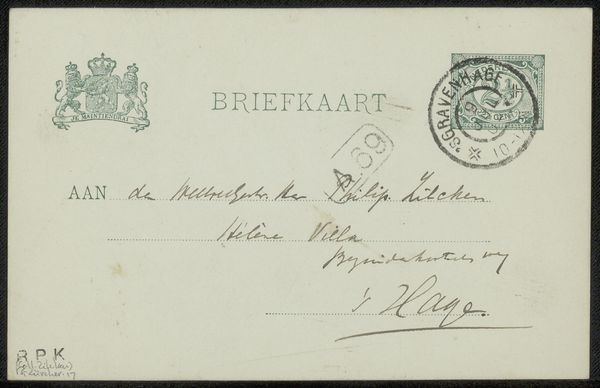
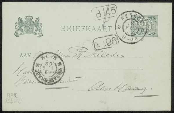
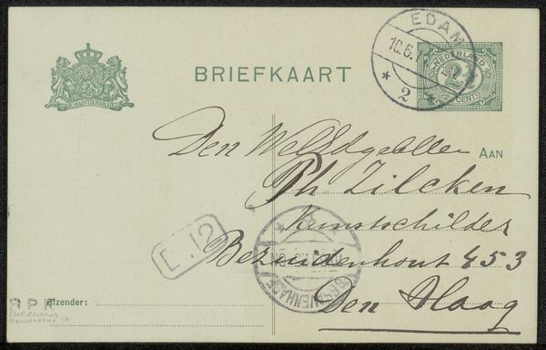
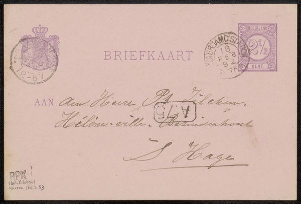
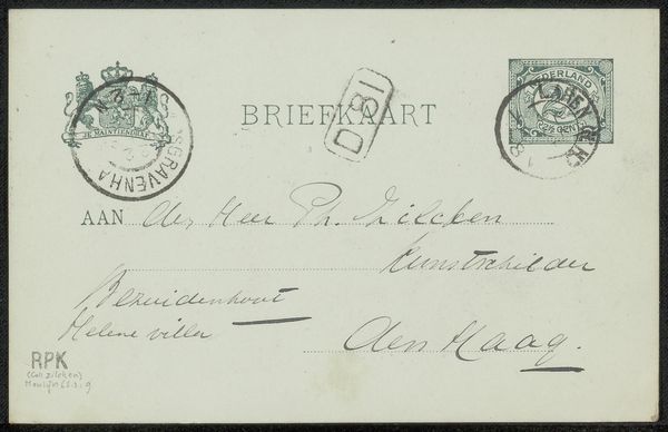
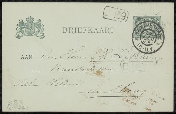
This "Briefkaart aan Philip Zicken" by Aletta Ruijsch is really just a vintage postcard, but for me it's also a kind of found drawing. The restrained palette of faded greens and blacks lets the cursive handwriting and the stamps take center stage, like characters in a play. I love how the ink bleeds a little, softening the edges of the letters. Look closely at how the looping flourishes extend, almost like the tendrils of a plant, each with its own unique rhythm and pressure. And it strikes me that this wasn’t meant to be art, yet it’s utterly beautiful. The layering of the postal markings over the address has a chaotic energy which reminds me of Cy Twombly’s mark-making. To think of this transient object, something so incidental, now framed and preserved – it asks what we value, and how we see. Maybe art is just whatever we choose to look at long enough.
Comments
No comments
Be the first to comment and join the conversation on the ultimate creative platform.
More like this