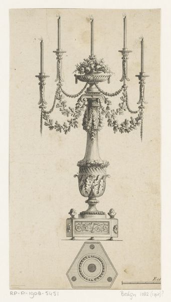
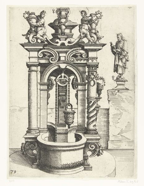
drawing, print, engraving, architecture
drawing
baroque
form
geometric
line
engraving
architecture
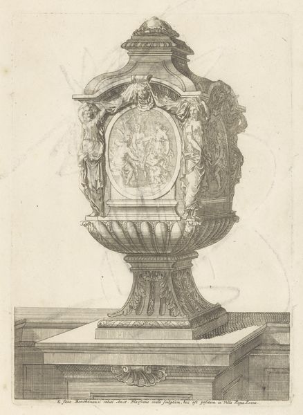
Dimensions: height 332 mm, width 235 mm
Copyright: Rijks Museum: Open Domain
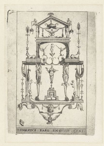
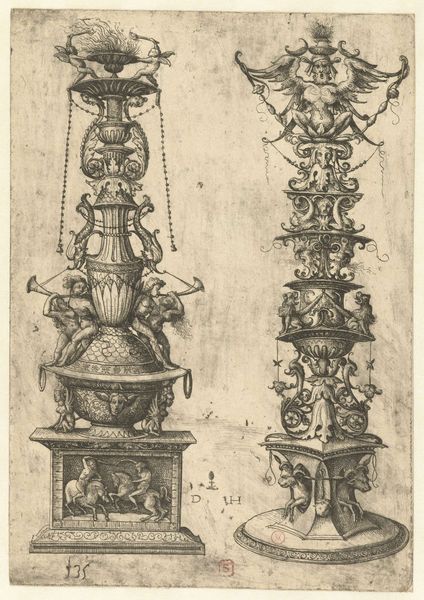
Curator: This is a drawing titled "Doopvont", which translates to "Baptismal Font". The print, an engraving on paper, was created anonymously sometime between 1575 and 1629. It resides here at the Rijksmuseum. Editor: Wow, there's something so incredibly precise and ornamental about this, right? It almost feels cold and calculated, like a blueprint from an alien civilization obsessed with elaborate geometry. But in a good way! Curator: The precision aligns with the Baroque style flourishing at the time. The period heavily emphasized grandeur and ornate detail in religious objects as a symbol of power. The historical context also suggests considering the Counter-Reformation. Baptism gained significance in distinguishing Catholics from emerging Protestant faiths. So, in essence, such ornate design served religious and socio-political functions. Editor: Right! A statement piece, basically. Looking at this intricate network of lines and the somewhat stern cherubs holding up the basin, I can't help but think about control. Both spiritual and societal, you know? Curator: Precisely. The cherubs, while seemingly innocent, represent a religious authority carefully overseeing the sacred act. The geometry also enforces an order and regulation of space and ritual, reminding those being baptized, or observing, of religious control during an age defined by reformations and inquisitions. Editor: See, this piece makes me think of being caught between tradition and transformation. The weight of ritual and those gorgeous details! This feels timeless, yet undeniably rooted in its specific cultural moment. So what does this mean for baptism in contemporary culture? How does the socio-political impact the experience of ritual today? It’s complicated…but incredibly engaging, even centuries later! Curator: Exactly, and that’s the key takeaway here, it is more than an attractive baptismal font from the late 16th and early 17th centuries. It presents social complexities that linger today. Editor: I guess you could say that we ended up diving deep.
Comments
No comments
Be the first to comment and join the conversation on the ultimate creative platform.