1693
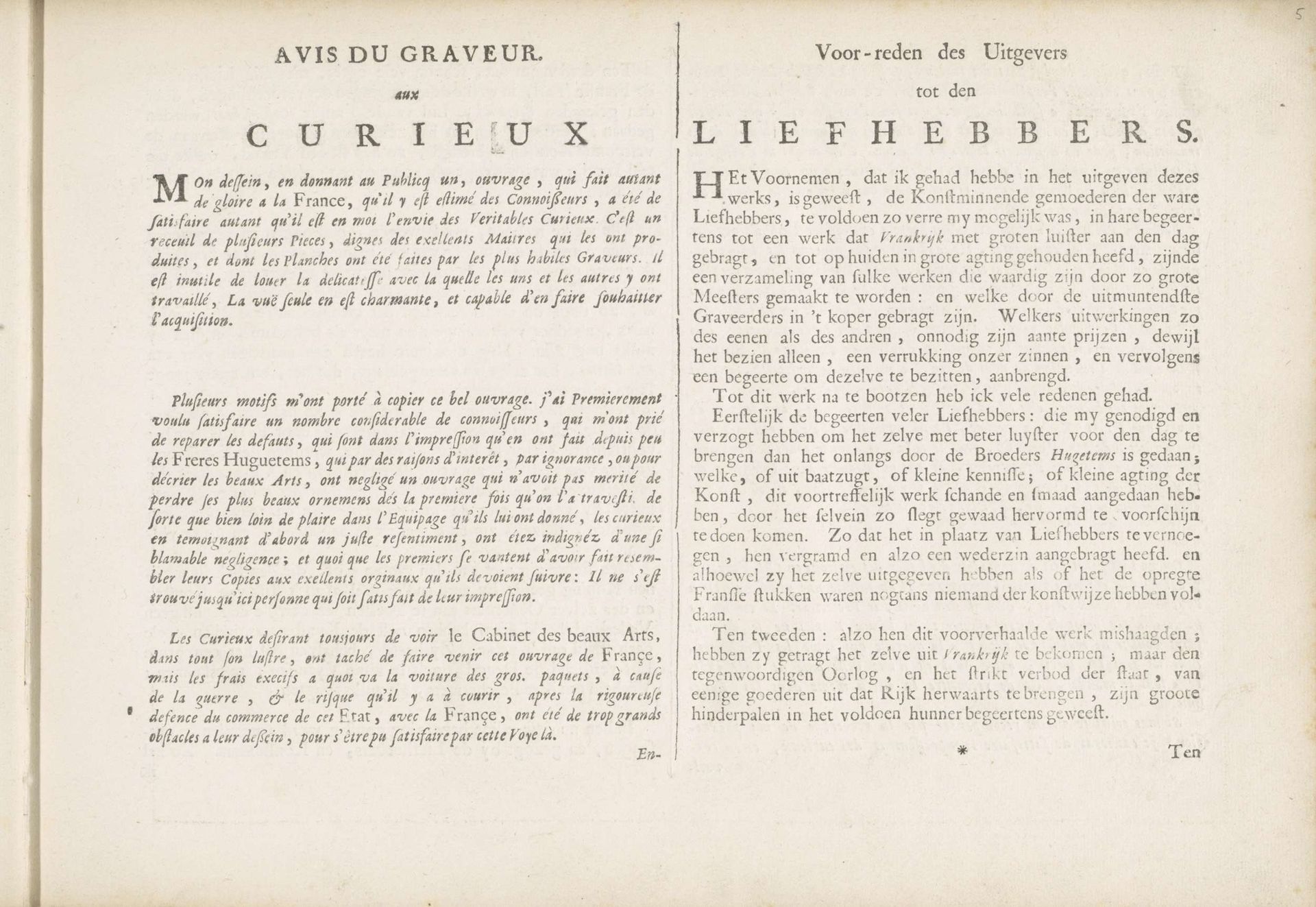
Avis du Graveur aux Curieux / Voor-reden des Uitgevers tot den Liefhebbers
Pieter Schenk
1660 - 1711Location
RijksmuseumListen to curator's interpretation
Curatorial notes
Curator: Here we have “Avis du Graveur aux Curieux / Voor-reden des Uitgevers tot den Liefhebbers,” a printed work by Pieter Schenk, created in 1693. It's part of the Rijksmuseum collection. Editor: My first thought? It’s… busy. Dense blocks of text, very little white space. It feels quite serious and formal, but visually a bit overwhelming at first glance. Curator: Yes, the visual density is certainly a defining characteristic. Notice how the artist uses typography almost as a visual element in itself. The weight and arrangement of the text create a clear division on the page. The print medium itself communicates the information, like a poster—both instructional and artful. Editor: I'm immediately drawn to the dual languages here – French and what I believe is Dutch. It’s telling me this was created for a specific, bilingual audience, likely in a region where both languages were common. Beyond just words, what symbols or established artistic traditions informed its design, giving the announcements cultural weight? Curator: It’s important to remember this isn’t just any text; it's the publisher and engraver's notice. Schenk uses this print to address collectors and art enthusiasts, detailing why his version is superior and worthy of acquisition. It seems he intended this piece to carry quite some authority. Editor: The symbolism there seems overt—it suggests ideas of accessibility, of democratizing taste perhaps, but also reinforces the art market’s pre-established hierarchy. In an age where visual communication was rarer and more specialized, this work acts as more than a mere announcement. What underlying messages might the “curieux” have picked up on regarding taste, status, and cultural identity? Curator: Indeed. From a formal standpoint, look at how carefully the lines are spaced, and the font choices themselves give visual texture. Schenk directs our attention, leading the eye systematically through his arguments. The very materiality of the print underscores its message. Editor: Ultimately, pieces like these are not only functional but can now function as records, speaking to shifts in social values or the economics around artistic production in 17th-century Europe. It offers invaluable insight, if one understands how to listen to the symbols. Curator: Precisely. Studying such artifacts allows us to consider the mechanics and visual cues behind art production during that time. A fascinating combination of function and deliberate, artful communication!