Copyright: Edward Avedisian,Fair Use
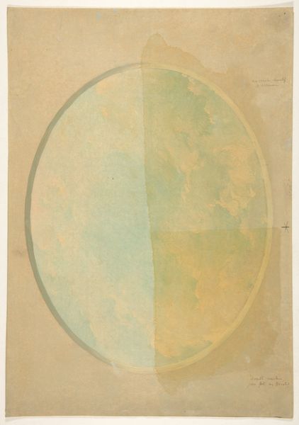
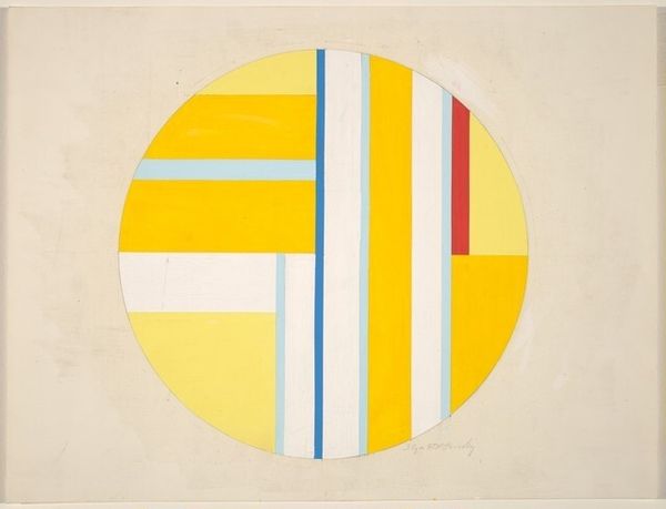
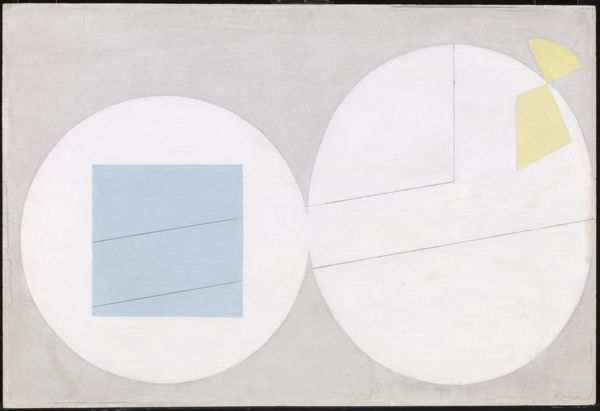
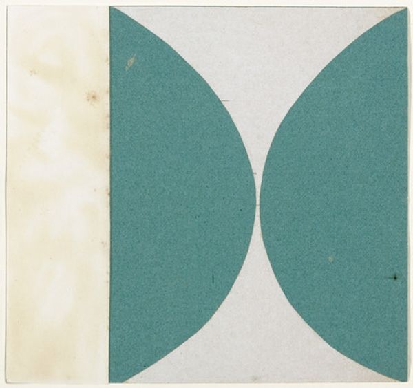
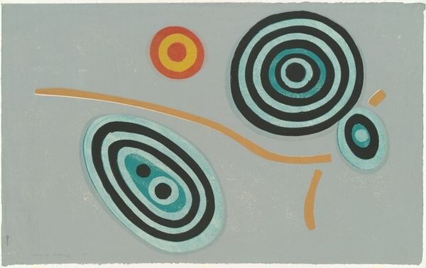
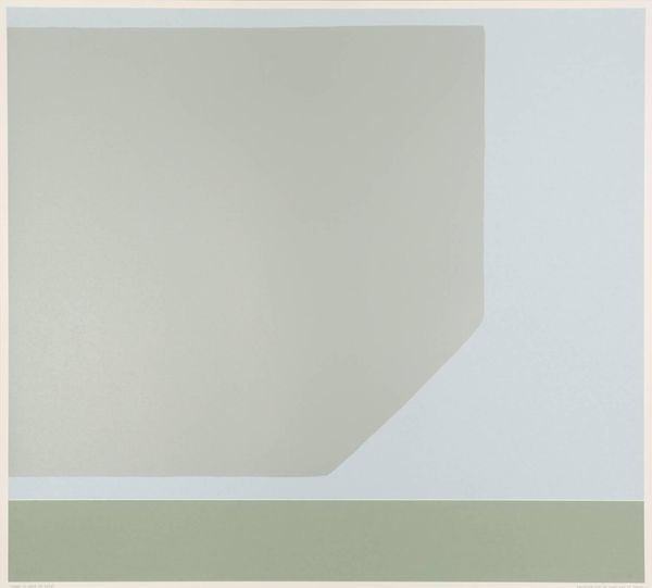
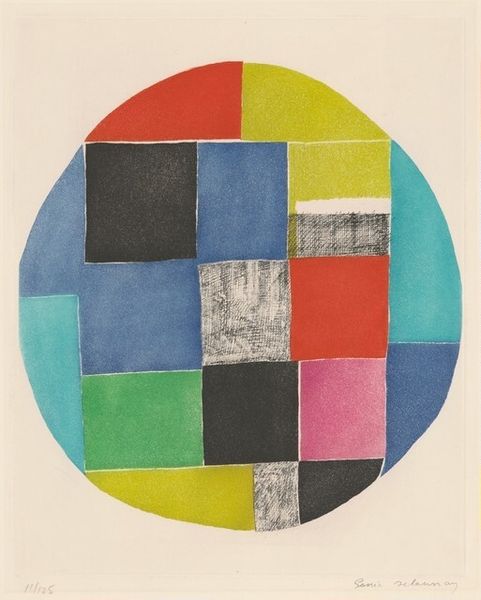
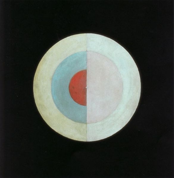
Curator: We’re looking at Edward Avedisian’s "Beach Ball" from 1960. It’s done in watercolor. Editor: It has a remarkably calm affect, really muted tones, the circle feels quite solid. It gives me a sense of pastel chalk dust and sunshine. Curator: It’s interesting you say solid, because Avedisian’s known for color field painting, where color seems to float. This circle almost seems to resist that reading with its geometric division. There's a quietness here; a deliberate stripping away, almost an archetypal image of a ball. Editor: The medium contributes greatly to that floating impression, though. Imagine that same design in acrylic, the visual weight changes immediately! The watercolor reads more ethereal, almost textile-like in the variations within each wash of color. Did he build the colors by layering washes, I wonder? It seems key to the feeling. Curator: Exactly! Think of the symbolic implications of a beach ball, particularly in 1960. Is it merely about form, color? Or is Avedisian commenting on leisure, mass production of toys, summer, and a kind of playful escape in the context of the cold war? The colors themselves have cultural weight. Editor: I'm more concerned with the artist's physical labor, frankly, like how those slightly irregular lines are far more telling than perfect digitally rendered bands. The uneven distribution of pigment tells its own story of process, and that makes the visual experience warmer. Curator: I think the dialogue between planned geometry and process is the key, a very modernist dialogue indeed. Editor: For me, it's more that it presents a case study in how something very simple materially – watercolour, paper, masking techniques perhaps – can produce complexity on closer observation. A compelling material engagement.
Comments
No comments
Be the first to comment and join the conversation on the ultimate creative platform.
