ink
#
minimalism
#
ink
#
geometric
#
abstraction
#
line
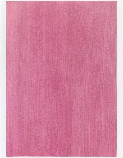
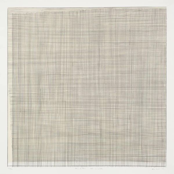
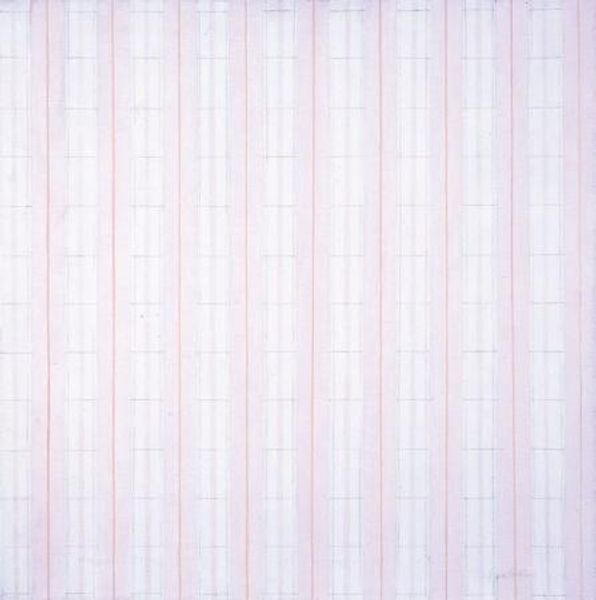
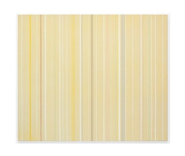
Dimensions: 27.9 x 27.9 cm
Copyright: Agnes Martin,Fair Use
Editor: So, here we have Agnes Martin's "Praise" from 1976, executed in ink. Honestly, at first glance, it seems incredibly simple—just faint, vertical lines. But there's something almost meditative about it. What do you see in this piece, that maybe I'm missing? Curator: It whispers, doesn't it? Like a childhood memory barely recalled. Agnes found divinity in the humble line. The imperfection of each hand-drawn stroke—the subtle wobble, the gentle fading—these aren't flaws, but affirmations of the human touch. Did you notice the pale pink hue? Editor: Yes, it's very subtle. Almost like a blush. Curator: Exactly. Think of it like a sunrise: soft, promising, almost ethereal. And while it seems like rigid geometry, it is not a prison; for Agnes, it was an open field for emotional play, where her subconscious was free to speak. How does it make you *feel*, separate from what you think about it? Editor: I guess I feel calmer looking at it than I expected. More at peace. It’s strangely soothing, despite the… nothingness. Curator: Precisely. The ‘nothingness’ as you call it, *is* the point. Martin wanted to create something devoid of ego, a pure expression of joy, untainted by the artist's "personality," or our daily needs. It's almost daringly simple, a radical act, like silence after a symphony. Editor: Wow. I'll never look at a minimalist painting the same way again. It is as simple as it seems, but it has such depth. Thank you for helping me unpack it! Curator: My pleasure. It reminds us that beauty isn't always about grand statements. Sometimes, it's in the quiet spaces between the lines.
Comments
No comments
Be the first to comment and join the conversation on the ultimate creative platform.
More like this