Copyright: Modern Artists: Artvee
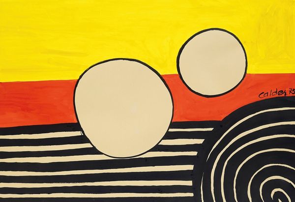
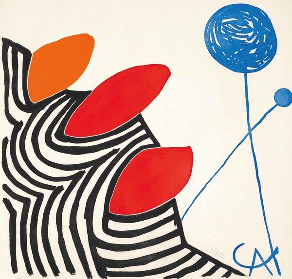
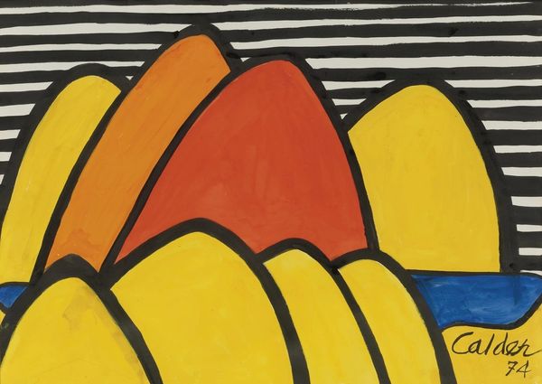
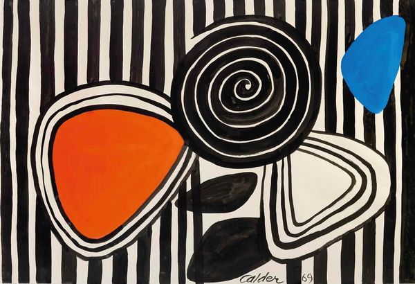
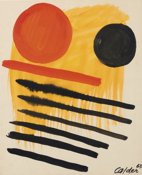
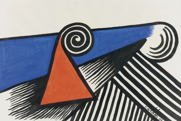
Curator: Right now we're looking at Alexander Calder’s 1975 acrylic painting "Horizon Forms." Editor: It strikes me immediately as playful, almost childlike in its simplicity. The bold, flat colors and the straightforward geometric shapes – domes and stripes – feel very immediate. Curator: Calder, of course, is famous for his mobiles. Here we see his approach to form applied to a static medium. The horizon is broken into bands and these forms really simplify natural motifs. What emotions arise when you view its parts and as a whole? Editor: The black and white stripes, particularly the concentric ones in the lower left, give the piece a graphic punch, a sense of movement contained, and remind me of pop art sensibilities. The orange and blue domes are much softer; the orange, especially, has this subtle textured application of paint. There's something a bit whimsical about how they sit atop those precise stripes. Curator: And what of the stark white backdrop on which these visual elements are set? That white acts like a stage that brings the themes forward. Calder used these shapes over and over and each one presents a new variation, an almost infinite landscape of abstract possibilities. It certainly touches on archetypal landscapes that trigger deep feelings of continuity within a cultural framework. Editor: Indeed. And though the composition seems quite simple, there's a real tension created by that contrast. The precision against the slightly imperfect forms; the solid color against the linear. These contrasts make you examine the elements separately. It feels meticulously arranged. The placement of the red and blue seems quite deliberate. It's about a calculated visual effect with those pure and flat pigments. Curator: We might consider it as a conversation between industry and nature, perhaps? These echoes can inform our interpretation. We see this in so many other forms: from traffic lights, to minimalist apartments. Editor: Ultimately, this artwork makes me think about visual syntax and geometry of seeing that. Calder plays with fundamental shapes. He has stripped it down to the bare minimum and achieved something quite satisfying in its reduced language. Curator: An image which gives you plenty to mull over from even such humble beginnings as bold acrylic applied to a blank surface. Editor: Definitely. This really makes me look with new appreciation and consideration!
Comments
No comments
Be the first to comment and join the conversation on the ultimate creative platform.
More like this