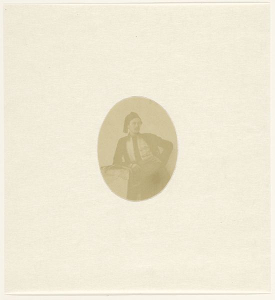
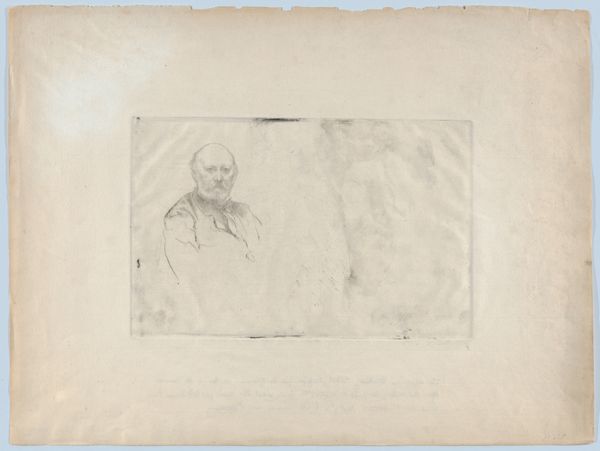
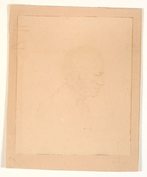
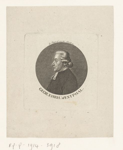
Ontwerp voor een bankbiljet met een portret van de president van de Braziliaanse Bank c. 1907 - 1908
0:00
0:00
drawing, print, paper, ink
#
portrait
#
drawing
#
ink paper printed
# print
#
light coloured
#
white palette
#
paper
#
negative
#
ink
#
academic-art
#
modernism
Dimensions: height 35 mm, width 33 mm, height 199 mm, width 149 mm
Copyright: Rijks Museum: Open Domain
Curator: This piece, entitled "Ontwerp voor een bankbiljet met een portret van de president van de Braziliaanse Bank," an ink and paper design by Pieter Dupont from around 1907-1908, offers a striking study in minimalist portraiture. What impressions does it conjure for you? Editor: Initially, it feels quite forlorn, almost comical in its isolation. The vast expanse of empty paper makes the tiny, precisely rendered portrait seem… well, a little lost. Curator: Indeed, the stark composition foregrounds the dialectic between figure and ground, focusing our attention on the intrinsic details of Dupont's draftsmanship. Observe the precision of line in rendering the president's features, a masterful example of academic art applied to the burgeoning modernist aesthetic of the era. Editor: Oh, I do see the elegance in the rendering. The tiny lines capture such dignity in the figure. I wonder about the rest of the bill though... where is the context? Or did they consider that whitespace inherently valuable for security? Curator: A prescient observation. The use of negative space can indeed be seen as an anti-counterfeiting measure, rendering forgery more challenging. However, on closer examination, we might also interpret it as a commentary on power. Editor: I love that tension! That such a powerful figure would be dwarfed so intentionally by nothing! It definitely resonates on an ironic level, don't you think? Curator: I'm compelled by the interplay of intent and execution here. The medium itself speaks volumes—ink on paper, the foundational elements of commerce and communication. And I hadn't considered the sheer boldness to strip a design this bare so close to Modernism. Editor: Right? It’s like peering into the soul of bureaucratic design... spare, efficient, and somehow also profoundly vulnerable. Curator: Agreed. It seems Dupont forces us to contemplate what we truly value in the image of leadership. Editor: Or what we're willing to bet on it. Thank you, as always. Curator: The pleasure was all mine.
Comments
No comments
Be the first to comment and join the conversation on the ultimate creative platform.
More like this