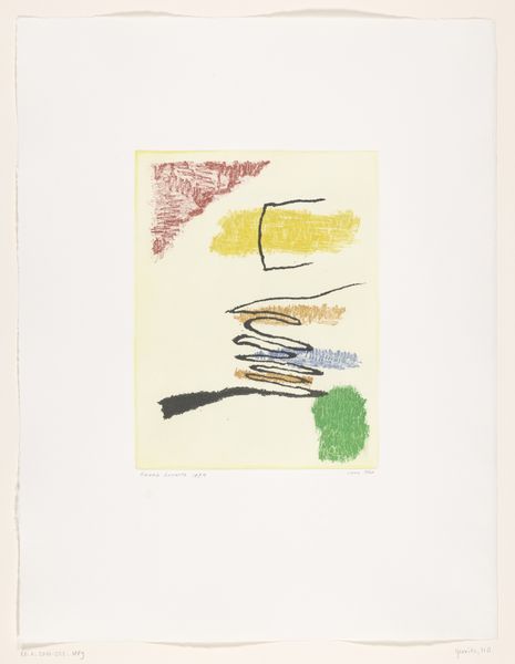
drawing, paper
#
drawing
#
paper
#
geometric
#
abstraction
#
modernism
Dimensions: height 327 mm, width 250 mm, height 204 mm, width 155 mm
Copyright: Rijks Museum: Open Domain
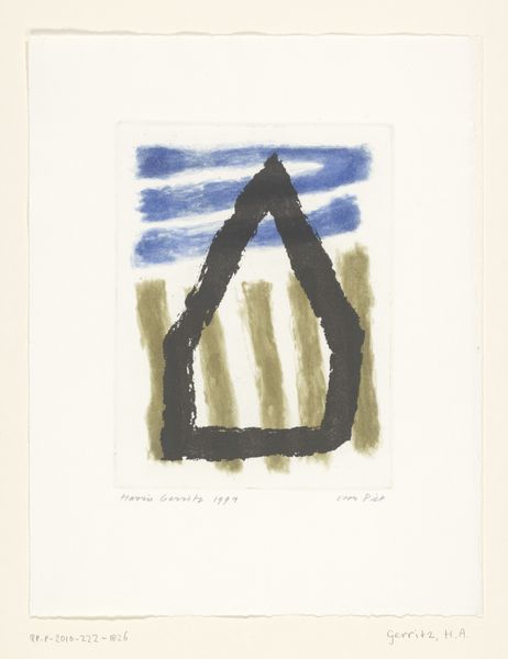
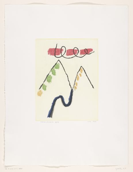
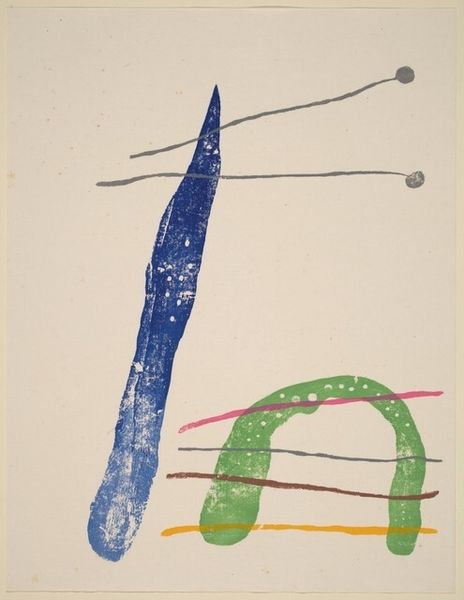
Curator: Welcome. We're standing before Harrie A. Gerritz's 1994 work, "Rode toren, halfronde blauwe cirkel"—or, "Red Tower, Semicircular Blue Circle." It's a drawing on paper, currently held here at the Rijksmuseum. What's your initial read? Editor: Stark, isn't it? The limited palette and simplified shapes lend it an almost childlike quality, yet there's a certain gravitas. The textured materiality of the paper contrasts beautifully with the flatness of the forms. Curator: Indeed. I'm interested in Gerritz’s process. Working on paper, using the medium of drawing—which traditionally is seen as less ‘important’—sets this work apart. The means of production, readily available and perhaps chosen for that very reason, speak to a wider democratic impulse. Editor: But look closer—it's about more than mere access. Notice how the blue shape doesn’t just sit within its yellow outline; the texture almost feels embedded into the fibers of the paper. How do you interpret that contrast between line and form? Curator: I think it is more relevant that the choice of these easily accessible materials, shifts the work’s interpretation away from high art towards accessibility and the everyday. It poses questions about art’s function and social context, not just aesthetics. Editor: Possibly, yet these very simplistic forms command space and attention. A lone tower contrasts against the solid weight of a half-circle, creating an intentional yet uneasy tension. Curator: And one might ask, what's the relationship between the subject, or the red tower in particular, and its title? What does Gerritz mean when he assigns 'tower' as the subject in his composition, given his conscious choice to democratize material access and process? Editor: Perhaps there is a correlation between the simplistic materials and minimalist architecture of this particular moment? Its scale could be symbolic of industry's accessibility—which can be easily consumed by a working class who also embrace an idea such as Modernism. Curator: Perhaps… both a formal examination and focus on material accessibility reveal the intricacies of this drawing, demonstrating just how such divergent interpretative avenues can actually coalesce in considering works from this period. Editor: It is indeed compelling how it brings material analysis and semiotic considerations together to create multiple layers of interpretations, prompting diverse lines of enquiry into seemingly simplistic designs.
Comments
No comments
Be the first to comment and join the conversation on the ultimate creative platform.
More like this