drawing, paper, pen
#
script typeface
#
drawing
#
script typography
#
hand-lettering
#
old engraving style
#
hand drawn type
#
hand lettering
#
paper
#
hand-drawn typeface
#
thick font
#
pen
#
handwritten font
#
calligraphy
#
small lettering
Copyright: Rijks Museum: Open Domain
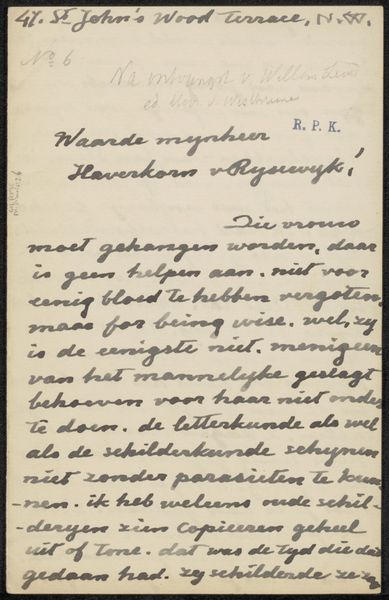
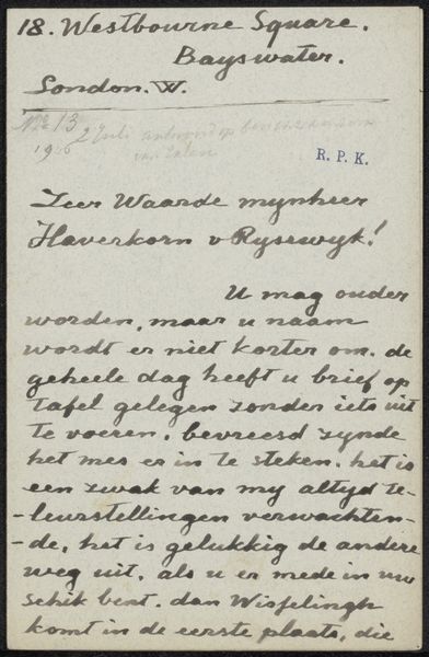
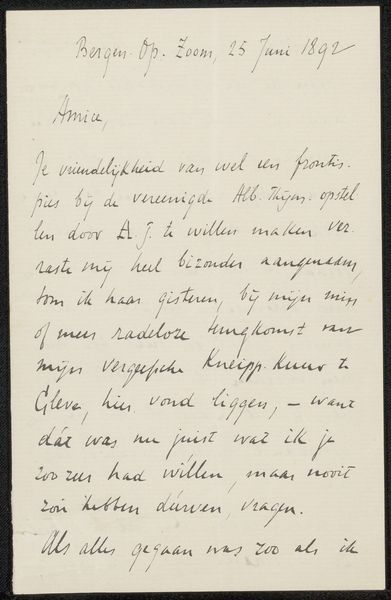
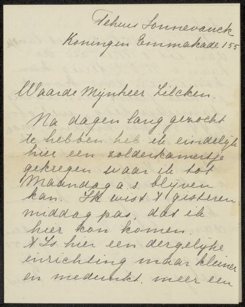
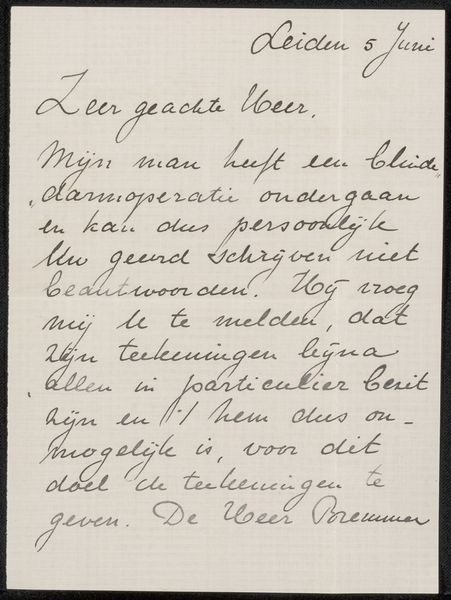
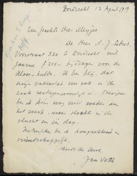
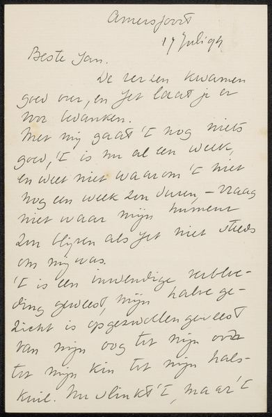
Curator: "Brief aan Jan Veth," possibly from 1919, appears to be a handwritten letter, probably in ink on paper. What strikes you about this piece? Editor: It feels quite personal and direct, even intimate, despite being a formal letter from the Ministry of Education, Arts and Sciences. The handwriting is so expressive, but also quite hard to read. What's your interpretation of it? Curator: The act of handwriting itself carries immense political weight. In an era increasingly dominated by bureaucratic typographies, a handwritten letter becomes an assertion of individuality. The letter addresses Jan Veth, likely the Dutch artist and critic. The context, from the Ministry, suggests perhaps an invitation or instruction. How do you think the tension between the formality of the sender and the intimacy of the medium contributes to the overall message? Editor: It does seem to create an odd contradiction! Like, maybe they're trying to appear approachable even within the power structure of the ministry. Curator: Precisely. The choice of hand-lettering can be seen as an attempt to bridge the gap between authority and the individual, to humanize the bureaucratic. It's a performative act, negotiating power dynamics through visual communication. Consider, too, who was afforded the luxury of handwriting and beautiful penmanship during this period? The class and educational privileges become subtly apparent. Editor: I never considered handwriting could have so much embedded meaning. It changes my perception completely! Curator: And it reminds us that even seemingly simple objects like handwritten letters are embedded with layers of social and political meaning waiting to be unpacked.
Comments
No comments
Be the first to comment and join the conversation on the ultimate creative platform.
More like this