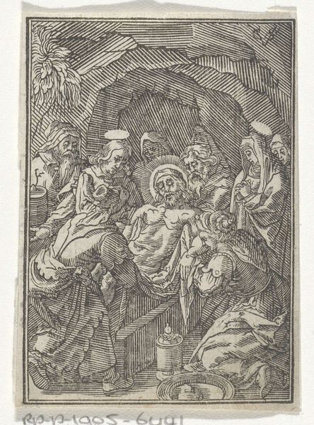
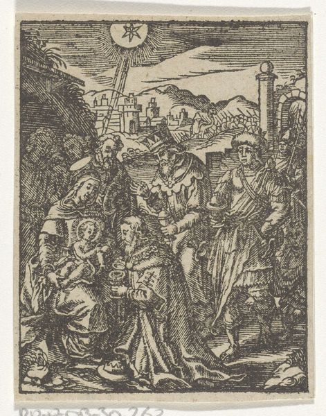
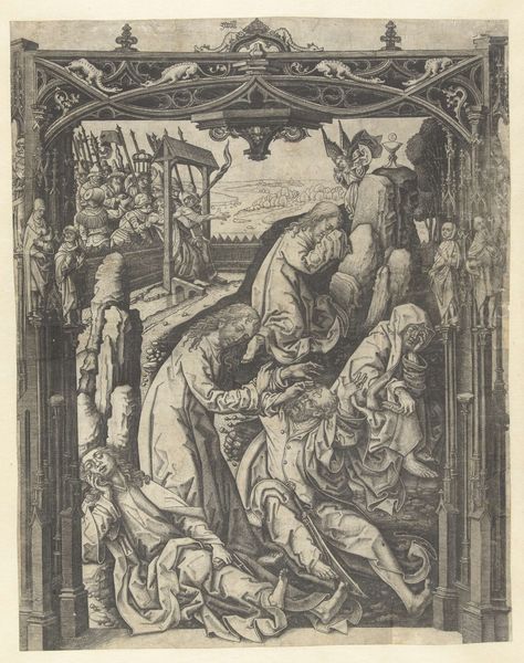
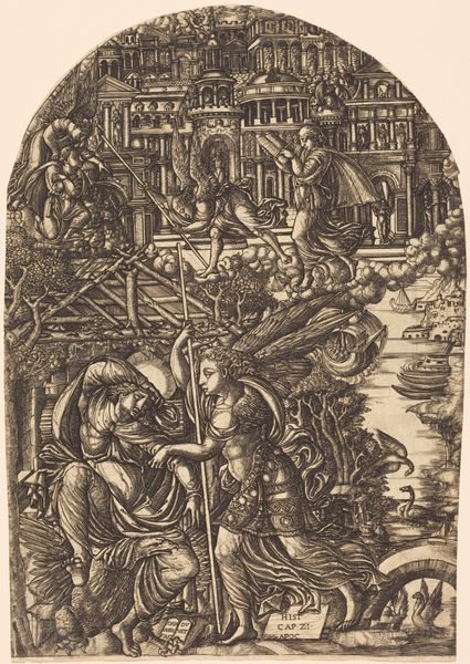
The Virgin of Sorrows: The Entombment; one of nine surrounding compartments from the Virgin of Sorrows, now separated 1520 - 1582
drawing, print, intaglio, engraving
portrait
drawing
narrative-art
intaglio
figuration
romanesque
history-painting
italian-renaissance
engraving
virgin-mary
Dimensions: Sheet: 2 13/16 × 2 3/16 in. (7.1 × 5.5 cm)
Copyright: Public Domain
Editor: This is "The Virgin of Sorrows: The Entombment" by Giorgio Ghisi, dating from sometime between 1520 and 1582. It's an engraving. I’m immediately struck by the composition – so much dense, interwoven line work creating a really somber, weighty scene. What jumps out to you? Curator: I find the engraving technique itself incredibly compelling. The density of the lines dictates the tone and mood of the composition entirely. Notice how Ghisi uses hatching and cross-hatching, varying the pressure and spacing, to create a rich tonal range in the absence of color. What effect do you believe this technique has on the viewer? Editor: It's true. It really emphasizes the gravity of the moment, the somberness of the entombment. There are barely any bright spots; the eye is constantly led back to these interwoven lines, reflecting the restricted color palette of an etching or even a drawing, compared to painting. Curator: Precisely. And consider the spatial organization. While ostensibly representational, there's a flattening effect created by the density of the line work. The background almost merges with the figures, collapsing the space. Do you think this compression contributes to the overall emotional impact? Editor: I think it does. It almost feels claustrophobic, adding to that feeling of sadness and inevitability. Almost like you can’t escape. The bodies also create these strong triangular shapes, especially with Mary at the front… Curator: Ah, a very keen observation! Now, focusing just on those shapes and that specific placement, how would you say it directs the viewers' gaze in relation to the space? Editor: It forces us to circle back to Mary at the front. Curator: Indeed. By stripping away the layers of meaning we might otherwise impose – the narrative, the religious symbolism – we arrive at a formal appreciation of its visual language. That dense web of lines evokes more sadness, and provides us with insight to the artist's intentions. Editor: Absolutely, I never thought to approach it that way, focusing purely on form and technique really emphasizes the somber atmosphere. Curator: The interplay between line, tone, and space creates a profoundly moving image and hopefully we have inspired a similar connection to others through a formalist appreciation of the artist's intent.
Comments
No comments
Be the first to comment and join the conversation on the ultimate creative platform.