Copyright: CC0 1.0
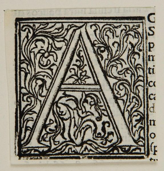
Editor: This artwork is called "Capital A" by an anonymous artist. It feels like a very formal, tightly composed design. What structural elements stand out to you? Curator: The symmetry of the floral and foliate designs surrounding the letterform is notable. Consider how the artist employs positive and negative space to create visual interest. The black ink on the page accentuates the contours of the "A" and its embellishments. Editor: So, it's all about the relationships between shapes and lines? Curator: Precisely. The relationship between the letter and its background is carefully calibrated to achieve visual harmony and legibility. It's a sophisticated balance. Editor: I see how the artist uses the texture to create a rich visual experience. Curator: Indeed. Such a piece reminds us to consider the intentionality behind every visual element.
Comments
No comments
Be the first to comment and join the conversation on the ultimate creative platform.
More like this