Copyright: CC0 1.0
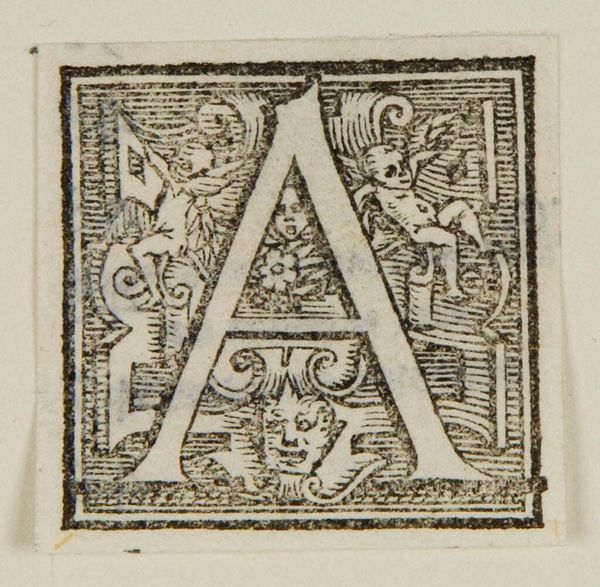
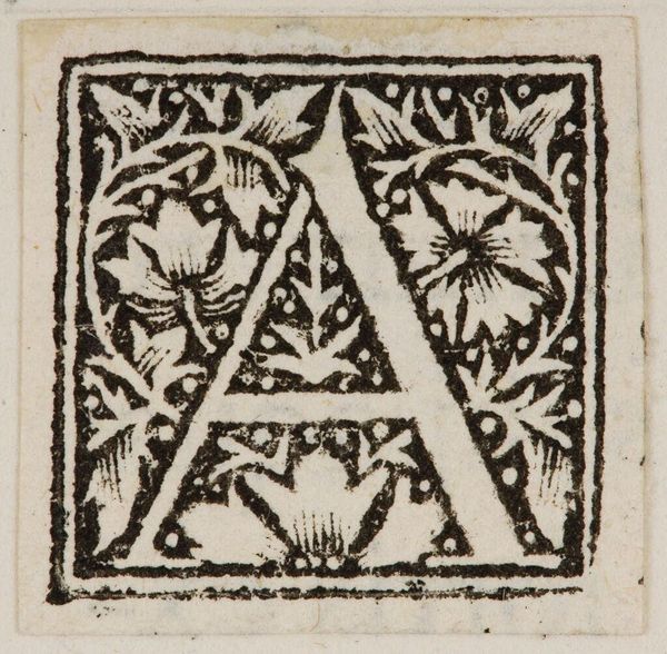
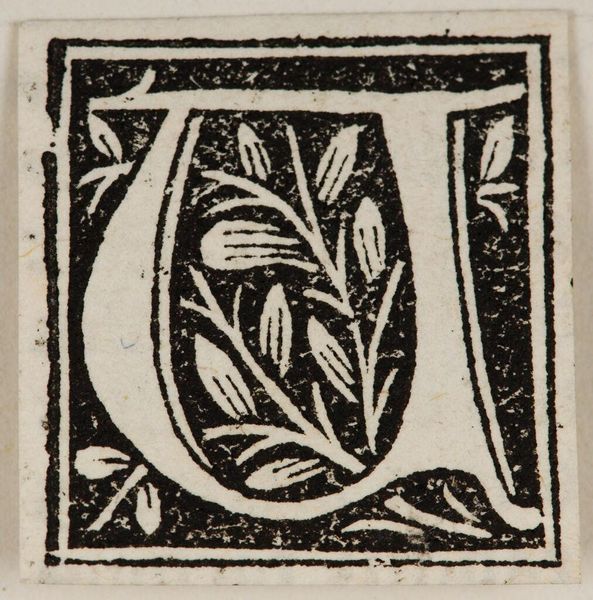
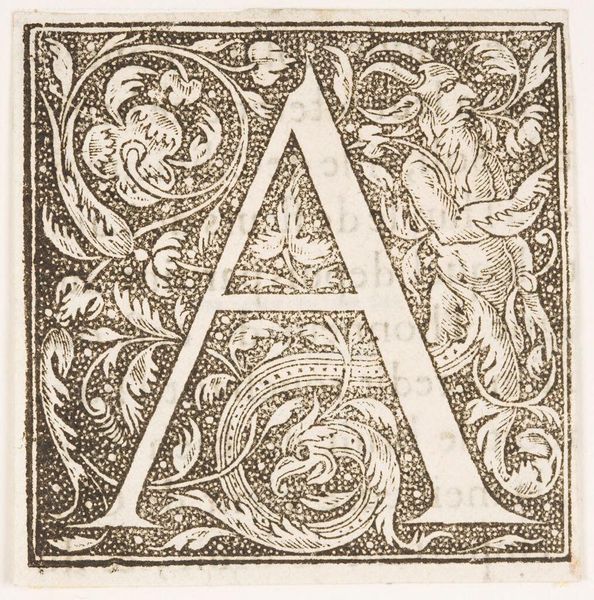
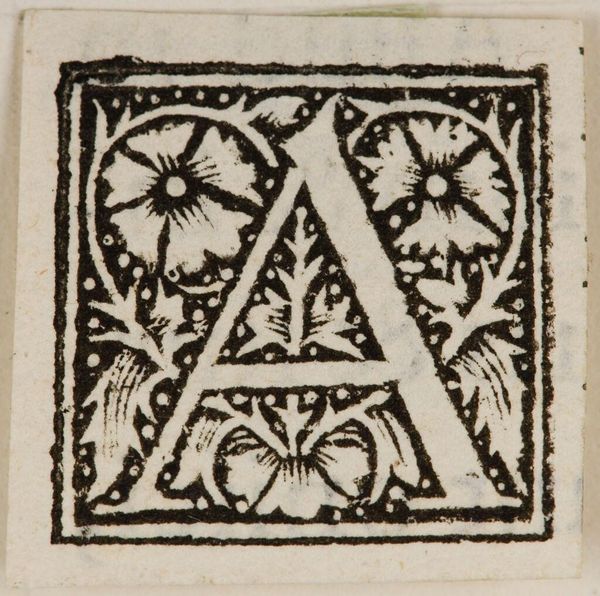
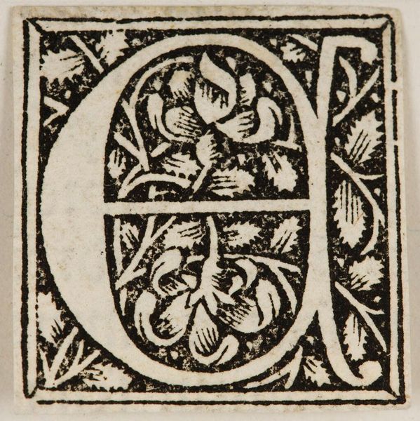
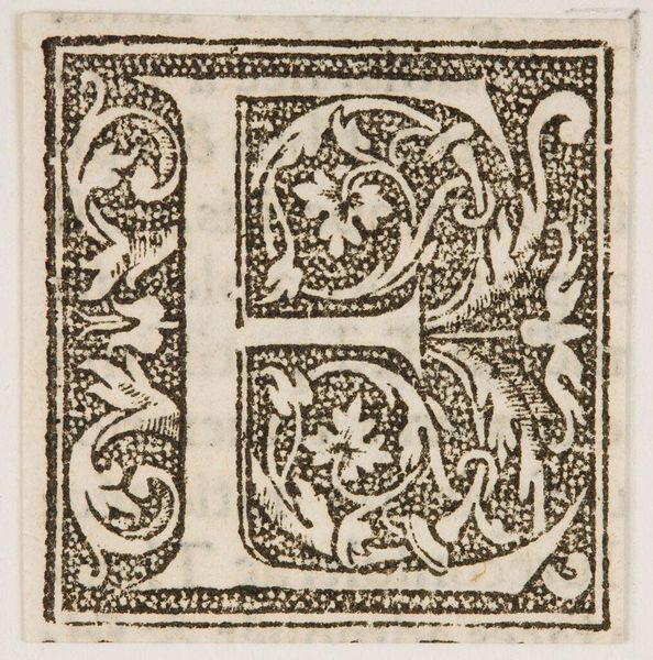
Editor: Here we have Letter A, by an anonymous artist. It's hard not to immediately notice the contrast between the solid letterform and the delicate, swirling patterns within. What stands out to you in terms of its composition? Curator: The stark dichotomy between the geometric rigidity of the letter and the organic, almost chaotic, floral infill is striking. Notice how the artist uses line weight to differentiate the primary form from the secondary decorative elements. The use of black and white creates a visual tension, doesn't it? Editor: It does! So, is that tension the key to understanding the work? Curator: Perhaps. Or perhaps it is simply a demonstration of skillful engraving, a balance between structure and embellishment. What do you make of the letterforms printed adjacent to it? Editor: Good point, I hadn't even considered those. It really makes me think about the artistry involved in something as functional as typography.
Comments
No comments
Be the first to comment and join the conversation on the ultimate creative platform.
More like this