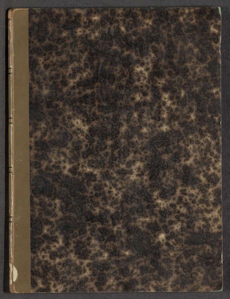
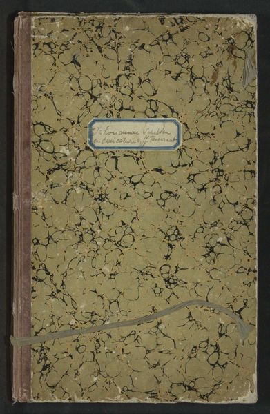
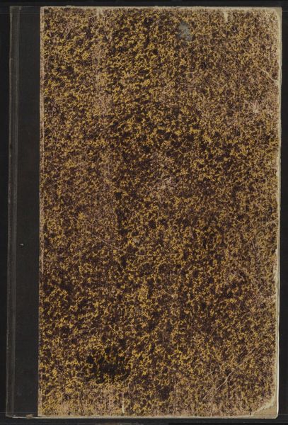
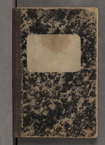
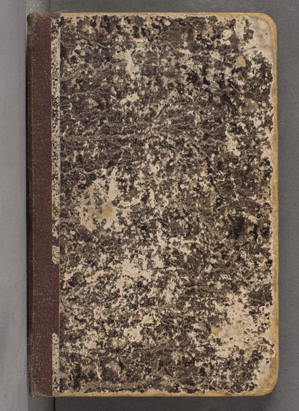
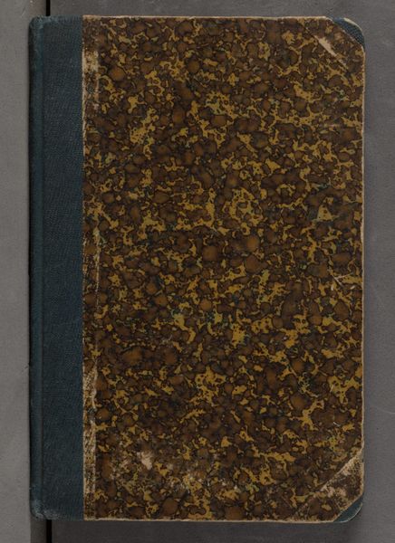
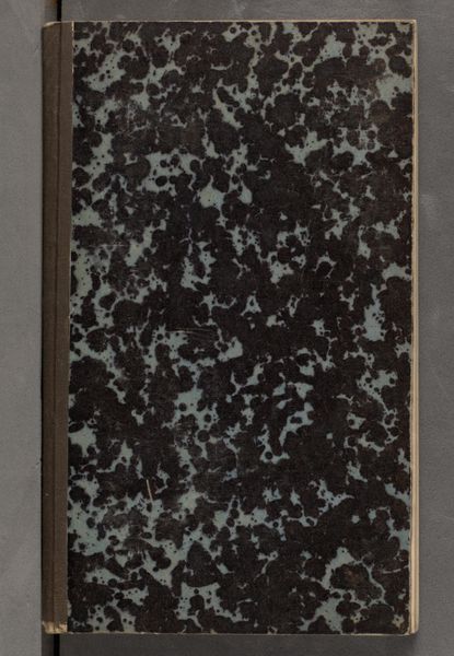
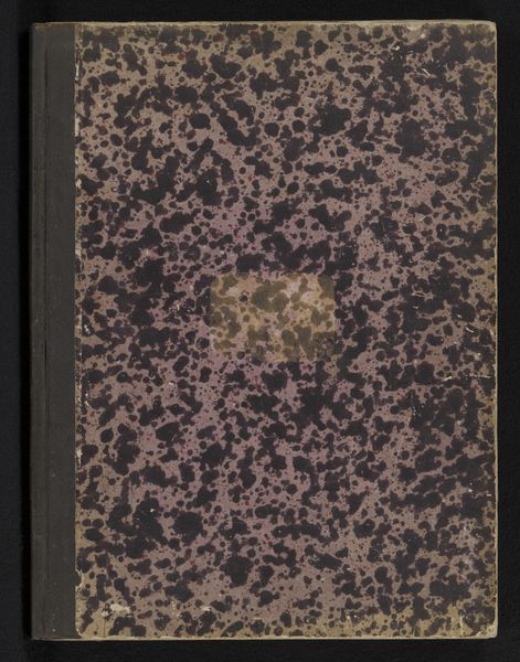
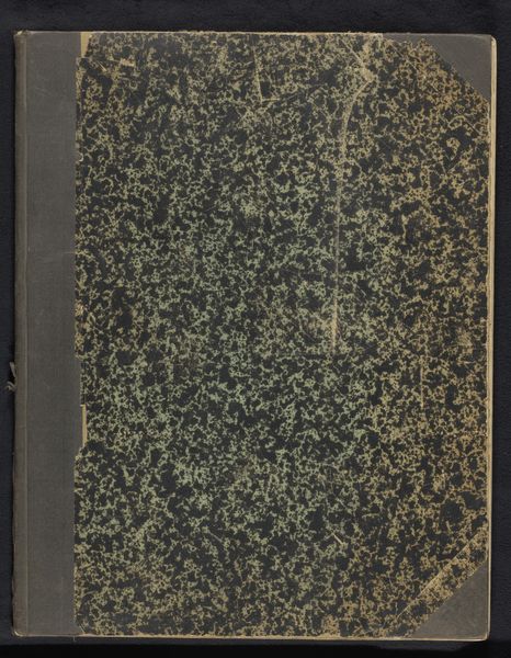
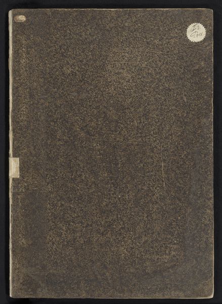
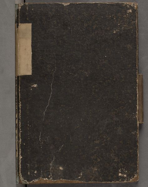
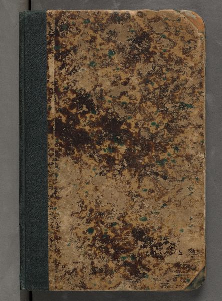
Portefeuille voor 83 tekeningen, 6 prenten en 1 brief van Humbert de Superville en enkele van zijn leerlingen 1814 - 1817
0:00
0:00
#
aged paper
#
reduced colour palette
#
fashion mockup
#
flat design on paper
#
personal journal design
#
paper texture
#
personal sketchbook
#
product mock up
#
studio mock-up
#
design on paper
Dimensions: height 435 mm, width 330 mm, thickness 40 mm
Copyright: Rijks Museum: Open Domain
Curator: Here we have an intriguing piece from the Rijksmuseum collection: a portfolio entitled "Portefeuille voor 83 tekeningen, 6 prenten en 1 brief van Humbert de Superville en enkele van zijn leerlingen," dating from 1814 to 1817. Editor: Immediately, I’m drawn to the texture. The mottled cover, those subdued tones—it evokes a real sense of intimacy and age. There's a clear emphasis on the tactile qualities of paper and binding. Curator: Indeed. This portfolio provides an insight into the artistic milieu surrounding David-Pierre Giottino Humbert de Superville. It gives us a peek into his studio and the dynamics of artistic apprenticeship in the early 19th century. Editor: Looking at the composition, there's a clear structure imposed by the binding and closure. These are elements meant for utility that end up impacting its visual reading; it brings a certain order to what might otherwise feel informal. Curator: Precisely. And the contents, primarily drawings and prints by Superville and his students, show their methods of teaching. Portfolios like this were pivotal tools for circulating artistic ideas, showing influence, and also in helping establish networks within the art community. It demonstrates art's connection to cultural dissemination at that time. Editor: Do you think the subdued color palette furthers the air of authenticity? Curator: I believe it is crucial. The sepia tones, likely products of the period's printing methods and paper quality, add depth to the images and enhance the historical aura. The constraints of color reproduction then dictated aesthetic choices just as much as artistic intent. Editor: Absolutely. Ultimately, analyzing the cover as it presents itself and without the context—I come away with an appreciation of design elements which continue to resonate. The contrast of geometric and chaotic elements, the tension that exists from being an object for functionality but viewed as a visual statement, the rough textures versus softer edges and materials. It creates something engaging. Curator: Agreed. Examining the portfolio from this historical and social standpoint emphasizes how art always functions within larger structures of learning, communication, and community formation. This portfolio offers much regarding the flow of artistic expression.
Comments
No comments
Be the first to comment and join the conversation on the ultimate creative platform.
More like this