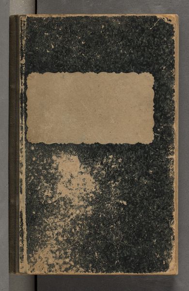
Album met voorstellingen van beeldhouwwerken in en op het Paleis op de Dam te Amsterdam Possibly 1655 - 1924
0:00
0:00
hubertquellinus
Rijksmuseum
mixed-media, paper, sculpture
#
mixed-media
#
paper
#
sculpture
Dimensions: height 406 mm, width 287 mm, thickness 12 mm, width 583 mm
Copyright: Rijks Museum: Open Domain
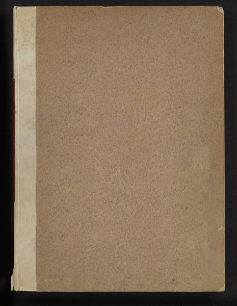
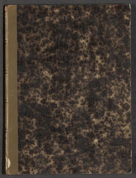
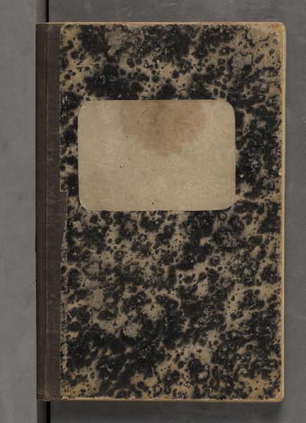
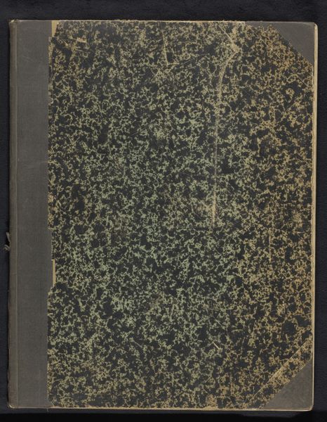
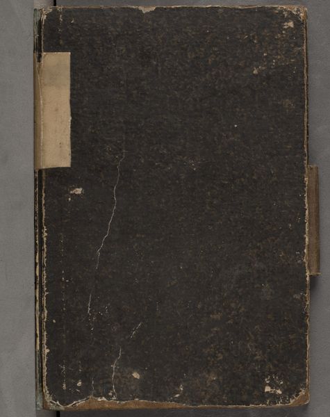
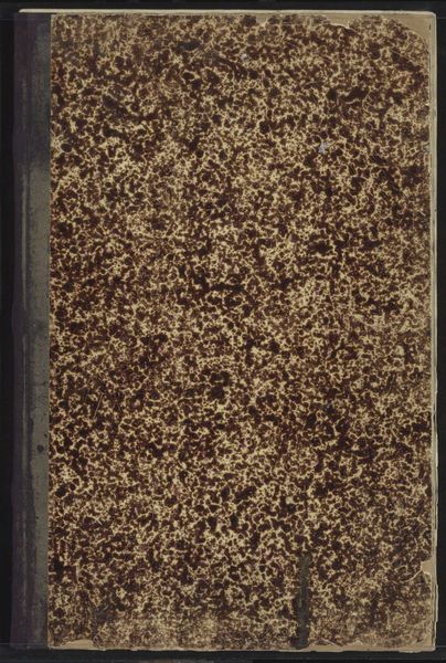
Editor: This is an album attributed to Hubert Quellinus, titled "Album met voorstellingen van beeldhouwwerken in en op het Paleis op de Dam te Amsterdam," dating perhaps from 1655 to 1924. It's comprised of mixed-media on paper and presently housed in the Rijksmuseum. The weathered cover intrigues me with its almost geological texture; what catches your eye about it? Curator: The materiality itself is quite telling. Observe how the aging of the album contributes to its overall aesthetic. The paper's surface and its tonal qualities aren't merely neutral backdrops; rather, they participate actively in the visual composition. The granular texture sets up a visual counterpoint to the anticipated smooth surfaces depicted within. How do you read this interplay? Editor: It's like a visual dialogue between decay and permanence, with the rough texture hinting at the sculptures’ potential for endurance versus the album's own ephemerality. Does the monochromatic nature affect your interpretation? Curator: Precisely! The lack of color encourages an engagement with form, line, and the interplay of light and shadow. Consider the composition--the placement of the aging marks relative to the book’s closure and binding. It subtly highlights the book's function as a container of knowledge, hinting at the concealed beauty it promises to reveal. Editor: That's a wonderful observation. I was so focused on the texture, I almost missed how it emphasizes the book as an object. I see the piece very differently now. Curator: And consider that the binding provides an element of visual structure too, in direct opposition to the "randomness" of the patterns within the front board's aged finish. Together, they create a satisfying contrast and visual harmony. Editor: I hadn’t thought of the binding that way, such a clever touch! Curator: Yes, indeed. Close analysis reveals so much about form, structure, and relationship between design elements of the artwork and its material components.
Comments
No comments
Be the first to comment and join the conversation on the ultimate creative platform.
More like this