#
neo-pop
Copyright: Modern Artists: Artvee
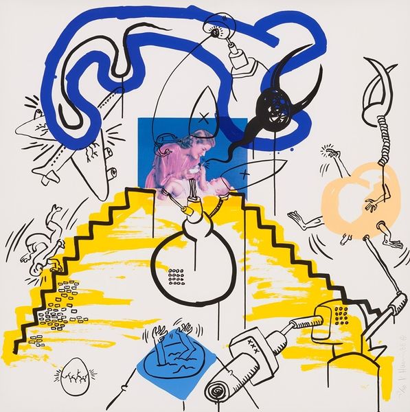
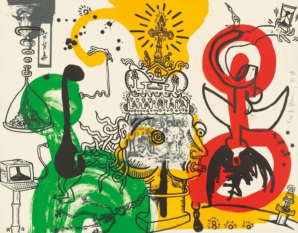
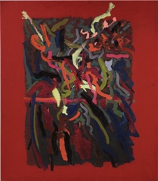
Keith Haring made this print, Apocalypse, sometime before 1990. The bold outlines and flat areas of bright colour feel immediate, like he’s making it up as he goes along. And in a way, that’s true of all art, isn’t it? You start with a blank surface and then respond to what happens next. Look at the way Haring uses colour. The red is so vibrant, almost alarming, but it's contained by those strong black lines. It’s like he’s wrestling with something powerful, trying to give shape to chaos. Notice how the red bleeds out of the figure, pools at the base of the print and contains more figures struggling in the mass. Haring was a peer of Basquiat and their work shares some concerns, but I feel like Haring has a more graphic, direct approach. His works really speak to the urgency of image making, it really emphasizes how art is an ongoing exchange of ideas across time. It reminds us that art is a space where ambiguity and multiple interpretations thrive.
Comments
No comments
Be the first to comment and join the conversation on the ultimate creative platform.
More like this