graphic-art, print, typography, poster
#
graphic-art
#
art-nouveau
# print
#
glasgow-school
#
typography
#
symbolism
#
poster
Dimensions: 12 3/4 x 17 1/8 in. (32.39 x 43.5 cm) (sight)22 7/8 x 28 3/8 x 1 3/8 in. (58.1 x 72.07 x 3.49 cm) (outer frame)
Copyright: No Copyright - United States
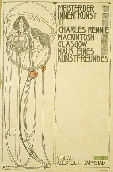
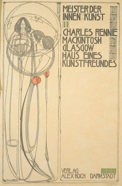
Curator: Let's take a look at "Plate 6" a print by Charles Rennie Mackintosh, crafted around 1902. The piece is currently housed here at the Minneapolis Institute of Art. Editor: My immediate response is that it feels fragile and almost dreamlike. The delicate lines, the elongated figures—it gives the impression of a fleeting moment, or a suppressed scream! Curator: The fragility resonates, certainly. Mackintosh often worked with symbolic imagery; the figures intertwined with floral motifs point to the Glasgow School’s preoccupation with nature, but through a stylized lens. These aren’t just decorative flourishes; they convey growth, sensuality, and perhaps the transient nature of beauty. Editor: Right, but beyond the symbolic, consider the *making* of it. This is a print; multiple copies would have been produced and disseminated. The intention was clearly for wider accessibility. Yet there's such careful, crafted quality in those very Art Nouveau linework details— challenging traditional views about design for the masses. Curator: I agree, there is intentionality about distribution to an audience that I want to probe a little further. In terms of cultural transmission, prints such as these provided a vital conduit for ideas. "Meister der Innen Kunst," (Master of Interior Art) featured prominently in the work itself, promoted artistic identity while advocating a unified aesthetic – the integration of art and everyday life. Editor: Which gets back to the materiality: a printed poster could democratize interior design on a scale impossible to previous generations. And Darmstadt, featured below – this references Ernst Ludwig’s artistic colony, working directly to combine workshops and residence to realize utopian art that also generates commercial prosperity. Curator: A truly fascinating tension there—the utopian ideals embedded in mass production. And note the prominent lettering, how typography itself becomes art. Even the placement of text and image, the balance between void and line, echoes a carefully staged performance. What, finally, does it communicate to us, beyond its historical placement? Editor: For me, it brings up questions about craft versus machine, how design can aim for beauty alongside its practical role. We see labor embedded in every choice, challenging art histories dominated only by wealthy individuals. Curator: It definitely demonstrates a deliberate ambition, one to influence cultural perception through widespread visual culture, making “Art” more accessible and an integrated component of modern, lived existence.
Comments
No comments
Be the first to comment and join the conversation on the ultimate creative platform.


