graphic-art, mixed-media, print, typography, poster
#
graphic-art
#
mixed-media
#
art-nouveau
#
hand-lettering
# print
#
hand lettering
#
glasgow-school
#
form
#
personal sketchbook
#
typography
#
geometric
#
line
#
poster
Dimensions: 17 1/4 x 12 in. (43.82 x 30.48 cm) (sight)28 1/4 x 22 7/8 in. (71.76 x 58.1 cm) (outer frame)
Copyright: No Copyright - United States
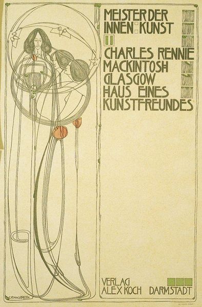
Curator: We're looking at a print titled "Title page," crafted by Charles Rennie Mackintosh in 1902. The work now resides at the Minneapolis Institute of Art. Editor: It’s instantly evocative, a bit haunting, isn't it? The palette is muted, almost ghostly, and then those pops of red... They feel like secrets. Curator: Absolutely. Mackintosh, positioned within the Art Nouveau movement, was deeply interested in exploring the symbolic weight of forms and challenging the restrictive aesthetics of his time. Here, we see the geometric interacting with the organic, a rebellion against industrial uniformity. The text, the image, even the white space on the page are considered holistically in order to question accepted norms. Editor: I like how the figures seem caught in a moment of contemplation. The circles feel womb-like, protective, yet they also hint at being trapped, as if they yearn for escape, you know? Curator: Precisely. The imagery can be examined within a broader sociopolitical framework, particularly related to the "New Woman" emerging at the turn of the century and the complicated societal expectations they faced. It raises fundamental questions about women's representation. The lettering, so unique, also references back to the Arts and Crafts movements where typography becomes key to expressing craft and meaning. Editor: I love imagining him, lost in his studio, carefully lettering each word, coaxing life into those elegant lines. Curator: A personal sketch book allows us insight into Mackintosh’s process to illuminate how an intersection of forces can shape both an artist’s output, as well as the movement that came to embrace their vision. This plate reveals how many facets shape his position at this specific moment in art history. Editor: I think my main takeaway is to be bold; take chances in making and reflecting on our work! Curator: A fitting interpretation of Mackintosh's spirit—invigorating, brave, but also beautiful in the complexity and questions that he leaves us to continue thinking about.
Comments
minneapolisinstituteofart over 1 year ago
⋮
This is the title page for the portfolio that Mackintosh and his wife Macdonald Mackintosh prepared for an international contest sponsored by German interior design magazine Zeitschrift für Innendekoration. Entrants were required to create a house for an art lover that was simultaneously grand and modern. The letter forms and box elements on the right side of the composition balance the three graceful, elongated female figures on the left, which were often featured in Mackintosh and Macdonald Mackintosh's interior designs. Because he was not obligated to please a client, Mackintosh was able to freely express his thoughts on architecture and interior design. Though his design did not win the competition, the building was constructed in Bellahouston Park, Glasgow, between 1989 and 1996, where it remains open to the public.
Join the conversation
Join millions of artists and users on Artera today and experience the ultimate creative platform.
More like this