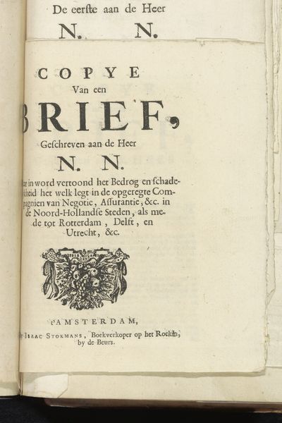
Twee brieven over het bedrog van de nieuw opgerichte compagnieën, 1720 1720
0:00
0:00
isaacstokmans
Rijksmuseum
collage, print, textile, paper, typography, engraving
#
hand written
#
collage
#
dutch-golden-age
# print
#
hand drawn type
#
textile
#
paper
#
typography
#
hand-written
#
hand-drawn typeface
#
engraving
Dimensions: height 210 mm, width 150 mm
Copyright: Rijks Museum: Open Domain
Editor: This is "Twee brieven over het bedrog van de nieuw opgerichte companieën, 1720", or "Two Letters on the Deceit of the Newly Established Companies, 1720", by Isaac Stokmans. It's a collage that includes prints, textiles and paper and it is held at the Rijksmuseum. It gives me the impression of someone raising awareness about possible wrong doing in newly formed entities. What can you tell me about this work from a historical perspective? Curator: This work immediately suggests a period of intense financial speculation and social critique. The Dutch Golden Age, despite its artistic and economic flourishing, also experienced significant financial bubbles, most notably the Tulip Mania earlier in the 17th century. Does this image recall that moment for you at all? Editor: In a way, yes. This text feels like a cautionary tale in the making. Curator: Exactly. Stokmans is reacting to the formation of new companies, likely joint-stock companies, which were becoming increasingly common and, as this work suggests, rife with potential for fraud. This work raises important questions about the public's trust in these institutions and the role of printed media in shaping public opinion. Editor: So it is a kind of social commentary? Curator: Precisely. The use of typography and what appears to be collage suggests an effort to disseminate information widely, almost like a public service announcement. What do you make of the handwritten element of this artwork? Editor: That detail definitely makes the image stand out. It makes it even more of an artifact. As if a warning survived from those times. Curator: I agree, it gives the piece a personal dimension. Overall it sheds light on the socio-political anxieties surrounding early capitalism. Editor: I see, it’s a visual record of public concerns during a pivotal period of economic expansion. Curator: Indeed, by exploring this image, we gain insights into how early financial markets impacted society and how artists and printers acted as important voices in shaping public discourse.
Comments
No comments
Be the first to comment and join the conversation on the ultimate creative platform.
More like this