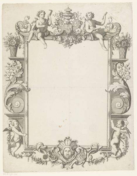
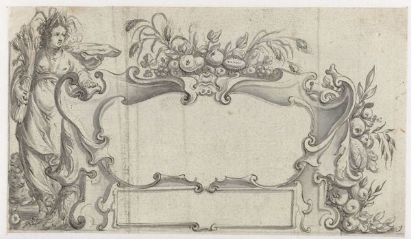
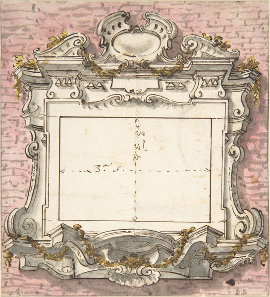
Design for a Frontispiece Surmounted by the Sacred Monogram IHS 1700 - 1770
0:00
0:00
drawing, print
#
drawing
#
baroque
# print
#
figuration
#
history-painting
#
academic-art
Dimensions: 6 3/4 x 9 in. (17.1 x 22.9 cm)
Copyright: Public Domain
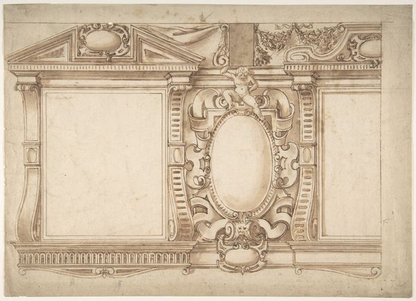
Editor: Here we have a design for a frontispiece, entitled "Design for a Frontispiece Surmounted by the Sacred Monogram IHS," created sometime between 1700 and 1770 by François Boucher. It’s a drawing and print – talk about multitasking! The piece has this really ornate, almost playful, frame around what looks like an empty space for text or another image. It feels…well, quite baroque! What do you make of this work, and especially this elaborate frame? Curator: Ah, Boucher! He does love his flourishes, doesn't he? The frame itself *is* the subject, in a way. Think of it like this: imagine stepping into a grand theater box. What do you see? Swirling decorations, cherubic figures, symbolic crests… It's all about creating a sense of awe and importance. The "IHS" monogram, representing Jesus Christ, is held aloft by these chubby cherubs. It was meant to signify a space where something of great import would be placed—the title page of an important book, perhaps? Boucher isn't just drawing a frame; he’s building a visual experience. Don't you think it has that effect on you? Editor: I can definitely see that sense of spectacle. But does the frame distract from whatever would eventually fill that blank space? It feels so dominant. Curator: It could, and that's the tightrope artists like Boucher walked. The key was balance: the frame had to elevate the central image without overshadowing it entirely. This elaborate surrounding would prime the viewer. But more than that, it created an aura of prestige. It announced, “Whatever you’re about to see or read *matters*.” Almost a form of visual...pre-selling! It’s interesting how our perception shifts through centuries; we are maybe now used to less adornment. Editor: I hadn't thought of it as "visual pre-selling" before, but that makes perfect sense! This conversation makes me see that even seemingly decorative elements can have a powerful, persuasive function. Curator: Precisely! The decorative IS the functional. Boucher was really skillful in understanding that connection, blending reverence and visual appeal seamlessly, proving that sometimes, more is indeed more, right?
Comments
No comments
Be the first to comment and join the conversation on the ultimate creative platform.
More like this