drawing, paper, ink, pen
#
drawing
#
script typography
#
hand-lettering
#
hand drawn type
#
hand lettering
#
paper
#
ink
#
hand-drawn typeface
#
pen work
#
pen
#
handwritten font
#
calligraphy
Copyright: Rijks Museum: Open Domain
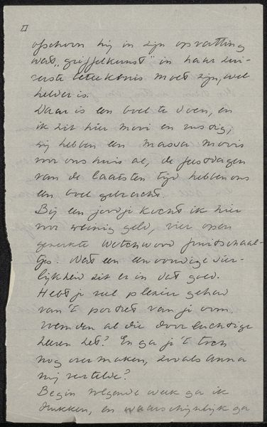
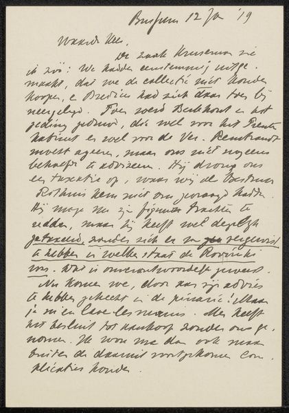
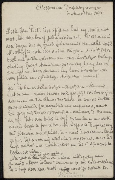
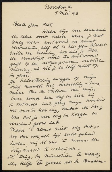
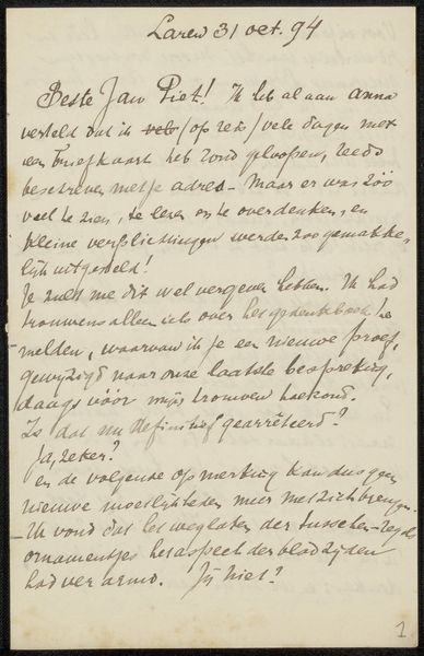
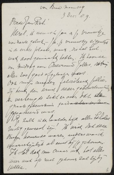
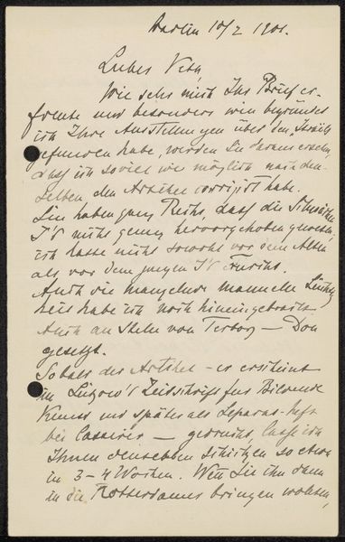
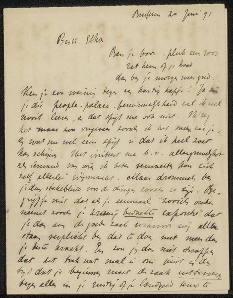
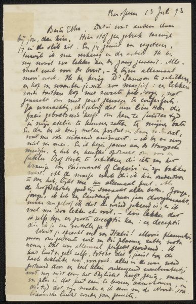
Curator: Looking at “Brief aan Pieter Haverkorn van Rijsewijk" by Jan Veth, probably from between 1894 and 1896 and held in the Rijksmuseum, it feels intimate, almost a whispered confidence on paper. Editor: It does. There's a lovely density to the writing, like a flock of birds landed on the page and arranged themselves into these elegant, sloping lines. The thick strokes of ink have such texture! It looks more like a work of art than correspondence. Curator: Precisely! Veth was quite active within the circles of Dutch art and literature, and he moved in some pretty interesting social circles. So letters between creative individuals weren’t just functional; they often became a space for experimentation with the written word itself. Editor: Do we know who Pieter Haverkorn van Rijsewijk was? Curator: Haverkorn van Rijsewijk was the director of Museum Boijmans, now Boijmans Van Beuningen, in Rotterdam, and Veth was a friend of his and an advisor to the museum. They had a rich, lively exchange about artistic endeavors, judging from all of the correspondence we see here. The letter references an artist called Dogman, the Stroebel…there seems to be some business to unpack between the lines. Editor: The handwriting itself feels so intentional. The way the letters are formed, the spacing... it’s like a visual dance. It reminds me how much care used to go into something as everyday as handwriting. There's a weight to ink on paper; you feel the impression. Curator: Right! It really highlights how handwriting itself has fallen away as an art. Think about it - the technology that allows for mass production and standardized typeface transformed both artistic output and our means of communicating. The letter is both highly functional and uniquely personal. Editor: I find that duality truly interesting. The fact that Jan Veth invested himself so wholeheartedly in these seemingly small forms - notes to friends - it gives the piece a touching sense of personality, which persists for centuries. Curator: Yes. Looking at this letter, we catch not just information but the energy and the spirit of a time now past.
Comments
No comments
Be the first to comment and join the conversation on the ultimate creative platform.
More like this