painting, acrylic-paint
#
acrylic
#
painting
#
stencil
#
acrylic-paint
#
geometric
#
abstraction
Copyright: Albert Rafols-Casamada,Fair Use
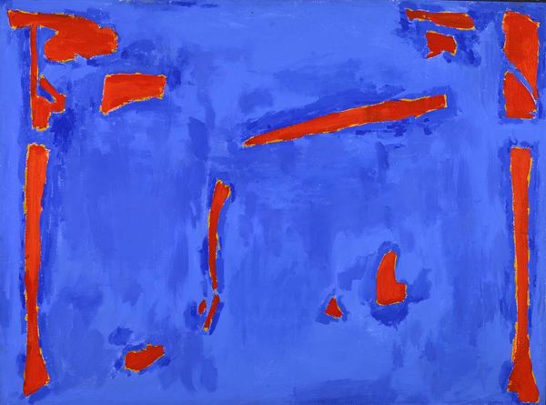
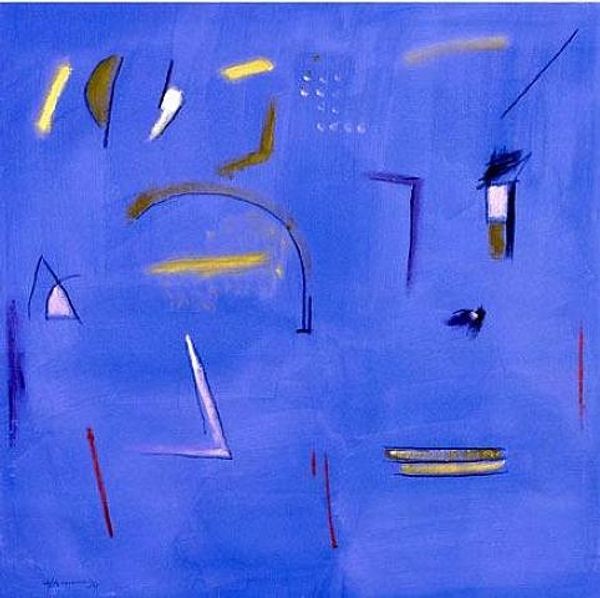
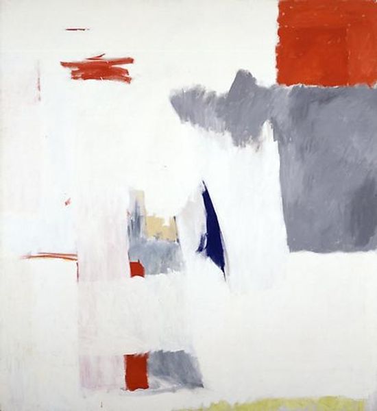
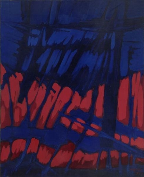
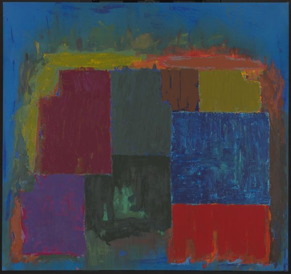
Editor: This is "Untitled," a 2003 acrylic on canvas painting by Albert Rafols-Casamada. I find the composition striking with its bold cobalt blue field, juxtaposed with bright orange and white gestures. How do you interpret this arrangement? Curator: It's interesting to note the careful arrangement of the limited color palette. The blue functions not merely as background, but as an active plane engaging with the linearity of the other forms. Notice the textural quality, the rough application of paint, creating varied optical sensations. Does that give you any initial impression? Editor: I see how the brushstrokes contribute to a layered effect, almost a sense of spatial depth, despite the apparent flatness of the picture. The white markings also seems almost like stencils or architectural signs, against this uniform blue, with touches of geometry. Curator: Precisely! It invites the viewer to contemplate the interplay between these elements. Semiotically, we might interpret these painted shapes as signs—minimal gestures towards form rather than direct representational meaning. Editor: I can see how reducing the forms down into gestures can direct attention towards the formal components of line, shape, color, and the layering of the paint itself, while the shapes feel suggestive. Curator: Ultimately, it's the optical relationship that defines the artwork’s communicative value and impact, and our attention, guiding us to engage directly with visual cues and perceptions. The artist seems interested in testing our assumptions about spatial representation. Editor: It makes me think differently about abstract compositions; rather than looking for meaning, you focus on the arrangement of formal aspects and their relationship. Curator: Precisely. Shifting the focus onto elements such as color and brushstroke can reveal much about the artwork's intrinsic qualities.
Comments
No comments
Be the first to comment and join the conversation on the ultimate creative platform.
