drawing, paper, typography, ink
#
drawing
#
hand-lettering
#
hand drawn type
#
typography
#
hand lettering
#
paper
#
typography
#
ink
#
hand-drawn typeface
#
fading type
#
calligraphic
#
thick font
#
typography style
#
calligraphy
#
small lettering
Copyright: Rijks Museum: Open Domain
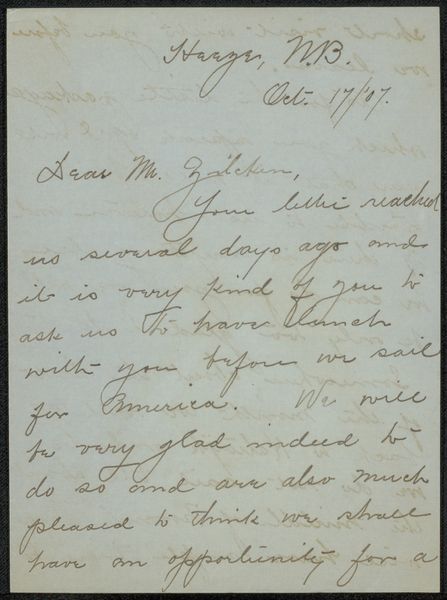
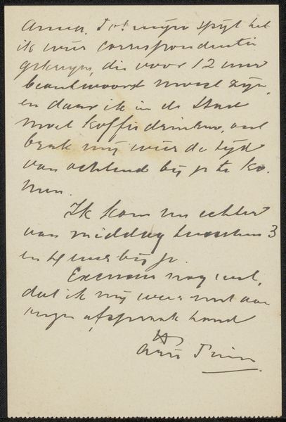
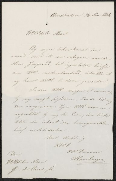
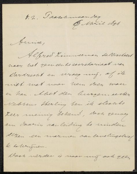
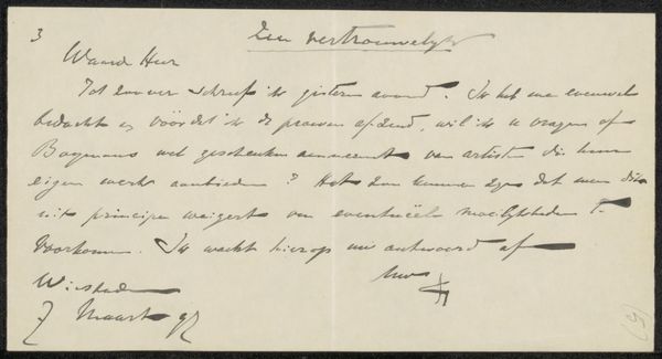
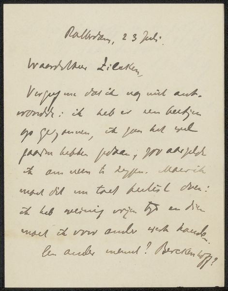
Editor: So, this is "Brief aan Philip Zilcken," or "Letter to Philip Zilcken," potentially from between 1907 and 1913, created by Walter Castle Keith. It seems to be ink on paper, a handwritten letter. What strikes me is its intimacy – it's a personal note frozen in time. What do you make of it? Curator: Intimacy is exactly the word! It whispers, doesn't it? The ink, the paper… these are materials that breathe history. This isn’t just about the words; it's the dance of the hand, the pressure of the pen, the very rhythm of thought flowing onto the page. Think about the intention: to connect, to share a moment. Do you get a sense of their relationship? Editor: A little. Formal, but familiar? "Dear Mr. Zilcken," yet the content seems quite casual – travel plans, a package. It's like a glimpse into a business acquaintance who's almost a friend. Curator: Precisely! And the beauty is in the imperfection. Look closely: the inconsistent spacing, the slight tremors in the lines… it’s a raw, unedited expression. Imagine Walter Keith sitting down, perhaps by lamplight, carefully crafting each word. The "Potsdam"... a ship, a journey. He offers more than just an itinerary; doesn't this glimpse hint at a whole world beyond what’s written? It's all subtext and texture! Editor: I see that now! It’s almost like a sketch, capturing a mood, a moment, as much as a message. Like he's not just writing a letter, he's *performing* the act of writing a letter. Curator: Absolutely! And isn't it lovely how a simple, functional object like a letter can transform into a piece of art simply by being a conduit for human connection? It certainly speaks to me in that way. It gets one wondering of our future way of communications! Editor: Yeah, looking back we appreciate it and gives a reminder about human connection. This makes me look at handwritten letters very differently.
Comments
No comments
Be the first to comment and join the conversation on the ultimate creative platform.
More like this