drawing, paper, ink, pen
#
drawing
#
paper
#
ink
#
pen
Copyright: Rijks Museum: Open Domain
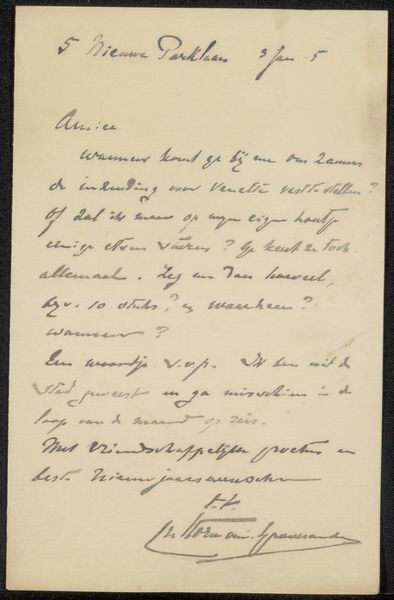
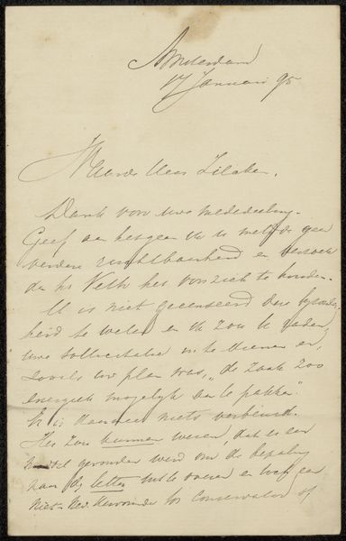
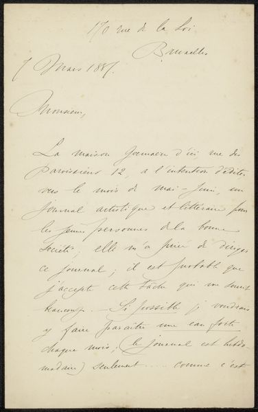
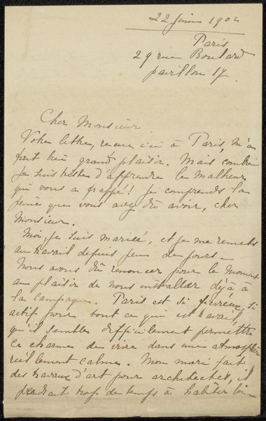
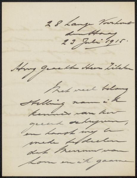
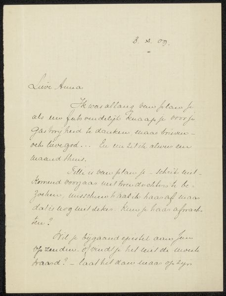
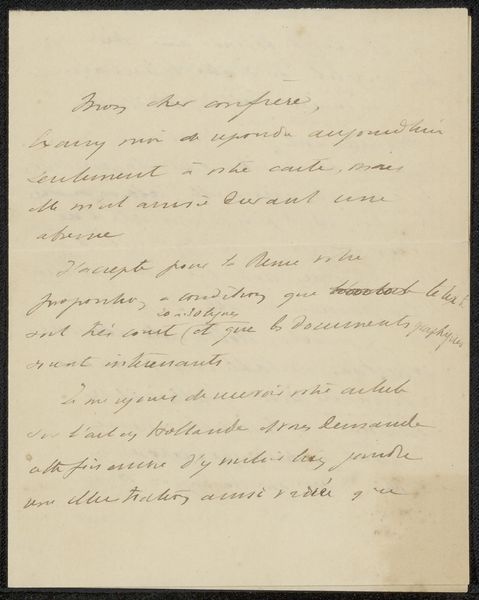
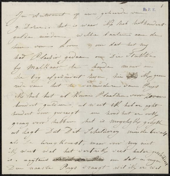
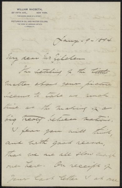
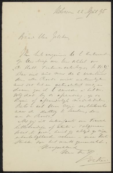
Curator: Here we have Carel Nicolaas Storm van 's-Gravesande's "Brief aan Philip Zilcken," likely created around 1905. It's ink on paper. A rather intimate glimpse, wouldn't you say? Editor: Intimate indeed. The off-white hue of the paper, combined with that faded sepia ink... It feels incredibly fragile, almost melancholic. Just seeing it gives the sense of a private moment shared, unintentionally or otherwise, across the decades. Curator: The visual weight is uneven, anchored in textual form. Van 's-Gravesande employs a fine nib pen. See the precision and consistency in stroke? The deliberate variations in pressure bring certain phrases to the forefront. The rhythm is remarkable, even within its formal constraints. Editor: It’s interesting you note the visual anchors. Viewing it through a historical lens, one is reminded of the role letter writing played in artistic and intellectual circles. This wasn't merely a personal note; it was a means of maintaining a network, sharing ideas, and conducting the business of art. Who was Philip Zilcken, and what was their relationship? Curator: Zilcken, an artist and art critic, highlights the social aspects art embodies as it travels to a broader public audience. See how it transcends its pure form to affect the society in which it belongs? Editor: Precisely. Also, the seemingly mundane details – the "rectification" regarding the price, mentions of publishers, and potential discomfort. It grounds the artistic world in everyday realities. It shows an important relationship between a letter writer, his art and society. Curator: Notice, too, how he manages space? Observe how his writing elegantly works around flaws in the paper. This becomes an integrated component in the art of writing a letter. The visual presence has depth that reaches beyond simply wanting to read it. Editor: It underlines the constraints of the time, resources and technology. But also the deliberate intent with language and visuals that had deep socio-political and public meaning. I now feel differently than my first, spontaneous reaction. Curator: Quite so. What seems on the surface quite plain actually represents the beauty in visual precision. Editor: For me, the real beauty exists in how letters brought a broader public meaning.
Comments
No comments
Be the first to comment and join the conversation on the ultimate creative platform.
