graphic-art
#
graphic-art
#
asian-art
#
line
#
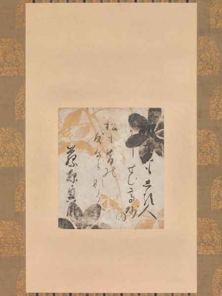
calligraphy
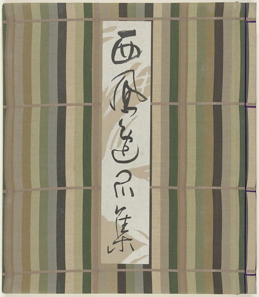
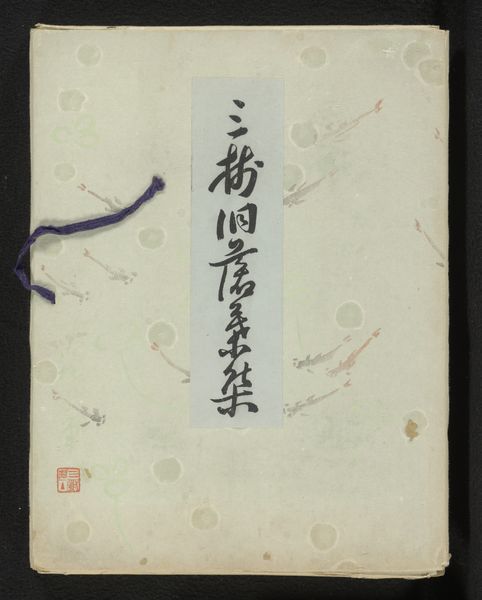
Dimensions: height 251 mm, width 181 mm
Copyright: Rijks Museum: Open Domain
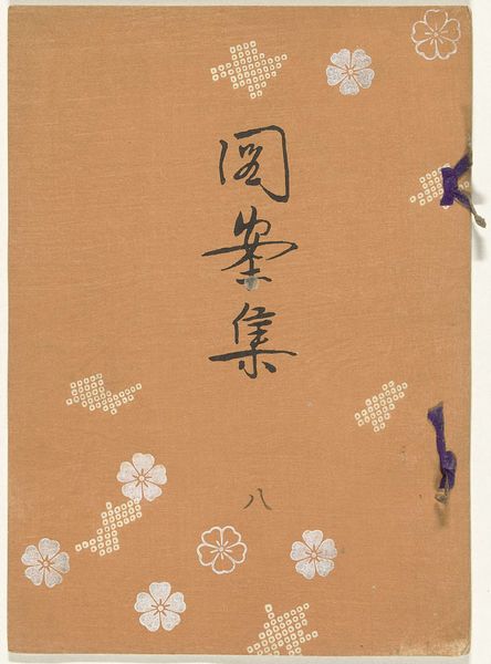
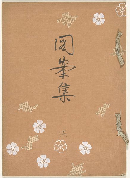
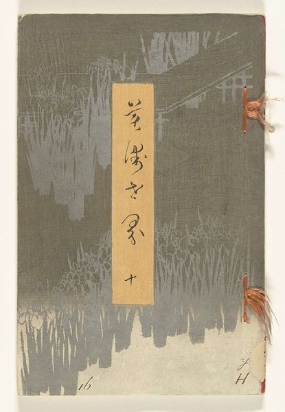
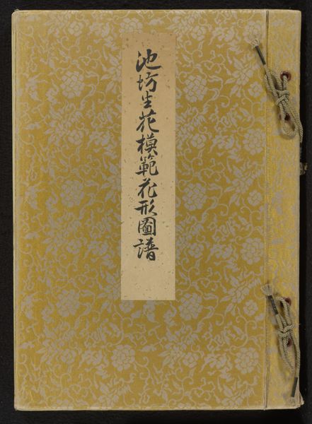
Curator: Stripes, stripes, and more stripes! Meet Furuya Kōrin's 'Strepenboek - deel één' from 1904, currently residing here at the Rijksmuseum. It's a wonderful example of Japanese graphic art with a focus on the beauty of simple lines. Editor: Okay, first impression: this feels strangely hypnotic, almost like looking into a barcode for the soul. But tell me, what’s the story behind all these lines? It looks almost like a textile sample book gone rogue. Curator: That's an interesting take. It plays with repetitive patterns, true, but on a very different field, this kind of "pattern book" was commonly used for textile and design in Japan and the cover hints calligraphy practice. Each stripe perhaps, as a form of meditation and each cover presenting different skills. Editor: Meditation? I get that, staring at those colors shift I am noticing also how the color themselves carries certain cultural significance. Do the different colored lines carry symbolic weight? Curator: Perhaps, for certain beholders, who will meditate long enough, but from my research not really. What speaks to me more is its relation to textile traditions. Like a little catalog of colorways... that can be easily transposed on clothes. This very direct and no non-sense presentation of an artisan’s technical ability… is not far from what you could find in 19th century Europe. Editor: Interesting, almost as an intercultural crossroad where function meets representation. The cover definitely merges practicality with an elegant display of craftsmanship. But, what is with the purple thread there, and why on top and on the bottom of the book? Curator: Ah, those delightful little threads. They serve the purpose of holding together this artistic experiment with an organic solution that in retrospective gives the final artefact a tangible intimacy! Without being said, those where not thought out by the creator of this wonderful set, since they are coming straight from the restoration workshop. They offer such an unusual contrast with the rigor of the stripes themselves! Editor: Agreed. So, a combination of intentional artistry, and accidental adornment… gives the piece a quirky allure. Overall I would conclude on its compelling simplicity, the "Strepenboek - deel één” pulls the looker into this mesmerizing exercise in color and order. Curator: Precisely. It is a testament to how lines, colours, and an open mind can come together in unexpected, engaging ways.
Comments
No comments
Be the first to comment and join the conversation on the ultimate creative platform.
More like this