oil-paint
#
abstract-expressionism
#
abstract expressionism
#
oil-paint
#
landscape
#
colour-field-painting
#
abstraction
#
abstract art
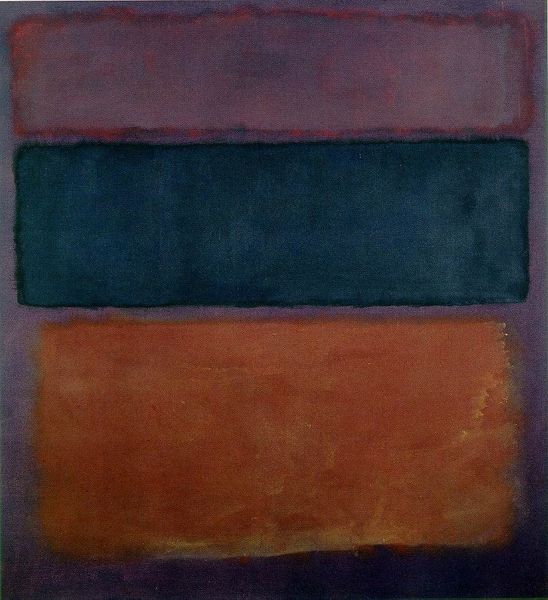
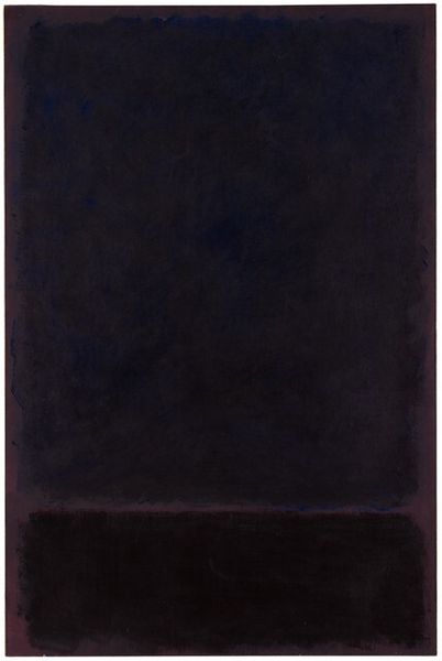
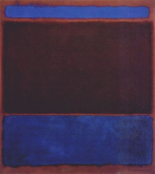
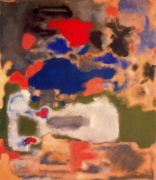
Dimensions: 214.5 x 174 cm
Copyright: Mark Rothko,Fair Use
Editor: We’re looking at Mark Rothko’s “Red, Orange, Tan and Purple” from 1954. It's an oil painting, and honestly, it just vibrates with a quiet intensity. The colors seem to breathe. What do you make of it? Curator: It’s funny you say “breathe” because, in a way, Rothko hoped to create just that – an experience of inhaling art, exhaling emotion. It's less about representation and more about presentation of raw feeling, don't you think? Those soft edges…are they sharp breaks or gentle whispers between colors? Editor: I see what you mean about whispers. It almost feels like the colors are influencing each other. Did Rothko have something particular in mind when he chose this palette? Curator: Well, he wasn't giving away secrets, but he wanted color to act as the main communicator. Think about it: Red, orange, tan, purple…they can signify joy, warmth, decay, royalty, sorrow... and all those possibilities dancing together on the canvas. It's about our response, really. Editor: So it’s like… a Rorschach test made of color? We bring our own stories to it? Curator: Precisely! Or, maybe it's the other way around? Maybe *it* gives us stories we didn’t know we had. It demands a vulnerability from us. To feel, without always needing to understand. It feels like you could step right into the space, fall into that purple, be buoyed by that tan. Editor: I never really thought of abstract art as inviting. This has definitely made me rethink how I approach Rothko, and color-field painting in general. Curator: See? You brought something to it, and it gave something back! That's the delicious secret.
Comments
No comments
Be the first to comment and join the conversation on the ultimate creative platform.
More like this