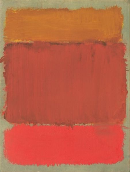
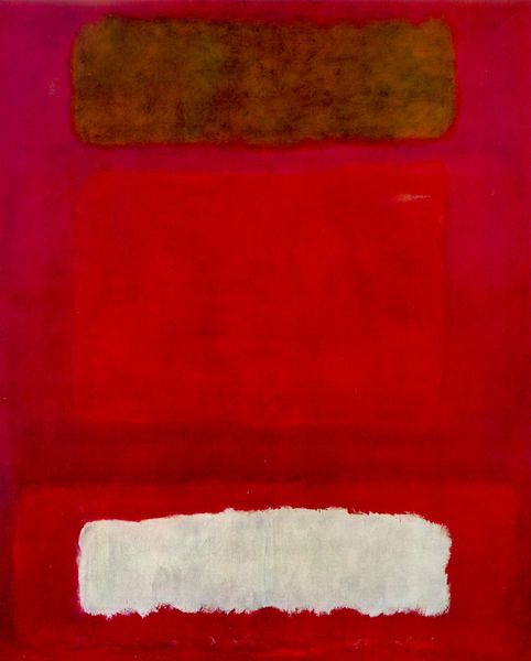
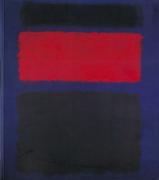
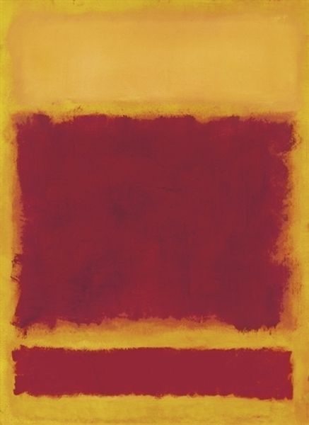
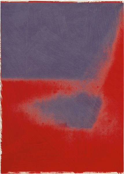
oil-paint
#
abstract-expressionism
#
abstract expressionism
#
oil-paint
#
landscape
#
colour-field-painting
#
abstraction
#
abstract art
#
modernism
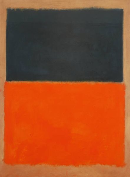
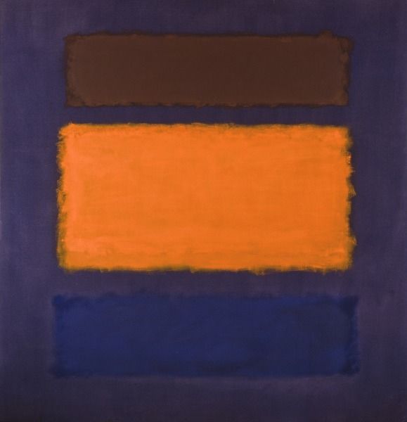
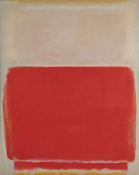
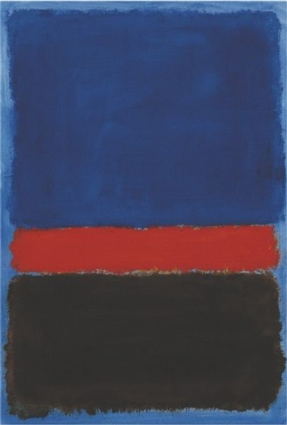
Dimensions: 229.2 x 205.9 cm
Copyright: Mark Rothko,Fair Use
Editor: This is Mark Rothko’s “Blue, Orange, Red” from 1961, made with oil paint. The way the colors vibrate against each other gives it an almost unsettling feel. What do you see in this piece? Curator: I see a meditation on primal contrasts. Blue, historically associated with spirituality and the heavens, struggles against the earthly, passionate reds and oranges. The blurred edges… do they represent a blurring of boundaries, a merging of these opposing forces? Rothko invites us to ponder these relationships. Editor: So, the color choices themselves are almost symbols? Curator: Absolutely. And consider the rectangular forms. They aren't perfect shapes, are they? Their instability reminds me of how cultural memory itself shifts, how we interpret symbols differently across generations. The orange might suggest hope or enlightenment, a flicker in the dominant somber blues. Editor: But is it really that simple? Curator: Never simple. It's an invitation, not a declaration. Rothko presents us with an arena of color and form. Are they in conflict? In harmony? It's our emotional and psychological history that dictates our response. Look closely at the subtle variations within each field of color, those almost imperceptible shifts that evoke atmosphere and emotion. Editor: It makes you realize how much our own backgrounds shape what we see, and how much art can make that visible. Curator: Precisely. Rothko offers not just a painting, but a mirror.
Comments
No comments
Be the first to comment and join the conversation on the ultimate creative platform.
More like this