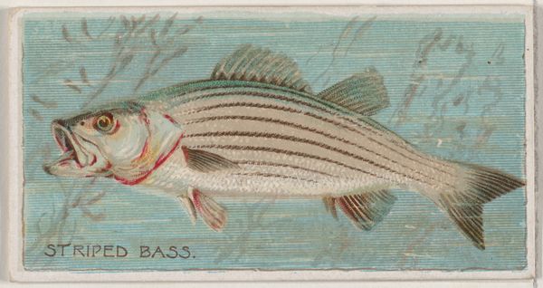
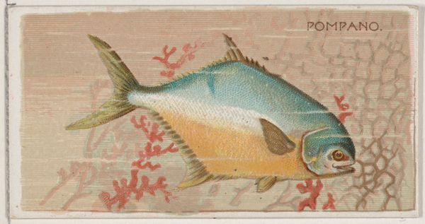
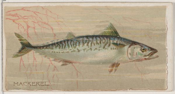
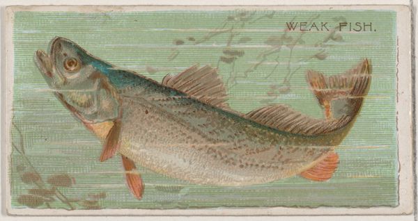
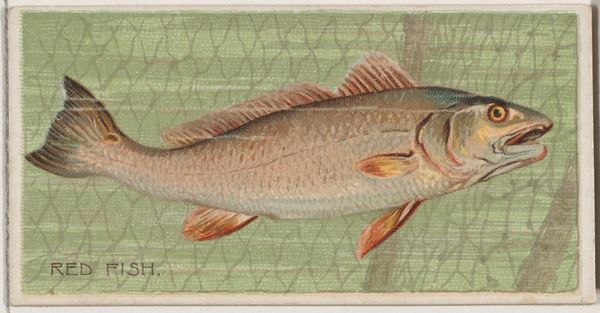
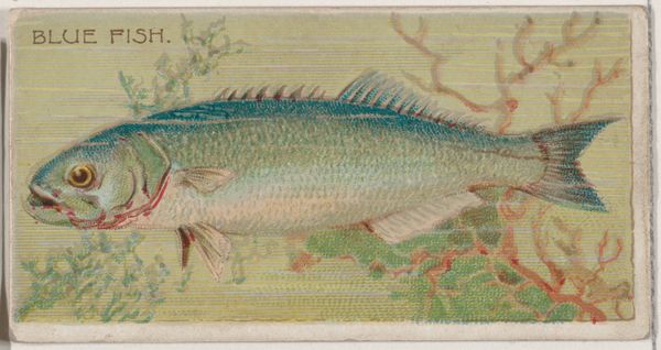
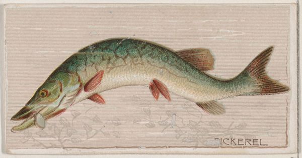
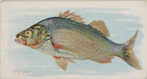
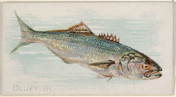
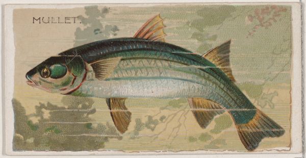
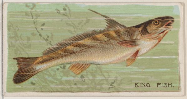
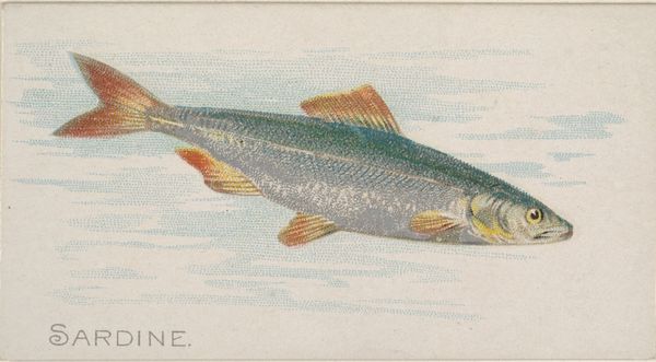
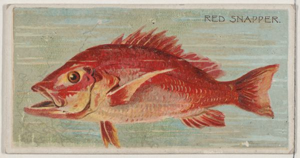
Bonito, from the series Fishers and Fish (N74) for Duke brand cigarettes 1888
0:00
0:00
Dimensions: Sheet: 1 7/16 × 2 3/4 in. (3.6 × 7 cm)
Copyright: Public Domain
Curator: This is an 1888 lithograph entitled "Bonito, from the series Fishers and Fish (N74) for Duke brand cigarettes," created by Knapp & Company. Editor: What immediately strikes me is the dynamic simplicity of it all. The pale blue background contrasts so starkly with the Bonito’s bright gold and the red coral, creating a sense of movement and visual interest. Curator: It’s fascinating to consider its origin as a promotional item. These cigarette cards, particularly series like "Fishers and Fish," reveal a complex relationship between leisure, consumer culture, and our evolving understanding of the natural world during the late 19th century. Who was targeted here and what are some assumptions we might derive from that? Editor: True. In purely formal terms, look at the use of line and color. There’s a subtle realism blended with a clear graphic quality. The fins and scales, for example, are delineated with remarkable detail while the fish itself becomes an iconic symbol, a Platonic form of “fishness”, as it were. The limited palette evokes a feeling of cool distance. Curator: That coolness might reflect the distance industrial society was putting between itself and nature. Consider, too, how these cards functioned within a system built on often exploitative labor practices. Were consumers thinking about that relationship, or simply collecting a beautiful picture? Editor: Yes, of course, and that creates an inescapable tension. Thinking formally about this, one must address the use of the grid structuring everything, from the scales on the fish to the lines indicating the currents surrounding it. There's a sense of implied geometric construction that reflects modernity’s obsession with rationalizing even natural forms. Curator: Precisely! We could think of this little card as a microcosm of late 19th-century ideologies, packaged and sold along with a product designed to be quite literally consumed and then discarded. Editor: Absolutely. It presents a surprising amount of complexity within such a diminutive format. Curator: And that contrast highlights the contradictions inherent in how we create, consume, and value our world. Editor: It does indeed. Thanks for shining a new light on a seemingly straightforward artwork!
Comments
No comments
Be the first to comment and join the conversation on the ultimate creative platform.
More like this