drawing, print, paper, ink, chalk, pen, black-chalk, architecture
#
drawing
#
allegory
#
baroque
# print
#
paper
#
ink
#
chalk
#
pen
#
history-painting
#
black-chalk
#
architecture
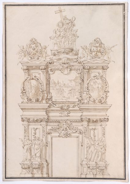
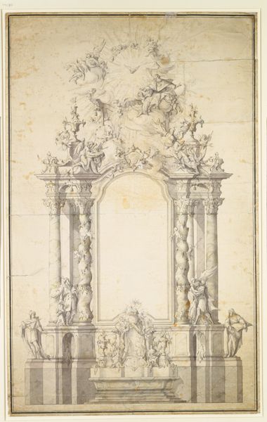
Dimensions: 390 × 211 mm
Copyright: Public Domain
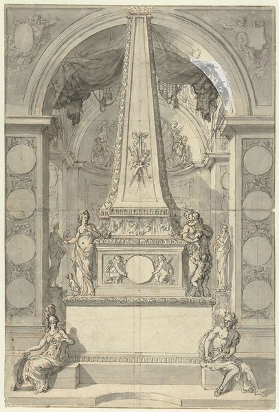
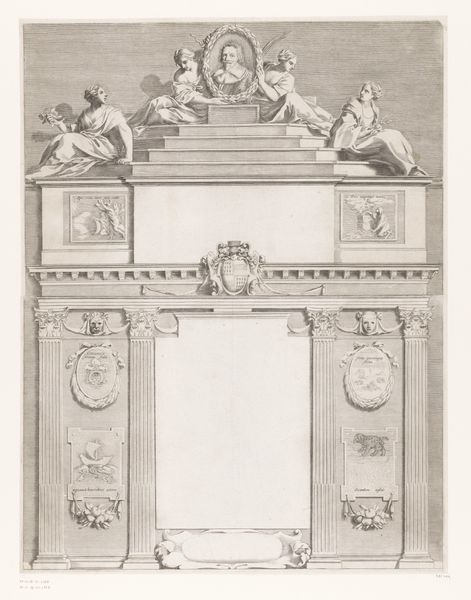
Editor: This is "Design for a Tomb," created sometime between 1677 and 1747. It’s an anonymous drawing made with pen, ink, and chalk on paper. The monumentality strikes me; the artist used primarily line work and shading to construct something really impressive. What visual cues stand out to you? Curator: Observe the interplay of lines and the stark contrast, which defines the architectural framework. The octagonal void at the composition’s core demands attention, drawing the eye into a space devoid of tangible form, yet pregnant with implied meaning. What, in your understanding, is the function of such an element within this piece? Editor: It feels like absence highlights presence – the emptiness throws the cherubs, figures, and crown into sharp relief. The composition, in that sense, uses the emptiness as contrast? Curator: Precisely. Consider the baroque flourishes adorning the structure—they are not mere decoration but calculated gestures of form. These elements amplify the design's intricacy, yes, but the rhythm of those repetitive ornaments along with the mirroring symmetry and the carefully plotted scale offer a visual grammar to understand the intended structure of space and presence. Editor: The symmetry almost makes it feel like a stage setting. All of the elements support the central frame. Curator: Indeed. Symmetry dictates a harmonious organization around a central vertical axis, endowing the structure with a sense of balance and order, further dramatized through light and shadow and all brought back to this central opening, inviting us, conceptually and formally. Now, the materiality of this work, rendered with pen, ink and chalk – does it convey the solemnity it attempts to portray? Editor: I think so. The deliberate choice of medium creates a level of precision and starkness that a painting wouldn’t necessarily achieve, which serves to focus on shape and arrangement. Curator: Precisely. The structure encourages further exploration into art and form. It appears we’ve only scratched the surface in understanding its visual syntax. Editor: It's amazing how much can be unpacked simply by observing line, shape and arrangement. I will carry a sharpened awareness of these formal components with me.
Comments
No comments
Be the first to comment and join the conversation on the ultimate creative platform.
More like this