print, engraving
#
baroque
# print
#
figuration
#
nude
#
engraving
Copyright: Public Domain: Artvee
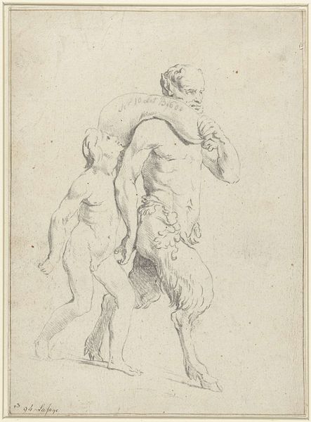
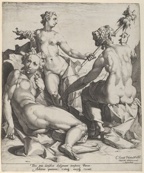
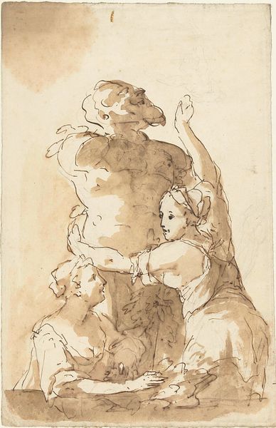
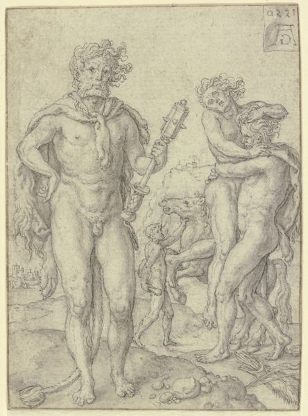
Editor: This engraving is entitled "Two satyrs, and the head of a satyr" by Peter Paul Rubens. The scene is curious and invites a closer examination. I’m especially intrigued by the stark contrast in textures, the smooth skin of the figures juxtaposed with the rough, almost chaotic lines defining the rocky terrain and the bust. How might we analyze this from a purely formal standpoint? Curator: Focusing on the formal elements, observe how Rubens establishes visual tension through line and form. The muscularity of the satyrs, rendered with intricate lines, contrasts sharply with the static form of the sculpted head. This contrast contributes to a dynamic visual rhythm. Editor: Rhythm in a static image? How does that work? Curator: It's in the eye's movement, a kind of choreography orchestrated by the artist. Notice how your gaze is directed across the composition, from the bust on the left, down to the central figure, and then right towards the standing satyr. This is achieved through careful arrangement of forms and directional lines. Ask yourself what that might represent; are those diagonals adding some excitement or are they trying to disrupt the traditional viewing plane? Editor: The varied line weights and densities definitely create depth. The satyr in the back feels closer because of that bolder use of line. And the figure is centrally located but turns to the right; very deliberate. Curator: Precisely. Now, let's think about how the artist plays with positive and negative space. The areas of blank paper surrounding the figures serve to isolate and emphasize their forms. Do you think this adds to the overall sense of drama and tension? Editor: Absolutely. By isolating the forms, the artist spotlights details in the composition. I also appreciate the use of light and shadow. Curator: Indeed, the stark contrasts in shading heighten the sculptural qualities of the figures, lending them a tangible presence. The lack of a naturalistic setting focuses attention solely on the formal interplay between the figures themselves, prompting us to consider what meaning might be derived from their arrangement. What a great chance for visual literacy to thrive.
Comments
No comments
Be the first to comment and join the conversation on the ultimate creative platform.
More like this