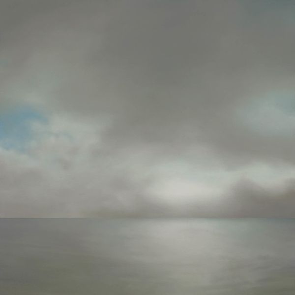
Copyright: Jacob Collins,Fair Use
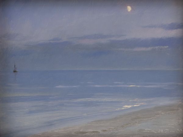
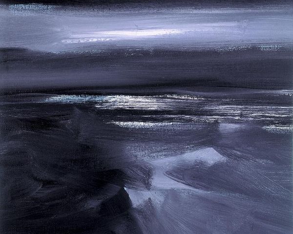
Jacob Collins’s "Green Island" is an exercise in understated landscape painting, made with what looks like oil on board. I love how Collins uses a muted palette, dominated by cool blues and grays, to evoke a contemplative mood. See how the surface of the water is built up with horizontal strokes, giving it a tangible sense of movement? Each brushstroke feels deliberate, almost like a meditation. The paint isn't too thick, but you can see how it's been layered to create depth and texture. The horizon line, a soft band of light, seems to hold everything in place. It's a masterful balancing act between representation and abstraction. It puts me in mind of Whistler, with the way Collins captures a specific atmosphere. But also, think of the Hudson River School guys, who really got into the way light and atmosphere shape our perception of the world. Ultimately, the work's beauty lies in its simplicity. It's a reminder that sometimes, less really is more.
Comments
No comments
Be the first to comment and join the conversation on the ultimate creative platform.
More like this