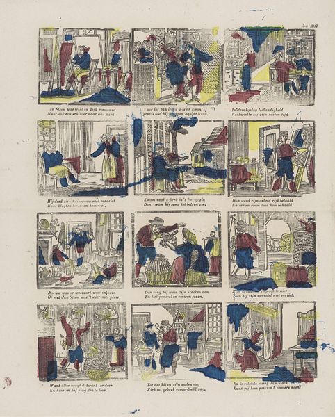
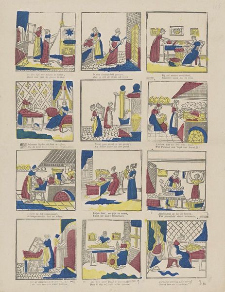
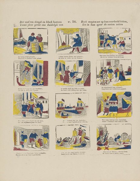
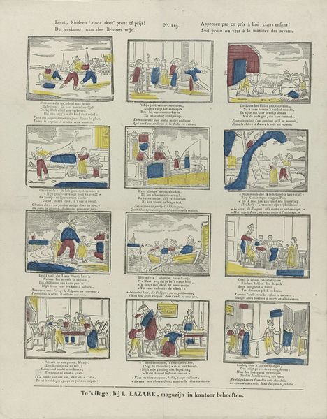
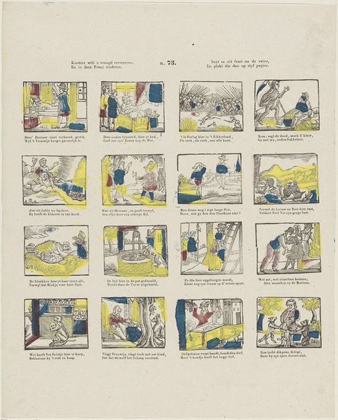
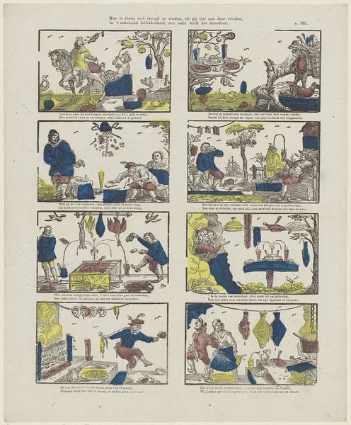
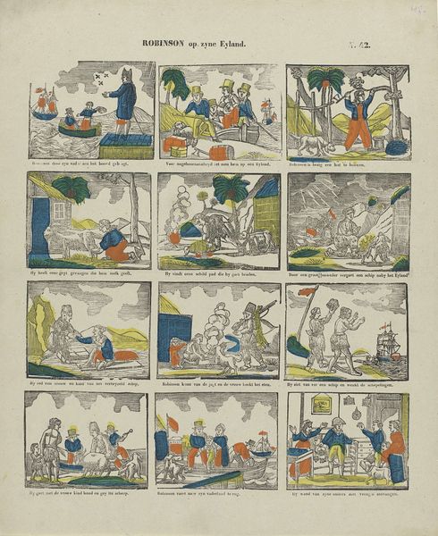
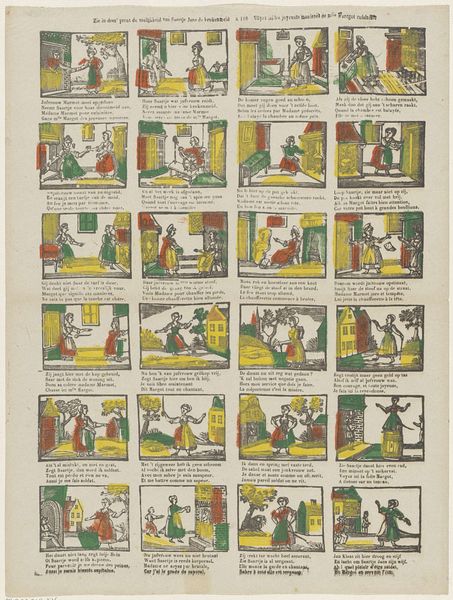
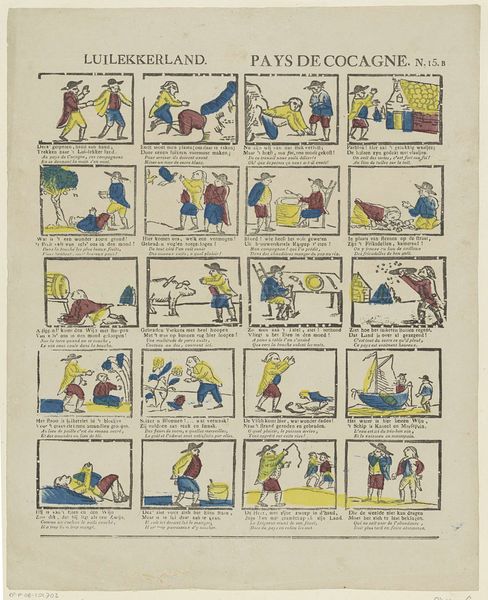
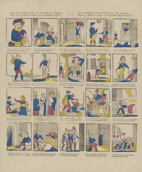
graphic-art, print
#
graphic-art
#
comic strip sketch
#
narrative-art
#
comic strip
# print
#
folk-art
#
genre-painting
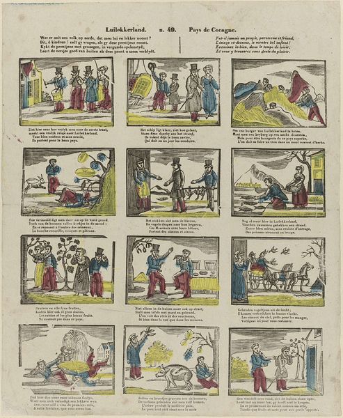
Dimensions: height 321 mm, width 401 mm
Copyright: Rijks Museum: Open Domain
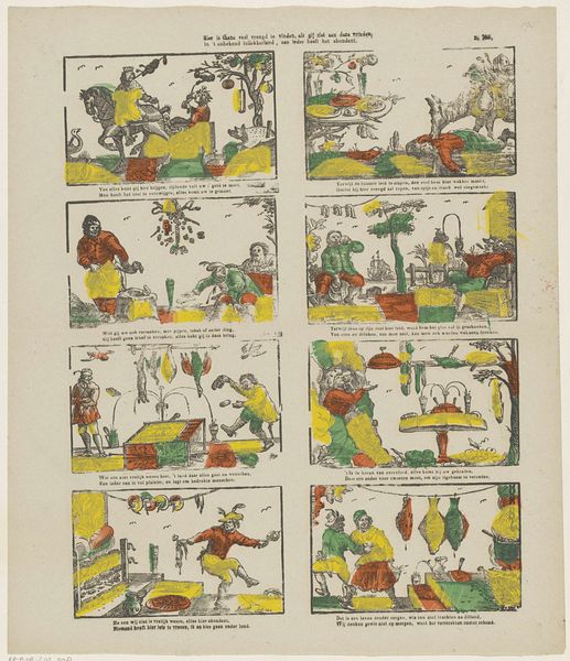
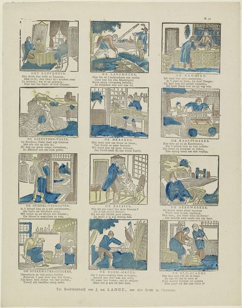
Editor: This is "De twaelf maenden van het jaer / Les douze mois de l'ann\u00e9e" by Glenisson & Van Genechten, created sometime between 1833 and 1870. It appears to be a print, possibly even folk art with these little scenes of each month. I'm really struck by the division into these little narrative boxes; it makes me wonder, how would you approach understanding something like this? Curator: I see this as a fascinating document of material culture and the intersection of labor and representation. Let's consider the means of production. It's a print, suggesting a certain level of accessibility and wider circulation than a unique painting. This raises questions about the intended audience. Editor: So, who was buying and looking at these? Curator: Probably those within the rising burgeois. Think about it: each panel depicts agricultural labor, traditionally associated with rural peasantry, but rendered here as a commodity to be consumed visually by an urban audience. They likely had no experience in the means depicted within each box, separating themselves from such hard, laborious work. Editor: It's like, viewing this idealized, sanitized version of the production of food, or material... Curator: Exactly. And note the repetitive, almost industrial, feel of the printing process. Each copy would have been mechanically reproduced, diminishing the "aura" of the original artwork and highlighting the labor involved in its mass distribution. Also note the ways it flattens seasons down to images, distancing viewers from the realities of a natural environment they were dominating via their factories. What do you notice in terms of materials employed to build the art? Editor: Well it’s cheap paper, with what appear to be fairly basic inks, yellow and blue to build the range of color, which speaks again to accessibility. Are you suggesting the print's very existence comments on shifting social structures through what its materials literally are? Curator: Precisely. Its value lies not in artistic genius or individual expression, but in the processes, materials, and conditions of its making and circulation. That’s what I take away from a materialist perspective. Editor: I’d never considered the implications of accessible folk art like this print, outside a very simplistic narrative lens! Thank you for this rich insight into the social and economic background that allowed this type of work to exist.
Comments
No comments
Be the first to comment and join the conversation on the ultimate creative platform.
More like this