drawing, mixed-media, textile, paper, ink, pen
#
drawing
#
aged paper
#
mixed-media
#
hand-lettering
#
ink paper printed
#
hand drawn type
#
textile
#
paper
#
personal sketchbook
#
ink
#
hand-drawn typeface
#
ink colored
#
pen work
#
sketchbook drawing
#
pen
#
sketchbook art
Copyright: Rijks Museum: Open Domain
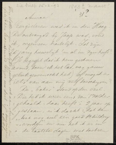
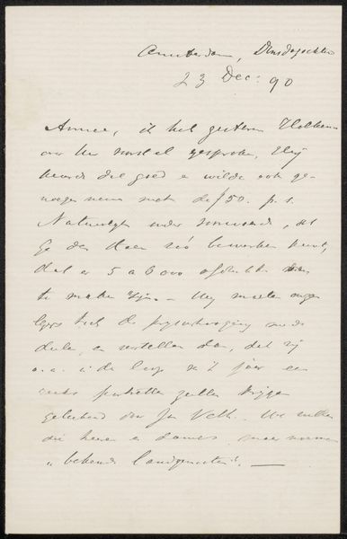
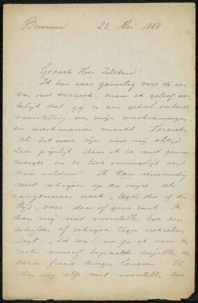
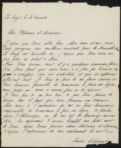
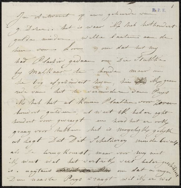
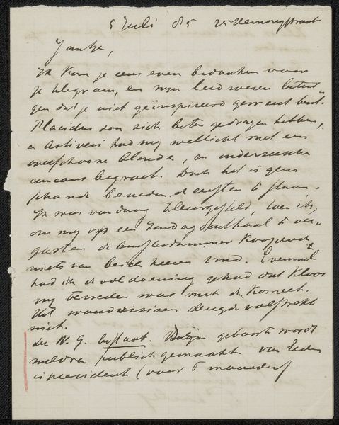
Editor: This is "Brief aan Sjoerd Kuperus," possibly from 1932-1934, by Jac. P. Thijsse. It's a mixed-media drawing combining ink, pen, and textile on paper, resembling something from a personal sketchbook. The aged paper gives it such an intimate feel. What do you see in this piece beyond just the literal handwriting? Curator: Oh, it’s like peering into a secret world, isn't it? Look at the way the words dance on the page; not just conveying information, but also hinting at a deeper connection between Thijsse and Kuperus. It feels like catching a snippet of a private, whispered conversation. What kind of tone do *you* pick up in that dance of words? Editor: There’s definitely a warmth in the informal handwriting, a sense of ease and familiarity. I feel a personal connection between them through his words. Curator: Exactly! Thijsse seems to be more concerned with the flow of thought and feeling than precise perfection. Notice how the lines occasionally overlap and wander, almost like vines climbing a wall. That suggests a spontaneous spirit, an openness to embracing imperfection, wouldn’t you agree? Editor: I do. It makes the letter feel more authentic and alive. It is like we found the artist's intimate memory instead of a perfect presentation of his thought. I never thought handwriting could show emotions like that. Curator: It’s a reminder that art isn't always about flawless execution, sometimes the beauty lies in the raw, unscripted moments. The medium here really brings out this unique and charming feeling. This conversation makes you wonder what a letter written for us might feel like in fifty years.
Comments
No comments
Be the first to comment and join the conversation on the ultimate creative platform.
More like this